
CSS Grid Layout revolutionized web design by providing a powerful two-dimensional layout system. While explicit grid tracks defined with grid-template-columns and grid-template-rows give you precise control, the grid-auto-columns property handles the implicit tracks that are automatically created when grid items overflow your defined grid structure.
Understanding grid-auto-columns is crucial for creating flexible, dynamic layouts that can adapt to varying content amounts without breaking your design. This property determines the size of implicitly created column tracks, ensuring your grid remains functional and visually appealing even when content exceeds your initial grid definition.
What is grid-auto-columns?
The grid-auto-columns property specifies the size of implicitly created column tracks in a CSS Grid container. When grid items are placed outside the explicitly defined grid columns or when the automatic placement algorithm creates additional columns, this property determines their width.
Think of it as a template for any extra columns that your grid might need to create automatically. While grid-template-columns defines your intended grid structure, grid-auto-columns handles the overflow gracefully.
Key Characteristics:
- Applies to: Grid containers only
- Default value:
auto - Inherited: No
- Animatable: Yes, when length values are used
Syntax and Values
The grid-auto-columns property accepts various types of values, giving you flexibility in how implicit columns are sized:
grid-auto-columns: <track-size>+;

/* Length values */
grid-auto-columns: 200px;
grid-auto-columns: 10em;
grid-auto-columns: 50%;

/* Flexible values */
grid-auto-columns: 1fr;
grid-auto-columns: minmax(100px, 1fr);
grid-auto-columns: fit-content(200px);

/* Multiple track sizes */
grid-auto-columns: 100px 200px;
grid-auto-columns: 1fr 2fr;

/* Keyword values */
grid-auto-columns: auto;
grid-auto-columns: min-content;
grid-auto-columns: max-content;
Value Types Explained:
Length Values
Fixed sizes using pixels, ems, percentages, or other CSS length units. These create columns with consistent, predictable widths.
Flexible Units (fr)
The fr unit represents a fraction of available space. 1fr means the column takes up one fraction of the remaining space after fixed-size tracks are accounted for.
Sizing Keywords
auto: Size based on content, similar tomax-contentmin-content: Minimum size needed to fit content without overflowmax-content: Maximum size the content would take if unconstrained
Sizing Functions
minmax(min, max): Defines a size range between minimum and maximum valuesfit-content(size): Acts likeminmax(auto, max-content)but clamped to the specified size
Basic Examples
Let’s explore how grid-auto-columns works with practical examples:
Example 1: Fixed Width Auto Columns
100px
100px
150px
150px
.grid-container {
  display: grid;
  grid-template-columns: repeat(2, 100px);
  grid-auto-columns: 150px;
  gap: 10px;
}

.item:nth-child(3) { grid-column: 3; }
.item:nth-child(4) { grid-column: 4; }
In this example, we define two explicit columns of 100px each. When items 3 and 4 are placed in columns 3 and 4, the grid automatically creates these columns with a width of 150px as specified by grid-auto-columns.
Example 2: Flexible Auto Columns
100px
100px
1fr
1fr
.grid-container {
  display: grid;
  grid-template-columns: 100px 100px;
  grid-auto-columns: 1fr;
  gap: 10px;
  width: 500px;
}
Here, the auto columns use 1fr, making them flexible. They share the remaining space equally after the fixed 100px columns and gaps are accounted for.
Advanced Techniques
Multiple Track Sizes
You can specify multiple values for grid-auto-columns, creating a repeating pattern for implicit columns:
80px
120px
160px
100px
120px
160px
.grid-container {
  display: grid;
  grid-template-columns: 80px;
  grid-auto-columns: 120px 160px 100px;
  gap: 10px;
}
The pattern 120px 160px 100px repeats for all implicit columns. Column 2 gets 120px, column 3 gets 160px, column 4 gets 100px, column 5 gets 120px again, and so on.
Using minmax() Function
The minmax() function provides responsive behavior by setting minimum and maximum constraints:
100px
minmax
minmax
.grid-container {
  display: grid;
  grid-template-columns: 100px;
  grid-auto-columns: minmax(150px, 1fr);
  gap: 10px;
}
The auto columns will be at least 150px wide but can grow to fill available space. Try resizing the container above (drag the resize handle in the bottom-right corner) to see how the columns adapt.
Practical Use Cases
Dynamic Content Cards
Perfect for layouts where you don’t know how many items you’ll have:
Feature 1
Essential functionality for your project
Feature 2
Advanced tools and capabilities
Feature 3
Premium integrations available
Bonus Feature
Extra functionality that fits perfectly
Special Add-on
Additional value for power users
.card-grid {
  display: grid;
  grid-template-columns: repeat(3, 1fr);
  grid-auto-columns: 1fr;
  gap: 15px;
}

/* Extra cards automatically get equal width */
.card:nth-child(4) { grid-column: 4; }
.card:nth-child(5) { grid-column: 5; }
Responsive Image Gallery
Create galleries that adapt to different numbers of images:
.gallery {
  display: grid;
  grid-template-columns: repeat(4, 80px);
  grid-auto-columns: 80px;
  gap: 8px;
}
Interactive Example: Auto Columns Playground
Experiment with different grid-auto-columns values to see how they affect layout:
4
grid-template-columns: repeat(2, 100px);grid-auto-columns: 150px;
Common Pitfalls and Solutions
Pitfall 1: Forgetting About Auto Placement
Auto-placed items might not behave as expected if you don’t understand the placement algorithm:
Problem: Items automatically flow into implicit columns even when you don’t want them to.
Solution: Use explicit grid positioning or adjust your grid template to accommodate all items.
Pitfall 2: Performance with Large Grids
Creating many implicit tracks can impact performance:
Problem: Placing items in very high column numbers (like column 1000) creates many empty implicit tracks.
Solution: Use reasonable positioning values and consider alternative layout strategies for very large datasets.
Pitfall 3: Mixing Auto and Explicit Sizing
Understanding how auto columns interact with explicit columns:
Tip: Auto columns are independent of explicit columns. They won’t automatically match the sizes of your template columns unless you specify the same values.
Browser Support and Compatibility
CSS Grid and grid-auto-columns have excellent modern browser support:
- Chrome: 57+ (March 2017)
- Firefox: 52+ (March 2017)
- Safari: 10.1+ (March 2017)
- Edge: 16+ (October 2017)
For older browsers, consider providing fallback layouts using flexbox or floats, or use CSS Grid with feature queries:
@supports (display: grid) {
  .container {
    display: grid;
    grid-template-columns: repeat(3, 1fr);
    grid-auto-columns: 1fr;
  }
}

/* Fallback for older browsers */
.container {
  display: flex;
  flex-wrap: wrap;
}
Best Practices
1. Plan for Content Growth
Always consider how your layout will handle additional content. Set reasonable auto column sizes that won’t break your design when new items are added.
2. Use Consistent Sizing
For most cases, using the same sizing strategy for both explicit and implicit tracks creates more predictable layouts:
/* Consistent approach */
.grid {
  grid-template-columns: repeat(3, 1fr);
  grid-auto-columns: 1fr;
}
3. Combine with grid-auto-flow
Use grid-auto-flow: column when you want items to flow into auto columns rather than creating new rows:
.horizontal-flow {
  display: grid;
  grid-template-columns: repeat(3, 200px);
  grid-auto-columns: 200px;
  grid-auto-flow: column;
}
4. Test with Dynamic Content
Always test your grid layouts with varying amounts of content to ensure the auto column behavior works as expected in real-world scenarios.
Conclusion
The grid-auto-columns property is a powerful tool for creating flexible, robust grid layouts that can handle dynamic content gracefully. By understanding how implicit column tracks are sized and positioned, you can build layouts that adapt seamlessly to varying content requirements.
Key takeaways:
grid-auto-columnscontrols the size of automatically created column tracks- It accepts the same values as
grid-template-columns, including fixed sizes, flexible units, and sizing functions - Multiple values create repeating patterns for implicit tracks
- Combine with other grid properties like
grid-auto-flowfor optimal control - Always consider performance implications when creating many implicit tracks
Master grid-auto-columns and you’ll be able to create sophisticated, responsive layouts that handle any amount of content with confidence. The examples and techniques covered here provide a solid foundation for implementing dynamic grid systems in your projects.
Start experimenting with these concepts in your own projects, and you’ll quickly discover how grid-auto-columns can solve complex layout challenges while keeping your CSS clean and maintainable.
Related Posts
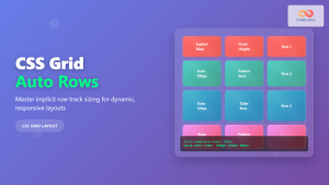
CSS Grid Auto Rows: Master Implicit Row Track Sizing for Dynamic Layouts
CSS Grid revolutionized web layout design, offering unprecedented control over both rows and columns. While you explicitly define grid tracks...
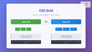
CSS Grid auto-fit vs auto-fill: Master Dynamic Responsive Layouts
CSS Grid's auto-fit and auto-fill are two powerful keywords that enable dynamic track creation in grid layouts. While they might...

CSS Grid Auto Flow: Master Item Placement Algorithm Control for Responsive Layouts
Understanding CSS Grid Auto Flow The grid-auto-flow property is a powerful CSS Grid feature that controls how auto-placed items are...
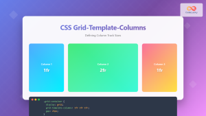
CSS Grid-Template-Columns: Complete Guide to Defining Column Track Sizes
The grid-template-columns property is one of the most fundamental aspects of CSS Grid Layout, allowing developers to define the size...

CSS Grid Functions: Complete Guide to repeat(), minmax(), and fit-content()
CSS Grid has revolutionized web layout design, offering developers unprecedented control over two-dimensional layouts. Among its most powerful features are...
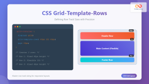
CSS Grid-Template-Rows: Master Row Track Sizing with Complete Examples
The grid-template-rows property is a fundamental building block of CSS Grid Layout that allows you to define the size of...
CSS Grid-Column-Start and Grid-Column-End: Complete Guide to Precise Item Column Placement
CSS Grid revolutionized web layout by providing precise control over both rows and columns. Among its most powerful features are...

CSS Style grid Property: CSS Grid Layout
CSS grid Property: Mastering CSS Grid Layout The CSS grid property is a powerful tool for creating two-dimensional layouts on...

CSS Grid Shorthand: Template and Auto Properties Combined for Efficient Layouts
CSS Grid has revolutionized web layout design, offering powerful tools for creating complex, responsive layouts. Among its most valuable features...

CSS Grid: Display Grid Container Property – Complete Guide with Examples
CSS Grid revolutionized web layout design by providing a two-dimensional grid system that allows developers to create complex, responsive layouts...

CSS Subgrid: Complete Guide to Inheriting Parent Grid Lines
CSS Subgrid is a powerful feature that extends CSS Grid Layout by allowing child grids to inherit the track sizing...
CSS Grid Template Areas: Master Named Grid Layouts with Visual Examples
CSS Grid revolutionized web layout design, and one of its most powerful features is grid-template-areas. This property allows you to...


