
CSS fontSize Property: Controlling Text Size
The fontSize property in CSS specifies the size of the font. This property is fundamental to controlling the readability and visual hierarchy of text on a webpage. It allows you to define the absolute or relative size of text, ensuring it is legible and fits well within the overall design.
Purpose of the fontSize Property
The primary purpose of the fontSize property is to:
- Control the size of text, enhancing readability.
- Establish a visual hierarchy by using different sizes for headings and body text.
- Ensure text fits appropriately within the layout.
- Create emphasis and draw attention to important content.
Syntax
The fontSize property can be defined using various units and keywords:
selector {
    font-size: value;
}
Possible Values
| Value | Description |
|---|---|
| `xx-small` | Sets the font size to the smallest available size. |
| `x-small` | Sets the font size to a very small size. |
| `small` | Sets the font size to a small size. |
| `medium` | Sets the font size to the default, medium size. |
| `large` | Sets the font size to a large size. |
| `x-large` | Sets the font size to a very large size. |
| `xx-large` | Sets the font size to the largest available size. |
| `smaller` | Sets the font size to be smaller than the parent element’s font size. |
| `larger` | Sets the font size to be larger than the parent element’s font size. |
| `length` | Sets the font size to a fixed size using units like `px`, `em`, `rem`, `pt`, etc. |
| `%` | Sets the font size as a percentage of the parent element’s font size. |
| `initial` | Sets this property to its default value. |
| `inherit` | Inherits this property from its parent element. |
Examples
Let’s explore different ways to use the fontSize property with practical examples.
Using Absolute Keywords
Absolute keywords define the font size as a fixed value, but their actual size can vary between browsers.
<p class="xx-small-text">This is xx-small text.</p>
<p class="x-small-text">This is x-small text.</p>
<p class="small-text">This is small text.</p>
<p class="medium-text">This is medium text.</p>
<p class="large-text">This is large text.</p>
<p class="x-large-text">This is x-large text.</p>
<p class="xx-large-text">This is xx-large text.</p>

<style>
    .xx-small-text { font-size: xx-small; }
    .x-small-text { font-size: x-small; }
    .small-text { font-size: small; }
    .medium-text { font-size: medium; }
    .large-text { font-size: large; }
    .x-large-text { font-size: x-large; }
    .xx-large-text { font-size: xx-large; }
</style>
Using Relative Keywords
Relative keywords adjust the font size relative to the parent element.
<div class="parent-text">
    <p class="smaller-text">This is smaller text.</p>
    <p class="larger-text">This is larger text.</p>
</div>

<style>
    .parent-text { font-size: 16px; }
    .smaller-text { font-size: smaller; }
    .larger-text { font-size: larger; }
</style>
Using Length Units (Pixels)
Pixels (px) provide precise control over font size, making them suitable for consistent design across devices.
<p class="pixel-text">This text is 20 pixels in size.</p>

<style>
    .pixel-text { font-size: 20px; }
</style>
Using em Units
em units are relative to the font size of the element itself. This makes them useful for creating scalable designs.
<div class="em-parent">
    <p class="em-text">This text uses em units.</p>
</div>

<style>
    .em-parent { font-size: 16px; }
    .em-text { font-size: 1.5em; } /* 1.5 times the parent's font size */
</style>
Using rem Units
rem units are relative to the root (HTML) element’s font size, providing consistent scaling across the entire page.
<p class="rem-text">This text uses rem units.</p>

<style>
    html { font-size: 16px; } /* Set root font size */
    .rem-text { font-size: 1.2rem; } /* 1.2 times the root font size */
</style>
Using Percentage Values
Percentage values set the font size relative to the parent element.
<div class="percent-parent">
    <p class="percent-text">This text uses percentage values.</p>
</div>

<style>
    .percent-parent { font-size: 16px; }
    .percent-text { font-size: 150%; } /* 1.5 times the parent's font size */
</style>
Best Practices
- Use Relative Units: Employ
emorremunits for scalability and better responsiveness across different devices. - Establish a Baseline: Set a base font size on the
htmlelement for consistentremscaling. - Maintain Readability: Ensure text is large enough to be easily readable on various screen sizes.
- Consider Visual Hierarchy: Use larger font sizes for headings to create a clear visual structure.
- Test on Different Devices: Always test your designs on multiple devices to ensure optimal text rendering.
Real-World Example: Responsive Typography
In this example, we create a responsive typography setup using rem units, ensuring consistent scaling and readability across different screen sizes.
<div class="container">
    <h1>Main Heading</h1>
    <p>This is the main content of the page. It uses responsive font sizes to ensure readability on all devices.</p>
    <h2>Subheading</h2>
    <p>Additional content here, with font sizes that scale appropriately.</p>
</div>

<style>
    html { font-size: 16px; } /* Base font size */

    .container {
        width: 80%;
        margin: 0 auto;
        padding: 20px;
    }

    h1 { font-size: 2.5rem; } /* Scaled heading */
    h2 { font-size: 1.8rem; } /* Scaled subheading */
    p { font-size: 1.1rem; } /* Scaled paragraph text */

    /* Media query for smaller screens */
    @media (max-width: 768px) {
        html { font-size: 14px; } /* Reduce base font size */
    }
</style>
In this setup, the rem units ensure that all text scales proportionally based on the root font size. The media query adjusts the root font size on smaller screens, ensuring that the text remains readable without being too large.
Conclusion
The fontSize property is a fundamental aspect of CSS, allowing you to control the size of text and enhance the readability and visual hierarchy of your webpages. By using appropriate units and following best practices, you can create responsive and visually appealing designs that provide an optimal reading experience across various devices.
Related Posts
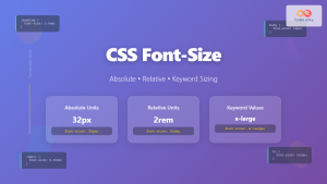
CSS Font-Size: Complete Guide to Absolute, Relative and Keyword Sizing
Font sizing is one of the most fundamental aspects of web typography that directly impacts user experience and accessibility. Understanding...
CSS Style font Property: CSS Font
CSS font Property: A Comprehensive Guide The CSS font property is a shorthand property used to set several font-related styles...
CSS Style fontStyle Property: CSS Font Style
CSS font-style Property: A Comprehensive Guide The font-style property in CSS is used to specify the style of a font....

CSS Style fontWeight Property: CSS Font Weight
CSS Style fontWeight Property: Mastering CSS Font Weight The fontWeight property in CSS is used to specify the weight, or...

CSS Style maxWidth Property: CSS Max Width
Understanding the CSS maxWidth Property The CSS maxWidth property is a fundamental tool in web development for controlling the maximum...
CSS Style fontFamily Property: CSS Font Family
CSS font-family Property: Mastering Web Typography The CSS font-family property is a fundamental aspect of web design, allowing you to...
CSS Style letterSpacing Property: CSS Letter Spacing
CSS letter-spacing Property: A Comprehensive Guide The letter-spacing CSS property controls the horizontal spacing between text characters. It allows you...

CSS Width Property: Mastering Element Width in CSS
CSS Width Property: Mastering Element Width The width property in CSS defines the width of an element's content area. It's...

CSS Width and Height: Complete Guide to Element Dimensions
Understanding how to control element dimensions is fundamental to creating well-structured web layouts. CSS width and height properties give you...
CSS Style lineHeight Property: CSS Line Height
Understanding the CSS line-height Property: Your Guide to Perfect Text Spacing The line-height property in CSS is a fundamental tool...
CSS Style minWidth Property: CSS Min Width
CSS min-width Property: Controlling Element Size The CSS min-width property sets the minimum width of an element. It prevents the...
CSS Font-Style: Complete Guide to Italic, Oblique and Normal Text Styling
The CSS font-style property is a fundamental typography tool that controls how text appears on your web pages. Whether you...


