
The CSS flex-wrap property is a fundamental flexbox feature that controls whether flex items are forced onto a single line or can wrap onto multiple lines. Understanding this property is crucial for creating responsive layouts that adapt seamlessly to different screen sizes and container widths.
What is CSS Flex-Wrap?
The flex-wrap property defines how flex items behave when they exceed the width of their flex container. By default, flex items try to fit on a single line, but with flex-wrap, you can control this behavior to create more flexible and responsive designs.
Syntax and Values
.flex-container {
  display: flex;
  flex-wrap: nowrap | wrap | wrap-reverse;
}
The flex-wrap property accepts three values:
- nowrap (default): Items stay on a single line
- wrap: Items wrap to new lines as needed
- wrap-reverse: Items wrap to new lines in reverse order
CSS Flex-Wrap: Nowrap
The nowrap value is the default behavior for flex containers. All flex items remain on a single line, regardless of their combined width or the container’s size.
Nowrap Example
Interactive Demo: Nowrap
Notice how items stay on one line and may overflow horizontally
.container-nowrap {
  display: flex;
  flex-wrap: nowrap; /* Default value */
  background-color: #f8f9fa;
  padding: 15px;
}

.item {
  background-color: #007bff;
  color: white;
  padding: 15px 20px;
  margin: 5px;
  border-radius: 4px;
  min-width: 120px;
}
When to Use Nowrap
Use flex-wrap: nowrap when you want items to:
- Always stay on a single horizontal line
- Shrink proportionally to fit the container
- Create horizontal scrolling interfaces
- Maintain consistent alignment in navigation bars
CSS Flex-Wrap: Wrap
The wrap value allows flex items to wrap onto new lines when they can’t fit within the container’s width. This creates a more responsive layout that adapts to different screen sizes.
Wrap Example
Interactive Demo: Wrap
Items wrap naturally to new lines when space runs out
.container-wrap {
  display: flex;
  flex-wrap: wrap;
  background-color: #f8f9fa;
  padding: 15px;
}

.item {
  background-color: #28a745;
  color: white;
  padding: 15px 20px;
  margin: 5px;
  border-radius: 4px;
  min-width: 120px;
}
Benefits of Using Wrap
The wrap value is ideal for:
- Creating responsive card layouts
- Building flexible tag clouds
- Designing adaptive button groups
- Implementing responsive image galleries
CSS Flex-Wrap: Wrap-Reverse
The wrap-reverse value works similarly to wrap, but new lines are added above the previous line instead of below, creating a reverse stacking effect.
Wrap-Reverse Example
Interactive Demo: Wrap-Reverse
Notice how wrapped items appear above the first line
.container-wrap-reverse {
  display: flex;
  flex-wrap: wrap-reverse;
  background-color: #f8f9fa;
  padding: 15px;
}

.item {
  background-color: #6f42c1;
  color: white;
  padding: 15px 20px;
  margin: 5px;
  border-radius: 4px;
  min-width: 120px;
}
Use Cases for Wrap-Reverse
Consider wrap-reverse for:
- Creating bottom-up layouts
- Implementing chat interfaces where new messages appear at the bottom
- Building reverse chronological displays
- Designing unique visual effects
Interactive Comparison Tool
Compare All Flex-Wrap Values
Current value: flex-wrap: wrap;
Real-World Applications
1. Responsive Navigation Menu
.nav-menu {
  display: flex;
  flex-wrap: wrap;
  list-style: none;
  padding: 0;
  margin: 0;
}

.nav-item {
  margin: 5px 10px;
  padding: 10px 15px;
  background-color: #007bff;
  color: white;
  text-decoration: none;
  border-radius: 4px;
}
2. Card Grid Layout
.card-grid {
  display: flex;
  flex-wrap: wrap;
  gap: 20px;
  padding: 20px;
}

.card {
  flex: 1 1 300px; /* grow, shrink, basis */
  min-height: 200px;
  background: white;
  border-radius: 8px;
  box-shadow: 0 2px 4px rgba(0,0,0,0.1);
}
3. Tag Cloud
.tag-cloud {
  display: flex;
  flex-wrap: wrap;
  gap: 8px;
  padding: 15px;
}

.tag {
  padding: 5px 12px;
  background-color: #e9ecef;
  border-radius: 20px;
  font-size: 14px;
  white-space: nowrap;
}
Best Practices and Tips
Performance Considerations
When using flex-wrap, keep these performance tips in mind:
- Use appropriate flex-basis: Set a reasonable
flex-basisto prevent excessive wrapping calculations - Limit nested flex containers: Deep nesting can impact performance
- Consider CSS Grid for complex layouts: For two-dimensional layouts, CSS Grid might be more appropriate
Common Pitfalls
Avoid these common mistakes when working with flex-wrap:
- Forgetting flex-basis: Without proper sizing, items may not wrap as expected
- Conflicting with overflow: Be careful when combining with
overflow: hidden - Ignoring cross-axis alignment: Use
align-contentto control wrapped line alignment
Browser Support
The flex-wrap property enjoys excellent browser support:
- Chrome: 29+ (21+ with prefix)
- Firefox: 28+ (18+ with prefix)
- Safari: 9+ (6.1+ with prefix)
- Edge: 12+
- Internet Explorer: 11+ (10+ with prefix)
Vendor Prefixes
For maximum compatibility, especially with older browsers, use vendor prefixes:
.flex-container {
  display: -webkit-flex;
  display: -ms-flexbox;
  display: flex;

  -webkit-flex-wrap: wrap;
  -ms-flex-wrap: wrap;
  flex-wrap: wrap;
}
Advanced Techniques
Combining with Flex-Flow
The flex-flow property is a shorthand that combines flex-direction and flex-wrap:
/* Instead of: */
.container {
  flex-direction: row;
  flex-wrap: wrap;
}

/* Use: */
.container {
  flex-flow: row wrap;
}
Controlling Wrapped Lines
Use align-content to control how wrapped lines are distributed:
.flex-container {
  display: flex;
  flex-wrap: wrap;
  align-content: space-between; /* Distributes wrapped lines */
  height: 400px;
}
Conclusion
The CSS flex-wrap property is essential for creating flexible, responsive layouts. Whether you choose nowrap for controlled single-line layouts, wrap for adaptive multi-line designs, or wrap-reverse for unique visual effects, understanding these values will significantly enhance your CSS layout skills.
Remember to combine flex-wrap with other flexbox properties like justify-content, align-items, and gap to create polished, professional layouts that work seamlessly across all devices and screen sizes.
Start experimenting with these examples in your own projects, and you’ll quickly master the art of flexible web layouts using flex-wrap.
Related Posts
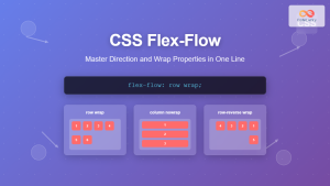
CSS Flex-Flow: Master Direction and Wrap Properties in One Line
The flex-flow property is a powerful CSS shorthand that combines two fundamental flexbox properties: flex-direction and flex-wrap. This single property...
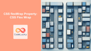
CSS flexWrap Property: CSS Flex Wrap
CSS flex-wrap Property: Mastering Flex Item Wrapping The flex-wrap property in CSS is a powerful tool for controlling how flex...
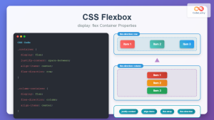
CSS Flexbox: Complete Guide to display: flex Container Properties and Layout Control
CSS Flexbox revolutionized web layout by providing a powerful, flexible way to arrange elements within containers. The display: flex property...
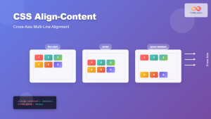
CSS Align-Content: Complete Guide to Cross-Axis Multi-Line Alignment
The align-content property is a powerful CSS tool that controls how multiple lines of content are distributed along the cross-axis...

CSS Style flexFlow Property: CSS Flex Flow
CSS flex-flow Property: A Comprehensive Guide The CSS flex-flow property is a shorthand property for setting both the flex-direction and...
CSS Style flexDirection Property: CSS Flex Direction
CSS flexDirection Property: Mastering Flex Item Arrangement The CSS flexDirection property is a crucial aspect of Flexbox layout, determining the...

CSS Align-Items: Master Cross-Axis Alignment in Flexbox and Grid
The CSS align-items property is a fundamental tool for controlling cross-axis alignment in both flexbox and CSS Grid layouts. Understanding...
CSS Flex-Direction: Complete Guide to Row, Column, Row-Reverse & Column-Reverse
The flex-direction property is one of the most fundamental aspects of CSS Flexbox, determining how flex items are arranged within...
CSS flexShrink Property: CSS Flex Shrink
CSS flexShrink Property: Controlling the Shrink Factor of Flex Items The CSS flexShrink property is a crucial component of the...

CSS Align-Self: Master Individual Flexbox Item Alignment
The CSS align-self property is a powerful flexbox feature that allows you to override the default cross-axis alignment for individual...
CSS Order Property: Complete Guide to Reordering Flex Items Visually
The CSS order property is a powerful flexbox feature that allows you to change the visual order of flex items...
CSS Flex-Shrink: Complete Guide to Flexible Item Shrinkage Control
The CSS flex-shrink property is a fundamental component of the flexbox layout system that determines how flex items shrink when...


