
CSS flexShrink Property: Controlling the Shrink Factor of Flex Items
The CSS flexShrink property is a crucial component of the Flexbox layout model, allowing you to specify how much a flex item will shrink relative to the other flex items in the flex container when there isn’t enough space. It dictates the item’s ability to shrink to prevent overflow. This guide explores the syntax, values, and practical applications of the flexShrink property to help you create more responsive and flexible layouts.
What is the flexShrink Property?
The flexShrink property defines the shrink factor of a flex item. It determines how much the item will shrink relative to the other items in the flex container when the total width of flex items exceeds the width of the flex container. A higher flexShrink value means the item will shrink more.
Syntax
The flexShrink property is specified as a single value:
.item {
  flex-shrink: <number>;
}
Values
| Value | Description |
|---|---|
| `number` | A non-negative number that specifies the shrink factor. When the total size of flex items exceeds the flex container size, items shrink to fit according to this factor. A value of `0` prevents the item from shrinking. The default value is `1`. |
| `initial` | Sets the property to its default value, which is `1`. |
| `inherit` | Inherits this property from its parent element. |
| `auto` | Computes to `1` if the `flex-basis` is set to `auto` or `content`; otherwise, it computes to `0`. |
Practical Examples
Example 1: Basic Usage
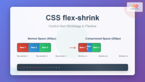
In this example, we have three flex items. The flexShrink property is set to 1 for the first item, 2 for the second, and 3 for the third. This means the second item will shrink twice as much as the first, and the third item will shrink three times as much as the first when there’s not enough space.
<div class="container_flexShrink_1">
  <div class="item_flexShrink_1 item-1_flexShrink_1">Item 1</div>
  <div class="item_flexShrink_1 item-2_flexShrink_1">Item 2</div>
  <div class="item_flexShrink_1 item-3_flexShrink_1">Item 3</div>
</div>

<style>
  .container_flexShrink_1 {
    display: flex;
    width: 300px;
    border: 1px solid black;
  }

  .item_flexShrink_1 {
    width: 150px;
    text-align: center;
  }

  .item-1_flexShrink_1 {
    flex-shrink: 1;
    background-color: #f0f8ff;
  }

  .item-2_flexShrink_1 {
    flex-shrink: 2;
    background-color: #e6e6fa;
  }

  .item-3_flexShrink_1 {
    flex-shrink: 3;
    background-color: #d8bfd8;
  }
</style>
<div
  class="container_flexShrink_1"
  style="display: flex; width: 300px; border: 1px solid black;"
>
  <div
    class="item_flexShrink_1 item-1_flexShrink_1"
    style="width: 150px; text-align: center; flex-shrink: 1; background-color: #f0f8ff;"
  >
    Item 1
  </div>
  <div
    class="item_flexShrink_1 item-2_flexShrink_1"
    style="width: 150px; text-align: center; flex-shrink: 2; background-color: #e6e6fa;"
  >
    Item 2
  </div>
  <div
    class="item_flexShrink_1 item-3_flexShrink_1"
    style="width: 150px; text-align: center; flex-shrink: 3; background-color: #d8bfd8;"
  >
    Item 3
  </div>
</div>
Explanation:
- The container has a fixed width of
300px. - Each item has an initial width of
150px. - Since the total width of the items (450px) exceeds the container width, they need to shrink.
- Item 2 shrinks twice as much as Item 1, and Item 3 shrinks three times as much as Item 1, relative to each other.
Example 2: Preventing Shrinking with flexShrink: 0
Setting flexShrink to 0 prevents an item from shrinking. In this example, the second item is set to flexShrink: 0, so it maintains its original width while the other items shrink to fit the container.
<div class="container_flexShrink_2">
  <div class="item_flexShrink_2 item-1_flexShrink_2">Item 1</div>
  <div class="item_flexShrink_2 item-2_flexShrink_2">Item 2</div>
  <div class="item_flexShrink_2 item-3_flexShrink_2">Item 3</div>
</div>

<style>
  .container_flexShrink_2 {
    display: flex;
    width: 300px;
    border: 1px solid black;
  }

  .item_flexShrink_2 {
    width: 150px;
    text-align: center;
  }

  .item-1_flexShrink_2 {
    flex-shrink: 1;
    background-color: #f0f8ff;
  }

  .item-2_flexShrink_2 {
    flex-shrink: 0;
    background-color: #e6e6fa;
  }

  .item-3_flexShrink_2 {
    flex-shrink: 1;
    background-color: #d8bfd8;
  }
</style>
<div
  class="container_flexShrink_2"
  style="display: flex; width: 300px; border: 1px solid black;"
>
  <div
    class="item_flexShrink_2 item-1_flexShrink_2"
    style="width: 150px; text-align: center; flex-shrink: 1; background-color: #f0f8ff;"
  >
    Item 1
  </div>
  <div
    class="item_flexShrink_2 item-2_flexShrink_2"
    style="width: 150px; text-align: center; flex-shrink: 0; background-color: #e6e6fa;"
  >
    Item 2
  </div>
  <div
    class="item_flexShrink_2 item-3_flexShrink_2"
    style="width: 150px; text-align: center; flex-shrink: 1; background-color: #d8bfd8;"
  >
    Item 3
  </div>
</div>
Explanation:
- The container has a fixed width of
300px. - Each item has an initial width of
150px. - Item 2 is set to
flex-shrink: 0, so it does not shrink and maintains its original width of150px. - Items 1 and 3 shrink to share the remaining space in the container.
Example 3: Using flexShrink with flexBasis
The flexShrink property works in conjunction with flexBasis. Here’s how they interact:
<div class="container_flexShrink_3">
  <div class="item_flexShrink_3 item-1_flexShrink_3">Item 1</div>
  <div class="item_flexShrink_3 item-2_flexShrink_3">Item 2</div>
  <div class="item_flexShrink_3 item-3_flexShrink_3">Item 3</div>
</div>

<style>
  .container_flexShrink_3 {
    display: flex;
    width: 400px;
    border: 1px solid black;
  }

  .item_flexShrink_3 {
    flex-basis: 200px;
    text-align: center;
  }

  .item-1_flexShrink_3 {
    flex-shrink: 1;
    background-color: #f0f8ff;
  }

  .item-2_flexShrink_3 {
    flex-shrink: 2;
    background-color: #e6e6fa;
  }

  .item-3_flexShrink_3 {
    flex-shrink: 1;
    background-color: #d8bfd8;
  }
</style>
<div
  class="container_flexShrink_3"
  style="display: flex; width: 400px; border: 1px solid black;"
>
  <div
    class="item_flexShrink_3 item-1_flexShrink_3"
    style="flex-basis: 200px; text-align: center; flex-shrink: 1; background-color: #f0f8ff;"
  >
    Item 1
  </div>
  <div
    class="item_flexShrink_3 item-2_flexShrink_3"
    style="flex-basis: 200px; text-align: center; flex-shrink: 2; background-color: #e6e6fa;"
  >
    Item 2
  </div>
  <div
    class="item_flexShrink_3 item-3_flexShrink_3"
    style="flex-basis: 200px; text-align: center; flex-shrink: 1; background-color: #d8bfd8;"
  >
    Item 3
  </div>
</div>
Explanation:
- The container has a fixed width of
400px. - Each item has a
flex-basisof200px, so their combined size is600px. - Since the items’ combined size exceeds the container’s width, they need to shrink.
- Item 2 shrinks twice as much as Items 1 and 3, relative to each other.
Example 4: Responsive Layout
Using flexShrink in responsive layouts can help manage content effectively on different screen sizes.
<div class="container_flexShrink_4">
  <div class="item_flexShrink_4 item-1_flexShrink_4">
    Longer Item 1 with more content
  </div>
  <div class="item_flexShrink_4 item-2_flexShrink_4">Item 2</div>
</div>

<style>
  .container_flexShrink_4 {
    display: flex;
    width: 300px;
    border: 1px solid black;
  }

  .item_flexShrink_4 {
    text-align: center;
    padding: 10px;
  }

  .item-1_flexShrink_4 {
    flex-shrink: 1;
    flex-basis: 200px;
    background-color: #f0f8ff;
  }

  .item-2_flexShrink_4 {
    flex-shrink: 1;
    flex-basis: 100px;
    background-color: #e6e6fa;
  }

  /* Media query for smaller screens */
  @media (max-width: 400px) {
    .container_flexShrink_4 {
      width: 100%; /* Adjust container width */
    }
  }
</style>
<div
  class="container_flexShrink_4"
  style="display: flex; width: 300px; border: 1px solid black;"
>
  <div
    class="item_flexShrink_4 item-1_flexShrink_4"
    style="text-align: center; padding: 10px; flex-shrink: 1; flex-basis: 200px; background-color: #f0f8ff;"
  >
    Longer Item 1 with more content
  </div>
  <div
    class="item_flexShrink_4 item-2_flexShrink_4"
    style="text-align: center; padding: 10px; flex-shrink: 1; flex-basis: 100px; background-color: #e6e6fa;"
  >
    Item 2
  </div>
</div>
Explanation:
- The container has a fixed width of
300px. - Item 1 has a
flex-basisof200px, and Item 2 has aflex-basisof100px. - When the screen size is smaller than
400px, the container adjusts to100%width. - The items shrink proportionally to fit the container, maintaining a responsive layout.
Common Use Cases
- Navigation Menus: Ensuring menu items shrink gracefully on smaller screens.
- Form Layouts: Adjusting the size of form elements in responsive designs.
- Dashboard Layouts: Managing the size of widgets in a dashboard.
Tips and Best Practices
- Combine with
flexBasisandflexGrow: UseflexShrinkin conjunction withflexBasisandflexGrowfor more comprehensive control over flex item sizing. - Test on Different Screens: Always test your layouts on various screen sizes to ensure they respond as expected.
- Use Media Queries: Apply different
flexShrinkvalues based on screen size using media queries for responsive designs. - Consider Content Length: Account for varying content lengths when setting
flexShrinkvalues.
Browser Support
The flexShrink property is well-supported across all modern browsers, including Chrome, Firefox, Safari, and Edge.
Conclusion
The flexShrink property is a powerful tool in CSS Flexbox for managing how flex items shrink within a container. By understanding and utilizing flexShrink effectively, you can create more flexible and responsive layouts that adapt gracefully to different screen sizes and content lengths.
Related Posts
CSS Flex-Shrink: Complete Guide to Flexible Item Shrinkage Control
The CSS flex-shrink property is a fundamental component of the flexbox layout system that determines how flex items shrink when...

CSS Flex-Grow: Complete Guide to Flexible Item Growth Properties
The CSS flex-grow property is a fundamental component of the flexbox layout model that controls how flex items grow to...

CSS Style flexFlow Property: CSS Flex Flow
CSS flex-flow Property: A Comprehensive Guide The CSS flex-flow property is a shorthand property for setting both the flex-direction and...
CSS flexWrap Property: CSS Flex Wrap
CSS flex-wrap Property: Mastering Flex Item Wrapping The flex-wrap property in CSS is a powerful tool for controlling how flex...
CSS Style flex Property: CSS Flex
Understanding the CSS flex Property: A Comprehensive Guide The CSS flex property is a shorthand property used to set the...
CSS Flex Shorthand: Master Grow, Shrink, and Basis in One Property
The CSS flex shorthand property is one of the most powerful tools in flexbox layouts, combining three essential properties into...
CSS Style flexDirection Property: CSS Flex Direction
CSS flexDirection Property: Mastering Flex Item Arrangement The CSS flexDirection property is a crucial aspect of Flexbox layout, determining the...

CSS Flex-Basis: Complete Guide to Initial Item Sizing in Flexbox
The flex-basis property is a fundamental component of CSS Flexbox that defines the initial main size of a flex item...
CSS Flexbox: Complete Guide to display: flex Container Properties and Layout Control
CSS Flexbox revolutionized web layout by providing a powerful, flexible way to arrange elements within containers. The display: flex property...
CSS Style overflowY Property: CSS Overflow Y
CSS overflowY Property: Controlling Vertical Content Overflow The CSS overflowY property specifies what happens when content overflows an element's block-level...

CSS Style overflow Property: CSS Overflow
CSS overflow Property: Controlling Content Overflow The CSS overflow property specifies how to handle content that overflows a container element....

CSS overflowX Property: CSS Overflow X Explained with Examples
Understanding the CSS overflowX Property The overflowX property in CSS dictates how the browser handles content that overflows the horizontal...


