
Understanding the CSS flex Property: A Comprehensive Guide
The CSS flex property is a shorthand property used to set the flexibility of a flex item. It specifies how a flex item will grow or shrink to fit the space available in its flex container. Understanding and utilizing the flex property is crucial for creating responsive and dynamic layouts in modern web development.
What is the flex Property?
The flex property is a shorthand for setting the following three properties:
flex-grow: Defines the ability for a flex item to grow if necessary.flex-shrink: Defines the ability for a flex item to shrink if necessary.flex-basis: Specifies the initial main size of the flex item.
By using the flex property, you can control how flex items behave within a flex container, ensuring they adapt to different screen sizes and content requirements.
Purpose of the flex Property
The primary purpose of the flex property is to:
- Control the sizing behavior of flex items.
- Enable responsive layouts that adapt to different screen sizes.
- Distribute available space among flex items.
- Create dynamic and flexible user interfaces.
Syntax and Values
The flex property accepts one, two, or three values, each corresponding to flex-grow, flex-shrink, and flex-basis.
Syntax
.item {
  flex: flex-grow flex-shrink flex-basis;
}
Values
| Value | Description |
|---|---|
| `none` | Equivalent to `flex: 0 0 auto`. The item is neither flexible nor sized based on its content. |
| `auto` | Equivalent to `flex: 1 1 auto`. The item is flexible and sized based on its content. |
| `initial` | Equivalent to `flex: 0 1 auto`. The item is flexible but does not grow to fill space. |
| `inherit` | Inherits the `flex` value from its parent element. |
| `flex-grow` | A single value representing `flex-grow`. `flex-shrink` is set to 1, and `flex-basis` is set to 0%. |
| `flex-grow flex-shrink` | Two values representing `flex-grow` and `flex-shrink`. `flex-basis` is set to 0%. |
| `flex-grow flex-shrink flex-basis` | Three values representing `flex-grow`, `flex-shrink`, and `flex-basis`. |
Understanding the Values
-
flex-grow: A number specifying how much the item will grow relative to the other flex items in the container. If all items haveflex-growset to 1, the remaining space will be distributed equally to all children. If one of the children has a value of 2, the remaining space would take twice as much space as the others. -
flex-shrink: A number specifying how much the item will shrink relative to the other flex items in the container. If all items haveflex-shrinkset to 1, they will shrink equally. If an item has aflex-shrinkvalue of 0, it will not shrink. -
flex-basis: The initial size of the item before the remaining space is distributed. It can be a length (e.g.,200px,50%) or a keyword (auto). Theautovalue means “look at my width or height property”.
Basic Examples
Let’s explore some basic examples to understand how the flex property works.
Example 1: Equal Distribution of Space
In this example, three items are set to equally share the available space in the flex container.
<div class="container-flex-1">
  <div class="item-flex-1">Item 1</div>
  <div class="item-flex-1">Item 2</div>
  <div class="item-flex-1">Item 3</div>
</div>

<style>
  .container-flex-1 {
    display: flex;
    width: 300px;
    height: 100px;
    border: 1px solid black;
  }

  .item-flex-1 {
    flex: 1;
    text-align: center;
    line-height: 100px;
    background-color: #f0f0f0;
  }
</style>
In this example, each item has flex: 1, which is equivalent to flex: 1 1 0%. The items grow equally to fill the available space.
Example 2: Unequal Distribution of Space
In this example, the second item is set to take up twice as much space as the other items.
<div class="container-flex-2">
  <div class="item-flex-2 item-1">Item 1</div>
  <div class="item-flex-2 item-2">Item 2</div>
  <div class="item-flex-2 item-3">Item 3</div>
</div>

<style>
  .container-flex-2 {
    display: flex;
    width: 300px;
    height: 100px;
    border: 1px solid black;
  }

  .item-flex-2 {
    flex: 1;
    text-align: center;
    line-height: 100px;
    background-color: #f0f0f0;
  }

  .item-2 {
    flex: 2;
  }
</style>
Here, item-2 has flex: 2, which means it takes up twice as much space as the other items.
Example 3: Using flex-basis
In this example, we set an initial size for the items using flex-basis.
<div class="container-flex-3">
  <div class="item-flex-3">Item 1</div>
  <div class="item-flex-3">Item 2</div>
  <div class="item-flex-3">Item 3</div>
</div>

<style>
  .container-flex-3 {
    display: flex;
    width: 400px;
    height: 100px;
    border: 1px solid black;
  }

  .item-flex-3 {
    flex: 1 1 100px;
    text-align: center;
    line-height: 100px;
    background-color: #f0f0f0;
  }
</style>
Each item has flex: 1 1 100px, which means they initially take up 100px and then grow to fill the remaining space equally.
Advanced Examples
Let’s look at some more advanced examples to see the full potential of the flex property.
Example 4: Combining flex-grow and flex-shrink
In this example, we combine flex-grow and flex-shrink to create a more complex layout.
<div class="container-flex-4">
  <div class="item-flex-4 item-1">Item 1</div>
  <div class="item-flex-4 item-2">Item 2</div>
  <div class="item-flex-4 item-3">Item 3</div>
</div>

<style>
  .container-flex-4 {
    display: flex;
    width: 400px;
    height: 100px;
    border: 1px solid black;
  }

  .item-flex-4 {
    flex: 1 1 auto;
    text-align: center;
    line-height: 100px;
    background-color: #f0f0f0;
    width: 50px; /* Initial width */
  }

  .item-1 {
    flex: 2 1 auto; /* Double the growth */
  }

  .item-2 {
    flex: 1 2 auto; /* Double the shrink */
  }
</style>
Here, item-1 grows twice as fast as the others, and item-2 shrinks twice as fast.
Example 5: Using flex: none
Using flex: none prevents the item from growing or shrinking.
<div class="container-flex-5">
  <div class="item-flex-5 item-1">Item 1</div>
  <div class="item-flex-5 item-2">Item 2</div>
  <div class="item-flex-5 item-3">Item 3</div>
</div>

<style>
  .container-flex-5 {
    display: flex;
    width: 400px;
    height: 100px;
    border: 1px solid black;
  }

  .item-flex-5 {
    flex: 1;
    text-align: center;
    line-height: 100px;
    background-color: #f0f0f0;
  }

  .item-2 {
    flex: none;
    width: 100px; /* Fixed width */
  }
</style>
In this example, item-2 has a fixed width of 100px and does not grow or shrink.
Tips and Best Practices
- Use Shorthand: The
flexshorthand property is more concise and easier to use than settingflex-grow,flex-shrink, andflex-basisindividually. - Understand Default Values: Be aware of the default values for
flex-grow,flex-shrink, andflex-basisto avoid unexpected behavior. - Test Responsiveness: Always test your flexbox layouts on different screen sizes to ensure they are responsive.
- Consider Content: Think about how the content of your flex items will affect their sizing and adjust the
flexvalues accordingly.
Real-World Applications
The flex property is used in various real-world applications, including:
- Navigation Menus: Creating flexible navigation menus that adapt to different screen sizes.
- Image Galleries: Building responsive image galleries with equal spacing between images.
- Form Layouts: Designing flexible form layouts that align labels and inputs consistently.
- Card Layouts: Creating card layouts that distribute content evenly within each card.
Browser Support
The flex property is well-supported by all modern browsers.
Conclusion
The CSS flex property is a powerful tool for creating flexible and responsive layouts. By understanding how to use flex-grow, flex-shrink, and flex-basis, you can create dynamic user interfaces that adapt to different screen sizes and content requirements. Mastering the flex property is essential for any modern web developer looking to build robust and responsive web applications. Happy coding! 🚀
Related Posts
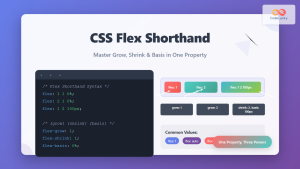
CSS Flex Shorthand: Master Grow, Shrink, and Basis in One Property
The CSS flex shorthand property is one of the most powerful tools in flexbox layouts, combining three essential properties into...
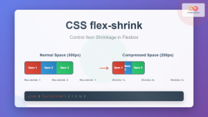
CSS Flex-Shrink: Complete Guide to Flexible Item Shrinkage Control
The CSS flex-shrink property is a fundamental component of the flexbox layout system that determines how flex items shrink when...
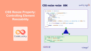
CSS Resize Property: Controlling Element Resizability
Understanding the CSS Resize Property: Controlling Element Resizability The resize property in CSS allows you to control whether (and how)...
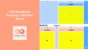
CSS flexShrink Property: CSS Flex Shrink
CSS flexShrink Property: Controlling the Shrink Factor of Flex Items The CSS flexShrink property is a crucial component of the...
CSS Style font Property: CSS Font
CSS font Property: A Comprehensive Guide The CSS font property is a shorthand property used to set several font-related styles...

CSS Style maxWidth Property: CSS Max Width
Understanding the CSS maxWidth Property The CSS maxWidth property is a fundamental tool in web development for controlling the maximum...
CSS Style alignItems Property: CSS Align Items
Understanding the CSS align-items Property The align-items property in CSS is a powerful tool that defines how items are aligned...
CSS Style flexDirection Property: CSS Flex Direction
CSS flexDirection Property: Mastering Flex Item Arrangement The CSS flexDirection property is a crucial aspect of Flexbox layout, determining the...
CSS Style minWidth Property: CSS Min Width
CSS min-width Property: Controlling Element Size The CSS min-width property sets the minimum width of an element. It prevents the...

CSS Style flexFlow Property: CSS Flex Flow
CSS flex-flow Property: A Comprehensive Guide The CSS flex-flow property is a shorthand property for setting both the flex-direction and...

CSS position Property: Mastering Layouts in CSS
Understanding the CSS position Property: A Comprehensive Guide The position property in CSS is a fundamental tool for controlling the...

CSS Margin: Mastering Spacing in Web Design
CSS Margin: Mastering Spacing in Web Design In CSS, the margin property is fundamental for controlling the space around HTML...


