
CSS flex-flow Property: A Comprehensive Guide
The CSS flex-flow property is a shorthand property for setting both the flex-direction and flex-wrap properties. It defines the direction of the flex items within a flex container, and what should happen if the flex items overflow the container. This property provides a concise way to control the layout of flex items in a single declaration.
Understanding flex-flow
The flex-flow property combines two essential aspects of flexbox layout:
- Direction: Determines the primary axis along which flex items are laid out.
- Wrapping: Specifies whether flex items should wrap to multiple lines if they exceed the container’s size.
By using flex-flow, you can manage the flow and arrangement of flex items efficiently, making your CSS more readable and maintainable.
Syntax and Values
The flex-flow property accepts one or two values, corresponding to flex-direction and flex-wrap.
flex-flow: <flex-direction> || <flex-wrap>;
| Value | Description |
|---|---|
| `row` | Flex items are placed side by side in a row. |
| `row-reverse` | Flex items are placed side by side in a row, but in reverse order. |
| `column` | Flex items are placed vertically in a column. |
| `column-reverse` | Flex items are placed vertically in a column, but in reverse order. |
| `nowrap` | Flex items will not wrap to multiple lines; they will try to fit on one line. This might cause overflow. |
| `wrap` | Flex items will wrap to multiple lines if they exceed the container’s width. |
| `wrap-reverse` | Flex items will wrap to multiple lines in reverse order. |
| `initial` | Sets the property to its default value. |
| `inherit` | Inherits this property from its parent element. |
| `unset` | Resets the property to its inherited value if it inherits from its parent or to its initial value if not. |
Basic Examples
Let’s explore some basic examples to illustrate how flex-flow works.
Example 1: row nowrap
This example sets the flex direction to row and disables wrapping.
<div
  id="flexContainer1"
  style="display: flex; flex-flow: row nowrap; border: 1px solid black; width: 300px;"
>
  <div style="width: 100px; height: 50px; background-color: red;">Item 1</div>
  <div style="width: 100px; height: 50px; background-color: green;">Item 2</div>
  <div style="width: 100px; height: 50px; background-color: blue;">Item 3</div>
</div>
The output will show three divs in a row. Since nowrap is set, the items will try to fit within the container, potentially overflowing.
Example 2: column wrap
This example sets the flex direction to column and enables wrapping.
<div
  id="flexContainer2"
  style="display: flex; flex-flow: column wrap; border: 1px solid black; height: 200px; width: 200px;"
>
  <div style="width: 50px; height: 50px; background-color: red;">Item 1</div>
  <div style="width: 50px; height: 50px; background-color: green;">Item 2</div>
  <div style="width: 50px; height: 50px; background-color: blue;">Item 3</div>
  <div style="width: 50px; height: 50px; background-color: orange;">Item 4</div>
</div>
The output will show items in a column, wrapping to create additional columns if the height is exceeded.
Example 3: row-reverse wrap-reverse
This example sets the flex direction to row-reverse and enables reverse wrapping.
<div
  id="flexContainer3"
  style="display: flex; flex-flow: row-reverse wrap-reverse; border: 1px solid black; width: 300px; height: 150px;"
>
  <div style="width: 100px; height: 50px; background-color: red;">Item 1</div>
  <div style="width: 100px; height: 50px; background-color: green;">Item 2</div>
  <div style="width: 100px; height: 50px; background-color: blue;">Item 3</div>
</div>
The output will show items in a row, in reverse order, and wrapping in reverse order if they exceed the container’s width.
Combining flex-flow with Other Flexbox Properties
flex-flow is often used in conjunction with other flexbox properties to create complex layouts. Here’s an example demonstrating its use with justify-content and align-items.
<div
  id="flexContainer4"
  style="display: flex; flex-flow: row wrap; justify-content: center; align-items: center; border: 1px solid black; width: 300px; height: 150px;"
>
  <div style="width: 80px; height: 50px; background-color: red;">Item 1</div>
  <div style="width: 80px; height: 50px; background-color: green;">Item 2</div>
  <div style="width: 80px; height: 50px; background-color: blue;">Item 3</div>
</div>
This will center the flex items both horizontally (justify-content: center) and vertically (align-items: center) within the flex container, while allowing them to wrap if needed.
Real-World Use Cases
-
Responsive Navigation Menus:
Use
flex-flowto create navigation menus that adjust their layout based on screen size.<nav id="navMenu" style="display: flex; flex-flow: row wrap; justify-content: space-around; border: 1px solid black;" > <a href="#" style="padding: 10px; text-decoration: none;">Home</a> <a href="#" style="padding: 10px; text-decoration: none;">About</a> <a href="#" style="padding: 10px; text-decoration: none;">Services</a> <a href="#" style="padding: 10px; text-decoration: none;">Contact</a> </nav>This ensures that the navigation links wrap to the next line on smaller screens, maintaining readability.
-
Image Galleries:
Implement flexible image galleries that adapt to different screen sizes.
<div
  id="imageGallery"
  style="display: flex; flex-flow: row wrap; justify-content: flex-start; border: 1px solid black; width: 400px;"
>
  <img
    src="https://dummyimage.com/100x100/000/fff"
    alt="Image 1"
    style="margin: 5px;"
  />
  <img
    src="https://dummyimage.com/100x100/000/fff"
    alt="Image 2"
    style="margin: 5px;"
  />
  <img
    src="https://dummyimage.com/100x100/000/fff"
    alt="Image 3"
    style="margin: 5px;"
  />
  <img
    src="https://dummyimage.com/100x100/000/fff"
    alt="Image 4"
    style="margin: 5px;"
  />
</div>
This creates an image gallery where images wrap to the next line as needed, ensuring a clean layout on various devices.
Tips and Best Practices
- Keep it Simple: Use
flex-flowto combineflex-directionandflex-wrapfor brevity, but don’t overcomplicate it. - Test Responsiveness: Always test your layouts on different screen sizes to ensure they adapt correctly. 📱
- Consider Accessibility: Ensure that your flexbox layouts are accessible to all users, including those using screen readers.
Browser Support
The flex-flow property is widely supported across modern browsers.
- Chrome
- Firefox
- Safari
- Edge
- Opera
Conclusion
The flex-flow property is a powerful tool for controlling the direction and wrapping behavior of flex items. By understanding and utilizing this property, you can create flexible and responsive layouts that adapt seamlessly to different screen sizes and devices. It simplifies the management of flexbox layouts, making your CSS code cleaner and more maintainable.
Related Posts
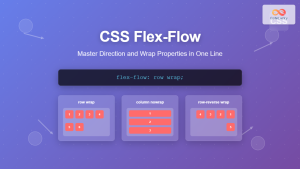
CSS Flex-Flow: Master Direction and Wrap Properties in One Line
The flex-flow property is a powerful CSS shorthand that combines two fundamental flexbox properties: flex-direction and flex-wrap. This single property...
CSS Style flexDirection Property: CSS Flex Direction
CSS flexDirection Property: Mastering Flex Item Arrangement The CSS flexDirection property is a crucial aspect of Flexbox layout, determining the...
CSS Flexbox: Complete Guide to display: flex Container Properties and Layout Control
CSS Flexbox revolutionized web layout by providing a powerful, flexible way to arrange elements within containers. The display: flex property...
CSS flexShrink Property: CSS Flex Shrink
CSS flexShrink Property: Controlling the Shrink Factor of Flex Items The CSS flexShrink property is a crucial component of the...
CSS flexWrap Property: CSS Flex Wrap
CSS flex-wrap Property: Mastering Flex Item Wrapping The flex-wrap property in CSS is a powerful tool for controlling how flex...
CSS Style flex Property: CSS Flex
Understanding the CSS flex Property: A Comprehensive Guide The CSS flex property is a shorthand property used to set the...
CSS Flex Shorthand: Master Grow, Shrink, and Basis in One Property
The CSS flex shorthand property is one of the most powerful tools in flexbox layouts, combining three essential properties into...
CSS Flex-Direction: Complete Guide to Row, Column, Row-Reverse & Column-Reverse
The flex-direction property is one of the most fundamental aspects of CSS Flexbox, determining how flex items are arranged within...
CSS Style alignItems Property: CSS Align Items
Understanding the CSS align-items Property The align-items property in CSS is a powerful tool that defines how items are aligned...
CSS Align-Content: Complete Guide to Cross-Axis Multi-Line Alignment
The align-content property is a powerful CSS tool that controls how multiple lines of content are distributed along the cross-axis...
CSS Order Property: Complete Guide to Reordering Flex Items Visually
The CSS order property is a powerful flexbox feature that allows you to change the visual order of flex items...

CSS Align-Items: Master Cross-Axis Alignment in Flexbox and Grid
The CSS align-items property is a fundamental tool for controlling cross-axis alignment in both flexbox and CSS Grid layouts. Understanding...


