
The flex-direction property is one of the most fundamental aspects of CSS Flexbox, determining how flex items are arranged within a flex container. This property controls the main axis direction and significantly impacts your layout’s visual flow and responsiveness.
What is CSS Flex-Direction?
CSS flex-direction defines the direction flex items are placed in the flex container. It establishes the main axis and cross axis, which are crucial for understanding how other flexbox properties work. The main axis runs in the primary direction of the flex container, while the cross axis runs perpendicular to it.
Syntax
.flex-container {
  display: flex;
  flex-direction: row | row-reverse | column | column-reverse;
}
The Four Flex-Direction Values
1. Row (Default Value)
The row value arranges flex items horizontally from left to right in left-to-right languages. This is the default behavior when you don’t specify a flex-direction.
Example: Flex-Direction Row
.row-container {
  display: flex;
  flex-direction: row;
  gap: 10px;
  padding: 20px;
  background-color: #e3f2fd;
}

.flex-item {
  padding: 20px;
  background-color: #2196f3;
  color: white;
  border-radius: 4px;
  text-align: center;
}2. Column
The column value stacks flex items vertically from top to bottom. This transforms the main axis from horizontal to vertical, making it perfect for creating vertical layouts.
Example: Flex-Direction Column
.column-container {
  display: flex;
  flex-direction: column;
  gap: 10px;
  padding: 20px;
  background-color: #f3e5f5;
  height: 300px;
}3. Row-Reverse
The row-reverse value arranges flex items horizontally but in reverse order, from right to left in left-to-right languages. This is useful for creating RTL-like layouts or reversing the visual order of elements.
Example: Flex-Direction Row-Reverse
.row-reverse-container {
  display: flex;
  flex-direction: row-reverse;
  gap: 10px;
  padding: 20px;
  background-color: #fff3e0;
}4. Column-Reverse
The column-reverse value stacks flex items vertically but in reverse order, from bottom to top. This creates an inverted vertical layout that can be useful for specific design requirements.
Example: Flex-Direction Column-Reverse
.column-reverse-container {
  display: flex;
  flex-direction: column-reverse;
  gap: 10px;
  padding: 20px;
  background-color: #e8f5e8;
  height: 300px;
}Interactive Demonstration
Try different flex-direction values with this interactive example:
Understanding Main Axis and Cross Axis
The flex-direction property determines which axis is the main axis and which is the cross axis:
| Flex Direction | Main Axis | Cross Axis |
|---|---|---|
row |
Horizontal (left to right) | Vertical (top to bottom) |
row-reverse |
Horizontal (right to left) | Vertical (top to bottom) |
column |
Vertical (top to bottom) | Horizontal (left to right) |
column-reverse |
Vertical (bottom to top) | Horizontal (left to right) |
Practical Use Cases
Navigation Bar (Row)
Perfect for creating horizontal navigation menus:
.navbar {
  display: flex;
  flex-direction: row;
  justify-content: space-between;
  align-items: center;
  padding: 10px 20px;
  background-color: #333;
}About
Contact
Sidebar Layout (Column)
Ideal for creating vertical sidebar layouts:
.sidebar {
  display: flex;
  flex-direction: column;
  width: 200px;
  height: 400px;
  background-color: #f5f5f5;
  padding: 20px;
}Breadcrumb Navigation (Row-Reverse)
Useful for RTL languages or reversed breadcrumb navigation:
.breadcrumb-rtl {
  display: flex;
  flex-direction: row-reverse;
  gap: 10px;
  padding: 10px;
}>
Category
>
Home
Responsive Design with Flex-Direction
Flex-direction can be changed using media queries to create responsive layouts:
.responsive-container {
  display: flex;
  flex-direction: row;
  gap: 20px;
}

/* Mobile: Stack vertically */
@media (max-width: 768px) {
  .responsive-container {
    flex-direction: column;
  }
}

/* Desktop: Arrange horizontally */
@media (min-width: 769px) {
  .responsive-container {
    flex-direction: row;
  }
}
Common Mistakes and Best Practices
⚠️ Common Mistakes
- Forgetting about axis changes: When switching from row to column, remember that justify-content and align-items behavior changes.
- Not considering text direction: In RTL languages, row and row-reverse behavior is different.
- Overusing reverse directions: Use reverse directions sparingly as they can confuse screen readers and accessibility tools.
✅ Best Practices
- Start with row (default): Only change flex-direction when you need a different layout.
- Consider accessibility: Use logical order in HTML and avoid relying solely on visual order changes.
- Test on different screen sizes: Ensure your flex-direction changes work well across devices.
- Combine with other flex properties: Use flex-wrap, justify-content, and align-items for complete layout control.
Browser Support
CSS flex-direction has excellent browser support across all modern browsers. It’s supported in:
- ✅ Chrome 29+
- ✅ Firefox 28+
- ✅ Safari 9+
- ✅ Edge 12+
- ✅ Internet Explorer 11 (with -ms- prefix)
Conclusion
CSS flex-direction is a powerful property that gives you precise control over how flex items are arranged in your layouts. Whether you’re creating horizontal navigation bars with row, vertical sidebars with column, or need to reverse the visual order with row-reverse or column-reverse, understanding flex-direction is essential for modern web development.
Remember that changing flex-direction affects the main and cross axes, which impacts how other flexbox properties like justify-content and align-items behave. Practice with different values and combine them with responsive design techniques to create flexible, maintainable layouts that work across all devices.
Start experimenting with flex-direction in your next project, and you’ll discover how this fundamental flexbox property can simplify your CSS and create more robust layouts.
Related Posts
CSS Style flexDirection Property: CSS Flex Direction
CSS flexDirection Property: Mastering Flex Item Arrangement The CSS flexDirection property is a crucial aspect of Flexbox layout, determining the...

CSS Align-Items: Master Cross-Axis Alignment in Flexbox and Grid
The CSS align-items property is a fundamental tool for controlling cross-axis alignment in both flexbox and CSS Grid layouts. Understanding...
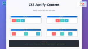
CSS Justify-Content: Complete Guide to Flexbox Main Axis Alignment
The justify-content property is one of the most powerful tools in CSS Flexbox for controlling how flex items are distributed...
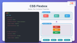
CSS Flexbox: Complete Guide to display: flex Container Properties and Layout Control
CSS Flexbox revolutionized web layout by providing a powerful, flexible way to arrange elements within containers. The display: flex property...
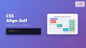
CSS Align-Self: Master Individual Flexbox Item Alignment
The CSS align-self property is a powerful flexbox feature that allows you to override the default cross-axis alignment for individual...
CSS Style flexFlow Property: CSS Flex Flow
CSS flex-flow Property: A Comprehensive Guide The CSS flex-flow property is a shorthand property for setting both the flex-direction and...
CSS Align-Content: Complete Guide to Cross-Axis Multi-Line Alignment
The align-content property is a powerful CSS tool that controls how multiple lines of content are distributed along the cross-axis...
CSS Flex-Flow: Master Direction and Wrap Properties in One Line
The flex-flow property is a powerful CSS shorthand that combines two fundamental flexbox properties: flex-direction and flex-wrap. This single property...
CSS Order Property: Complete Guide to Reordering Flex Items Visually
The CSS order property is a powerful flexbox feature that allows you to change the visual order of flex items...

CSS Align-Content: Master Grid Container Block Axis Alignment
The CSS align-content property is a powerful tool for controlling how grid items are distributed along the block axis (typically...
CSS Align-Items: Complete Guide to Grid Item Block Axis Alignment
Understanding CSS Align-Items in Grid Context The CSS align-items property is a powerful tool for controlling how grid items align...

CSS Flex-Wrap: Master Nowrap, Wrap, and Wrap-Reverse for Perfect Responsive Layouts
The CSS flex-wrap property is a fundamental flexbox feature that controls whether flex items are forced onto a single line...


