
CSS flexDirection Property: Mastering Flex Item Arrangement
The CSS flexDirection property is a crucial aspect of Flexbox layout, determining the direction in which flex items are placed within a flex container. Understanding and utilizing this property effectively is fundamental to creating flexible and responsive web layouts. This guide provides an in-depth look at the flexDirection property, complete with syntax, values, and practical examples.
What is the flexDirection Property?
The flexDirection property specifies how flex items are placed in the flex container, defining the direction of the main axis. This direction influences the flow of items and how they are positioned within the container. It’s an essential tool for controlling the arrangement of elements in responsive designs.
Purpose of the flexDirection Property
The primary purpose of the flexDirection property is to:
- Control the direction in which flex items are laid out within the flex container.
- Create horizontal or vertical layouts with ease.
- Reverse the order of items within the container.
- Build responsive designs that adapt to different screen sizes and orientations.
Syntax of flexDirection
The flexDirection property is defined with one of the following values:
.container {
  flex-direction: row | column | row-reverse | column-reverse;
}
Possible Values for flexDirection
Understanding the different values is key to using flexDirection effectively:
| Value | Description |
|---|---|
| `row` | Items are placed side by side in a row (from left to right in LTR contexts, and right to left in RTL contexts). This is the default value. |
| `column` | Items are placed one below the other in a column (from top to bottom). |
| `row-reverse` | Items are placed in a row but in reverse order (from right to left in LTR contexts, and left to right in RTL contexts). |
| `column-reverse` | Items are placed in a column but in reverse order (from bottom to top). |
Practical Examples of flexDirection
Let’s dive into practical examples that demonstrate how to use the flexDirection property to control the arrangement of flex items.
Example 1: flexDirection: row
This example demonstrates the default behavior, where items are arranged in a row.
<div class="flex-container-row">
  <div>Item 1</div>
  <div>Item 2</div>
  <div>Item 3</div>
</div>

<style>
  .flex-container-row {
    display: flex;
    flex-direction: row; /* Default value */
    background-color: #f0f0f0;
    padding: 10px;
  }

  .flex-container-row > div {
    background-color: #ddd;
    margin: 5px;
    padding: 10px;
    text-align: center;
  }
</style>
Example 2: flexDirection: column
Here, the items are arranged vertically in a column.
<div class="flex-container-column">
  <div>Item 1</div>
  <div>Item 2</div>
  <div>Item 3</div>
</div>

<style>
  .flex-container-column {
    display: flex;
    flex-direction: column;
    background-color: #f0f0f0;
    padding: 10px;
    height: 200px; /* Set a height for the container */
  }

  .flex-container-column > div {
    background-color: #ddd;
    margin: 5px;
    padding: 10px;
    text-align: center;
  }
</style>
Example 3: flexDirection: row-reverse
This example demonstrates how to reverse the order of items in a row.
<div class="flex-container-row-reverse">
  <div>Item 1</div>
  <div>Item 2</div>
  <div>Item 3</div>
</div>

<style>
  .flex-container-row-reverse {
    display: flex;
    flex-direction: row-reverse;
    background-color: #f0f0f0;
    padding: 10px;
  }

  .flex-container-row-reverse > div {
    background-color: #ddd;
    margin: 5px;
    padding: 10px;
    text-align: center;
  }
</style>
Example 4: flexDirection: column-reverse
Here, the items are arranged in a column with the order reversed.
<div class="flex-container-column-reverse">
  <div>Item 1</div>
  <div>Item 2</div>
  <div>Item 3</div>
</div>

<style>
  .flex-container-column-reverse {
    display: flex;
    flex-direction: column-reverse;
    background-color: #f0f0f0;
    padding: 10px;
    height: 200px; /* Set a height for the container */
  }

  .flex-container-column-reverse > div {
    background-color: #ddd;
    margin: 5px;
    padding: 10px;
    text-align: center;
  }
</style>
Tips and Best Practices
- Understanding the Main Axis: The
flexDirectionproperty defines the main axis. Other properties likejustifyContentalign items along this axis. - Responsive Design: Use media queries to change
flexDirectionbased on screen size for responsive layouts. 📱 - Combining with Other Flexbox Properties:
flexDirectionworks best when combined with other Flexbox properties likejustifyContent,alignItems, andflexWrapto achieve complex layouts. - Accessibility: Ensure that the visual order of content matches the DOM order for accessibility. If using
row-reverseorcolumn-reverse, test with assistive technologies. ♿
Real-World Applications of flexDirection
The flexDirection property is widely used in web development for creating various layouts:
- Navigation Menus: Arranging menu items horizontally or vertically.
- Product Listings: Displaying products in rows or columns, adapting to different screen sizes.
- Form Layouts: Structuring form elements in a clear, organized manner.
- Mobile App Interfaces: Building flexible layouts that adapt to different mobile devices.
Use Case Example: Responsive Navigation Bar
Create a responsive navigation bar that switches from a horizontal row on larger screens to a vertical column on smaller screens.
<nav class="navbar">
  <a href="#">Home</a>
  <a href="#">About</a>
  <a href="#">Services</a>
  <a href="#">Contact</a>
</nav>

<style>
  .navbar {
    display: flex;
    background-color: #333;
    overflow: hidden;
  }

  .navbar a {
    display: block;
    color: white;
    text-align: center;
    padding: 14px 16px;
    text-decoration: none;
  }

  /* Media query for smaller screens */
  @media screen and (max-width: 600px) {
    .navbar {
      flex-direction: column;
    }
  }
</style>
On larger screens, the navigation items will be displayed in a horizontal row. On screens smaller than 600px, the navigation items will switch to a vertical column. This provides a better user experience on mobile devices.
Browser Support
The flexDirection property is supported by all modern browsers.
Conclusion
The flexDirection property is a fundamental tool in CSS Flexbox, allowing you to control the direction and order of flex items within a container. By understanding the different values and how to combine them with other Flexbox properties, you can create flexible, responsive, and well-structured web layouts. Whether you’re building navigation menus, product listings, or complex application interfaces, flexDirection is an essential property to master. 🚀
Related Posts
CSS Style flexFlow Property: CSS Flex Flow
CSS flex-flow Property: A Comprehensive Guide The CSS flex-flow property is a shorthand property for setting both the flex-direction and...
CSS Flexbox: Complete Guide to display: flex Container Properties and Layout Control
CSS Flexbox revolutionized web layout by providing a powerful, flexible way to arrange elements within containers. The display: flex property...
CSS Flex-Direction: Complete Guide to Row, Column, Row-Reverse & Column-Reverse
The flex-direction property is one of the most fundamental aspects of CSS Flexbox, determining how flex items are arranged within...
CSS Order Property: Controlling Flexbox and Grid Item Placement
CSS order Property: Mastering Element Reordering in Flexbox and Grid Layouts The CSS order property is a powerful tool that...

CSS Align-Items: Master Cross-Axis Alignment in Flexbox and Grid
The CSS align-items property is a fundamental tool for controlling cross-axis alignment in both flexbox and CSS Grid layouts. Understanding...
CSS Order Property: Complete Guide to Reordering Flex Items Visually
The CSS order property is a powerful flexbox feature that allows you to change the visual order of flex items...
CSS Style alignItems Property: CSS Align Items
Understanding the CSS align-items Property The align-items property in CSS is a powerful tool that defines how items are aligned...
CSS Style flex Property: CSS Flex
Understanding the CSS flex Property: A Comprehensive Guide The CSS flex property is a shorthand property used to set the...

CSS Style justifyContent Property: CSS Justify Content
CSS justifyContent Property: Mastering Content Alignment The CSS justifyContent property defines how the browser distributes space between and around content...
CSS flexShrink Property: CSS Flex Shrink
CSS flexShrink Property: Controlling the Shrink Factor of Flex Items The CSS flexShrink property is a crucial component of the...
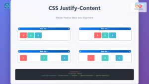
CSS Justify-Content: Complete Guide to Flexbox Main Axis Alignment
The justify-content property is one of the most powerful tools in CSS Flexbox for controlling how flex items are distributed...
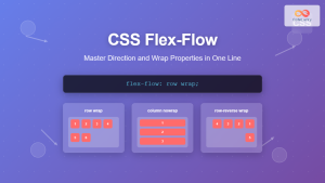
CSS Flex-Flow: Master Direction and Wrap Properties in One Line
The flex-flow property is a powerful CSS shorthand that combines two fundamental flexbox properties: flex-direction and flex-wrap. This single property...


