Understanding the CSS display Property: A Comprehensive Guide
The display property in CSS is a cornerstone for controlling the layout of elements on a web page. It dictates the rendering box type used for an HTML element, significantly influencing how elements interact with each other and how content flows within them. This comprehensive guide explores the various values of the display property, complete with practical examples to help you master web page layout.
What is the display Property?
The display property specifies the type of rendering box used for an element. It determines whether an element behaves as a block-level element, an inline element, or something else, such as a flex container or grid container. By manipulating the display property, you can control how elements are positioned and sized within a web page.
Purpose of the display Property
The primary purpose of the display property is to:
Define the layout and rendering behavior of HTML elements.
Control how elements flow within a document.
Create complex layouts using advanced display types like flex and grid.
Hide or show elements based on specific conditions.
Syntax of the display Property
The syntax for the display property is straightforward. You specify the display property followed by one of its valid values.
element {
  display: value;
}
Possible Values
The display property accepts a wide range of values, each influencing the rendering behavior of the element. Here is a comprehensive list:
Value
Description
none
The element is completely removed from the document flow. It does not take up any space.
inline
The element is rendered as an inline element. It flows within the text and only takes up as much width as necessary.
block
The element is rendered as a block-level element. It takes up the full width available and starts on a new line.
inline-block
The element is rendered as an inline-level block container. It flows within the text but can have a specified width and height.
flex
The element is rendered as a block-level flex container. It enables the use of Flexbox layout for its children.
inline-flex
The element is rendered as an inline-level flex container.
grid
The element is rendered as a block-level grid container. It enables the use of CSS Grid Layout for its children.
inline-grid
The element is rendered as an inline-level grid container.
table
The element behaves like a `
` HTML element.
`table-row`
The element behaves like a `
` HTML element.
`table-cell`
The element behaves like a `
` HTML element.
`list-item`
The element behaves like a `
` HTML element.
Practical Examples of the display Property
Let’s dive into practical examples to illustrate how each value of the display property affects the rendering of HTML elements.
display: none;
The display: none; value completely removes an element from the document. It’s as if the element doesn’t exist in the HTML structure.
<div id="displayNoneContainer">
  <p>This paragraph is visible.</p>
  <p id="hiddenParagraph">This paragraph is hidden.</p>
  <p>This paragraph is also visible.</p>
</div>

<style>
  #hiddenParagraph {
    display: none;
  }
</style>
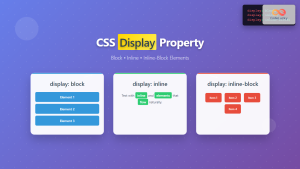
The display: inline; value causes an element to be rendered as an inline element. Inline elements flow within the text and only take up as much width as necessary.
<div id="displayInlineContainer">
  <p>This is a <span>span element</span> with display: inline.</p>
</div>

<style>
  span {
    display: inline;
    background-color: lightblue;
  }
</style>
The display: block; value causes an element to be rendered as a block-level element. Block-level elements take up the full width available and start on a new line.
<div id="displayBlockContainer">
  <p>This is a paragraph with display: block.</p>
  <span id="blockSpan">This is a span with display: block.</span>
  <p>This is another paragraph.</p>
</div>

<style>
  #blockSpan {
    display: block;
    background-color: lightgreen;
    padding: 5px;
  }
</style>
The display: inline-block; value allows an element to flow within the text like an inline element, but it can also have a specified width and height like a block-level element.
The display: flex; value turns an element into a flex container, enabling the use of Flexbox layout for its children. Flexbox provides a powerful way to align and distribute space among items in a container.
The display: grid; value turns an element into a grid container, enabling the use of CSS Grid Layout for its children. Grid layout provides a powerful way to create two-dimensional layouts.
The display property is essential for creating complex and responsive web layouts. Here are some real-world applications:
Navigation Menus: Using display: flex; to create horizontal navigation menus.
Image Galleries: Using display: grid; to create responsive image galleries.
Forms: Controlling the layout of form elements using various display values.
Responsive Layouts: Hiding or showing elements based on screen size using media queries and the display property.
Use Case Example: Creating a Responsive Image Gallery
Let’s create a practical example of using the display property with CSS Grid to build a responsive image gallery. This example demonstrates how to use media queries to adjust the number of columns in the gallery based on the screen size.
This example demonstrates several important concepts:
CSS Grid Layout: Using display: grid; to create a flexible grid layout.
Responsive Design: Adjusting the layout based on screen size using media queries.
Image Handling: Ensuring images fill their grid cells while maintaining aspect ratio.
Automatic Column Fitting: Using repeat(auto-fit, minmax(200px, 1fr)) to create as many columns as possible while maintaining a minimum width.
This practical example shows how the display property, combined with CSS Grid and media queries, can be used to create a responsive and visually appealing image gallery.
Browser Support
The display property enjoys excellent support across all modern web browsers, ensuring that your layouts will render consistently across various platforms.
Conclusion
The display property is a fundamental aspect of CSS layout, providing the ability to control how elements are rendered and positioned within a web page. Mastering the various values of the display property, including none, inline, block, inline-block, flex, and grid, is essential for creating modern, responsive, and visually appealing web designs. This comprehensive guide should equip you with the knowledge and practical examples needed to leverage the power of the display property in your projects. Happy coding!