
CSS Custom Properties, commonly known as CSS Variables, revolutionize how we write and maintain stylesheets by introducing dynamic values that can be reused throughout your CSS. Unlike preprocessor variables (Sass, Less), CSS custom properties are native to the browser and can be manipulated at runtime using JavaScript, making them incredibly powerful for creating responsive, themeable, and maintainable web applications.
What Are CSS Custom Properties?
CSS Custom Properties are entities defined by CSS authors that contain specific values to be reused throughout a document. They’re defined using the custom property notation (two dashes followed by a name) and accessed using the var() function. Unlike traditional CSS properties, custom properties cascade and can be inherited, making them truly dynamic.
- Runtime Manipulation: Change values dynamically with JavaScript
- Cascade and Inheritance: Follow CSS’s natural flow
- Better Maintainability: Centralize commonly used values
- Theme Implementation: Easy dark/light mode switching
- Responsive Design: Different values at different breakpoints
Basic Syntax and Declaration
CSS custom properties are declared using two dashes (–) followed by the property name. They can be defined at any scope but are commonly declared in the :root pseudo-class for global access.
/* Global custom properties */
:root {
  --primary-color: #3498db;
  --secondary-color: #2ecc71;
  --font-size-base: 16px;
  --spacing-unit: 8px;
  --border-radius: 4px;
}

/* Using custom properties */
.button {
  background-color: var(--primary-color);
  font-size: var(--font-size-base);
  padding: calc(var(--spacing-unit) * 2);
  border-radius: var(--border-radius);
}
Interactive Example: Basic Custom Properties
Dynamic Card
Hover to see the effect
View CSS Code
–demo-primary: #3498db;
–demo-secondary: #2ecc71;
–demo-spacing: 12px;
}
.demo-card {
background: linear-gradient(135deg, var(–demo-primary), var(–demo-secondary));
padding: var(–demo-spacing);
border-radius: var(–demo-spacing);
}
Understanding Scope and Inheritance
CSS custom properties follow the cascade and inheritance rules of CSS. When declared at different scopes, they create a hierarchy where more specific selectors override more general ones.
/* Global scope */
:root {
  --text-color: #333;
  --bg-color: #fff;
}

/* Component scope */
.dark-theme {
  --text-color: #fff;
  --bg-color: #333;
}

/* Element scope */
.special-button {
  --text-color: #ff6b6b;
}

/* All elements inherit these values */
.content {
  color: var(--text-color);
  background-color: var(--bg-color);
}
Scope Demonstration
This uses the default color scheme.
This overrides the text color but inherits background.
This uses the dark color scheme.
This overrides the text color but inherits background.
Fallback Values and Error Handling
The var() function accepts a second parameter as a fallback value, which is used when the custom property is undefined or invalid. This provides graceful degradation and error handling.
/* Single fallback */
.element {
  color: var(--undefined-color, #333);
}

/* Multiple fallbacks (nested) */
.element {
  font-size: var(--large-text, var(--medium-text, 16px));
}

/* Fallback with calculations */
.element {
  margin: var(--custom-margin, calc(1rem + 10px));
}

/* Complex fallback values */
.element {
  background: var(--gradient, linear-gradient(45deg, #ff6b6b, #4ecdc4));
}
Fallback Values Example
Dynamic Theming with CSS Custom Properties
One of the most powerful applications of CSS custom properties is creating dynamic themes. You can switch entire color schemes by changing just a few variables at the root level.
Complete Theme System Example
Dynamic Theme System
This entire component changes theme with CSS custom properties.
Color Variables in Action
- Background: var(–theme-bg)
- Surface: var(–theme-surface)
- Text: var(–theme-text)
- Primary: var(–theme-primary)
Mathematical Operations with Custom Properties
CSS custom properties work seamlessly with CSS functions like calc(), enabling mathematical operations and dynamic calculations. This makes them incredibly powerful for responsive design and spacing systems.
:root {
  --base-spacing: 8px;
  --multiplier: 2;
  --container-width: 1200px;
  --sidebar-ratio: 0.25;
}

.spacing-system {
  /* Calculated spacing values */
  --space-xs: calc(var(--base-spacing) * 0.5);  /* 4px */
  --space-sm: var(--base-spacing);              /* 8px */
  --space-md: calc(var(--base-spacing) * 2);    /* 16px */
  --space-lg: calc(var(--base-spacing) * 3);    /* 24px */
  --space-xl: calc(var(--base-spacing) * 4);    /* 32px */
}

.layout {
  --main-width: calc(var(--container-width) * (1 - var(--sidebar-ratio)));
  --sidebar-width: calc(var(--container-width) * var(--sidebar-ratio));
}

.responsive-grid {
  /* Dynamic grid calculations */
  --columns: 3;
  --gap: var(--space-md);
  --item-width: calc((100% - (var(--gap) * (var(--columns) - 1))) / var(--columns));
}
Mathematical Operations Demo
Dynamic Controls
10px
3
Calculated Spacing Scale
Dynamic Grid Layout
Responsive Design with Custom Properties
CSS custom properties can be redefined within media queries, making them perfect for responsive design. Instead of changing multiple properties across different selectors, you can modify just the custom property values.
:root {
  --container-padding: 16px;
  --font-size-h1: 2rem;
  --grid-columns: 1;
  --card-gap: 1rem;
}

@media (min-width: 768px) {
  :root {
    --container-padding: 24px;
    --font-size-h1: 2.5rem;
    --grid-columns: 2;
    --card-gap: 1.5rem;
  }
}

@media (min-width: 1024px) {
  :root {
    --container-padding: 32px;
    --font-size-h1: 3rem;
    --grid-columns: 3;
    --card-gap: 2rem;
  }
}

/* Components automatically adapt */
.container {
  padding: var(--container-padding);
}

.title {
  font-size: var(--font-size-h1);
}

.card-grid {
  display: grid;
  grid-template-columns: repeat(var(--grid-columns), 1fr);
  gap: var(--card-gap);
}
Responsive Design Demo
Resize your browser to see the layout adapt!
Grid columns, gaps, padding, and font sizes all change based on screen size using CSS custom properties.
JavaScript Integration and Dynamic Updates
One of the most powerful features of CSS custom properties is their ability to be manipulated in real-time using JavaScript. This enables dynamic styling based on user interactions, data changes, or external events.
// Reading custom property values
const rootStyles = getComputedStyle(document.documentElement);
const primaryColor = rootStyles.getPropertyValue('--primary-color');

// Setting custom property values
document.documentElement.style.setProperty('--primary-color', '#e74c3c');

// Setting on specific elements
const element = document.querySelector('.my-component');
element.style.setProperty('--local-color', '#2ecc71');

// Removing custom properties
document.documentElement.style.removeProperty('--temporary-color');

// Dynamic updates based on data
function updateProgress(percentage) {
  document.documentElement.style.setProperty('--progress-width', percentage + '%');
}

// Theme switching
function switchTheme(theme) {
  const themes = {
    light: { '--bg': '#fff', '--text': '#333' },
    dark: { '--bg': '#333', '--text': '#fff' }
  };

  Object.entries(themes[theme]).forEach(([property, value]) => {
    document.documentElement.style.setProperty(property, value);
  });
}
Interactive JavaScript Demo
Related Posts

CSS Variable Declaration: Master :root and Local Scope for Better Styling
CSS Variables, also known as CSS Custom Properties, revolutionize how we manage and reuse values in our stylesheets. Understanding variable...

CSS Variable Usage: Complete Guide to var() Function and Fallback Values
CSS Custom Properties, commonly known as CSS variables, revolutionized how we write maintainable and dynamic stylesheets. The var() function serves...
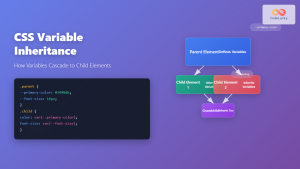
CSS Variable Inheritance: Complete Guide to Cascading Custom Properties
CSS variables, also known as custom properties, revolutionized how we write maintainable stylesheets. One of their most powerful features is...
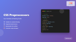
CSS Preprocessors: Sass Variables and Nesting – Complete Guide for Modern Web Development
CSS preprocessors have revolutionized how developers write and maintain stylesheets. Among the most popular preprocessors, Sass (Syntactically Awesome StyleSheets) stands...

CSS Style cssText Property: CSS Text
CSS Style cssText Property: Comprehensive Guide The CSS cssText property in JavaScript is a powerful way to get or set...

HTML style Property: Element Style
HTML style Property: Element Style The HTML style property allows you to apply inline CSS styles directly to individual HTML...

CSS Style background Property: CSS Background
CSS background Property: A Comprehensive Guide to Styling Web Page Backgrounds The CSS background property is a versatile shorthand property...
CSS Style color Property: CSS Color
Understanding the CSS color Property: A Comprehensive Guide The CSS color property is fundamental for styling web pages. It specifies...

CSS Attribute Selectors: Master Targeting Elements by Attribute Values
What Are CSS Attribute Selectors? CSS attribute selectors allow you to target HTML elements based on their attributes and attribute...

CSS Syntax: Complete Guide to Rules, Selectors, Properties and Values
CSS (Cascading Style Sheets) is the cornerstone of web design, transforming plain HTML into visually stunning websites. Understanding CSS syntax...
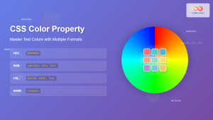
CSS Color Property: Complete Guide to Text Colors with Hex, RGB, HSL Values
The CSS color property is one of the most fundamental styling properties in web development, allowing you to control the...
CSS Style backgroundColor Property: CSS Background Color
CSS backgroundColor Property: Mastering Background Colors The backgroundColor property in CSS allows you to define the background color of an...


