CSS column-span Property: Mastering Column Spanning in CSS
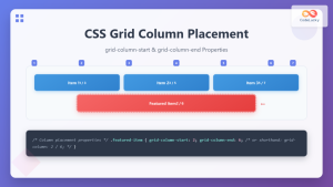
The CSS column-span property dictates how many columns an element should span across in a multi-column layout. It provides the ability to create headings, images, or other elements that break out of the column flow and stretch across multiple columns, enhancing the visual structure and readability of your content. This guide explores the syntax, values, and usage of the column-span property with practical examples.
What is the column-span Property?
The column-span property is used in conjunction with the column-count or column-width properties to create multi-column layouts. By default, elements flow within a single column. The column-span property allows you to override this behavior, making an element span across all columns or a specified number of columns.
Purpose of the column-span Property
The primary purpose of the column-span property is to:
- Create visually distinct sections or headings that span across multiple columns.
- Highlight important content elements by allowing them to occupy more space.
- Improve the overall layout and readability of multi-column text flows.
- Break the monotony of column-based layouts with elements that stand out.
Syntax of the column-span Property
The basic syntax of the column-span property is as follows:
element {
  column-span: value;
}
Where value can be one of the following:
| Value | Description |
|---|---|
| `1` (default) | The element spans only one column. This is the default behavior. |
| `none` | The element spans only one column. This is equivalent to the value `1`. |
| `all` | The element spans across all columns. The element will be displayed above all columns. |
Practical Examples of column-span
Let’s explore some practical examples to understand how to use the column-span property effectively.
Basic Example: Spanning an Element Across All Columns
This example demonstrates how to make a heading span across all columns in a multi-column layout.
<!DOCTYPE html>
<html>
  <head>
    <title>CSS column-span Example 1</title>
    <style>
      .container_1 {
        column-count: 3;
        column-gap: 20px;
      }

      h2_1 {
        column-span: all;
        text-align: center;
        background-color: #f0f0f0;
        padding: 10px;
      }
    </style>
  </head>
  <body>
    <div class="container_1">
      <h2_1>This Heading Spans All Columns</h2_1>
      <p>
        This is some text in the first column. Lorem ipsum dolor sit amet,
        consectetur adipiscing elit.
      </p>
      <p>
        This is some text in the second column. Sed do eiusmod tempor incididunt
        ut labore et dolore magna aliqua.
      </p>
      <p>
        This is some text in the third column. Ut enim ad minim veniam, quis
        nostrud exercitation ullamco laboris.
      </p>
    </div>
  </body>
</html>
Output:
The heading “This Heading Spans All Columns” will stretch across all three columns, appearing at the top of the multi-column layout.
Using column-span with column-width
Here’s an example that uses column-span with column-width for a more responsive layout.
<!DOCTYPE html>
<html>
  <head>
    <title>CSS column-span Example 2</title>
    <style>
      .container_2 {
        column-width: 200px;
        column-gap: 20px;
      }

      h2_2 {
        column-span: all;
        text-align: center;
        background-color: #f0f0f0;
        padding: 10px;
      }
    </style>
  </head>
  <body>
    <div class="container_2">
      <h2_2>This Heading Spans All Columns</h2_2>
      <p>
        This is some text in the first column. Lorem ipsum dolor sit amet,
        consectetur adipiscing elit.
      </p>
      <p>
        This is some text in the second column. Sed do eiusmod tempor incididunt
        ut labore et dolore magna aliqua.
      </p>
      <p>
        This is some text in the third column. Ut enim ad minim veniam, quis
        nostrud exercitation ullamco laboris.
      </p>
    </div>
  </body>
</html>
Output:
The heading “This Heading Spans All Columns” will stretch across all columns, adapting to the column width.
Applying column-span to Images
You can also use column-span with images to make them span across multiple columns.
<!DOCTYPE html>
<html>
  <head>
    <title>CSS column-span Example 3</title>
    <style>
      .container_3 {
        column-count: 2;
        column-gap: 20px;
      }

      img_3 {
        column-span: all;
        width: 100%;
        margin-bottom: 10px;
      }
    </style>
  </head>
  <body>
    <div class="container_3">
      <img_3
        src="https://dummyimage.com/600x200/000/fff"
        alt="Spanning Image"
      />
      <p>
        This is some text in the first column. Lorem ipsum dolor sit amet,
        consectetur adipiscing elit.
      </p>
      <p>
        This is some text in the second column. Sed do eiusmod tempor incididunt
        ut labore et dolore magna aliqua.
      </p>
    </div>
  </body>
</html>
Output:
The image will span across both columns, appearing above the text content.
Combining column-span with Other CSS Properties
This example demonstrates how to combine column-span with other CSS properties to create a visually appealing layout.
<!DOCTYPE html>
<html>
  <head>
    <title>CSS column-span Example 4</title>
    <style>
      .container_4 {
        column-count: 3;
        column-gap: 20px;
      }

      .featured_4 {
        column-span: all;
        background-color: #e0e0e0;
        padding: 20px;
        margin-bottom: 20px;
        text-align: center;
      }
    </style>
  </head>
  <body>
    <div class="container_4">
      <div class="featured_4">
        <h2>Featured Content</h2>
        <p>
          This is featured content that spans across all columns. It stands out
          from the rest of the text.
        </p>
      </div>
      <p>
        This is some text in the first column. Lorem ipsum dolor sit amet,
        consectetur adipiscing elit.
      </p>
      <p>
        This is some text in the second column. Sed do eiusmod tempor incididunt
        ut labore et dolore magna aliqua.
      </p>
      <p>
        This is some text in the third column. Ut enim ad minim veniam, quis
        nostrud exercitation ullamco laboris.
      </p>
    </div>
  </body>
</html>
Output:
The “Featured Content” section will span across all three columns, with a distinct background color and padding, making it stand out from the regular text content.
Styling with Multiple Elements
Here’s an example combining multiple elements with different column-span properties.
<!DOCTYPE html>
<html>
  <head>
    <title>CSS column-span Example 5</title>
    <style>
      .container_5 {
        column-count: 3;
        column-gap: 20px;
      }

      h2_5 {
        column-span: all;
        text-align: center;
        background-color: #f0f0f0;
        padding: 10px;
      }

      img_5 {
        column-span: all;
        width: 100%;
        margin-bottom: 10px;
      }

      .intro_5 {
        column-span: all;
        font-style: italic;
        margin-bottom: 20px;
      }
    </style>
  </head>
  <body>
    <div class="container_5">
      <h2_5>Multi-Column Layout Example</h2_5>
      <img_5
        src="https://dummyimage.com/600x150/007acc/fff&text=Banner+Image"
        alt="Banner"
      />
      <p class="intro_5">
        An introduction spanning across all columns to set the stage for the
        content below.
      </p>
      <p>
        This is some text in the first column. Lorem ipsum dolor sit amet,
        consectetur adipiscing elit.
      </p>
      <p>
        This is some text in the second column. Sed do eiusmod tempor incididunt
        ut labore et dolore magna aliqua.
      </p>
      <p>
        This is some text in the third column. Ut enim ad minim veniam, quis
        nostrud exercitation ullamco laboris.
      </p>
    </div>
  </body>
</html>
Output:
The heading, banner image, and introductory paragraph will all span across all three columns, providing a structured and visually appealing layout.
Real-World Applications of the column-span Property
The column-span property is used in various real-world applications, including:
- Magazine Layouts: Creating visually appealing magazine-style layouts with headings and images spanning multiple columns.
- Newspaper Articles: Highlighting key sections or images in newspaper articles.
- Web Design: Enhancing the layout of web pages with featured content spanning across columns.
- E-commerce Sites: Showcasing product images or promotional banners across multiple columns in product listings.
Browser Support
The column-span property is widely supported across modern web browsers:
- Chrome
- Firefox
- Safari
- Edge
- Opera
Note: Always test your layouts across different browsers to ensure consistent rendering. 🧐
Conclusion
The CSS column-span property is a powerful tool for creating visually appealing and well-structured multi-column layouts. By allowing elements to span across multiple columns, you can highlight important content, improve readability, and create a more engaging user experience. Understanding and utilizing the column-span property effectively will enhance your ability to design sophisticated and responsive web layouts. Happy coding!

