
CSS clip-path Property: A Comprehensive Guide
The clip-path property in CSS allows you to define a specific region of an element that should be visible, effectively clipping away the parts outside of the defined region. This powerful tool can be used to create unique and visually appealing layouts, shapes, and effects without needing images or complex JavaScript.
What is the clip-path Property?
The clip-path property lets you specify a clipping region that determines what parts of an element are visible. Anything outside this region is hidden. The clipping region can be defined using various functions and shapes, such as circles, ellipses, polygons, and more.
Purpose of the clip-path Property
The primary purpose of the clip-path property is to:
- Create custom shapes and layouts.
- Highlight specific areas of an element.
- Produce unique visual effects and transitions.
- Enhance the aesthetic appeal of web pages.
Syntax and Values
The clip-path property can accept various values, each defining a different type of clipping region.
clip-path: none | <clip-source> | <geometry-box> | <basic-shape> | global-value;
Where:
none: Specifies that no clipping should be applied, and the element is fully visible.<clip-source>: A URL referencing an SVG<clipPath>element.<geometry-box>: A box that serves as the clipping region. Possible values includemargin-box,border-box,padding-box, andcontent-box.<basic-shape>: A shape function defining the clipping region, such ascircle(),ellipse(),polygon(), orinset().global-value: Global CSS values likeinherit,initial,revert,unset.
Possible Values Explained
| Value | Description |
|---|---|
| `none` | Removes any applied clipping, making the entire element visible. |
| `url()` | Specifies a path to an SVG ` |
| `circle()` | Defines a circular clipping region with a specified radius and center. |
| `ellipse()` | Defines an elliptical clipping region with specified radii and center. |
| `polygon()` | Defines a polygonal clipping region using a list of vertex points. |
| `inset()` | Defines an inset rectangle as the clipping region, specifying offsets from the edges. |
| `margin-box` | Uses the margin box as the clipping region. |
| `border-box` | Uses the border box as the clipping region. |
| `padding-box` | Uses the padding box as the clipping region. |
| `content-box` | Uses the content box as the clipping region. |
Basic Examples
Let’s explore some basic examples of using the clip-path property with different values.
Using clip-path: none
This example shows how to remove any clipping applied to an element, making it fully visible.
<div id="clipNone" style="width: 200px; height: 150px; background: red;">
  This is a div with no clipping.
</div>
#clipNone {
  clip-path: none;
}
Output:
Using clip-path: circle()
This example demonstrates how to create a circular clipping region.
<div
  id="clipCircle"
  style="
    width: 200px;
    height: 150px;
    background: blue;
    color: white;
    text-align: center;
    line-height: 150px;
  "
>
  Circle Clip
</div>
#clipCircle {
  clip-path: circle(50% at 50% 50%);
}
Output:
Circle Clip
Using clip-path: ellipse()
This example demonstrates how to create an elliptical clipping region.
<div
  id="clipEllipse"
  style="
    width: 200px;
    height: 150px;
    background: green;
    color: white;
    text-align: center;
    line-height: 150px;
  "
>
  Ellipse Clip
</div>
#clipEllipse {
  clip-path: ellipse(50% 30% at 50% 50%);
}
Output:
Ellipse Clip
Using clip-path: polygon()
This example demonstrates how to create a polygonal clipping region.
<div
  id="clipPolygon"
  style="
    width: 200px;
    height: 150px;
    background: purple;
    color: white;
    text-align: center;
    line-height: 150px;
  "
>
  Polygon Clip
</div>
#clipPolygon {
  clip-path: polygon(50% 0%, 0% 100%, 100% 100%);
}
Output:
Polygon Clip
Using clip-path: inset()
This example demonstrates how to create an inset clipping region.
<div
  id="clipInset"
  style="
    width: 200px;
    height: 150px;
    background: orange;
    color: white;
    text-align: center;
    line-height: 150px;
  "
>
  Inset Clip
</div>
#clipInset {
  clip-path: inset(20px 30px 40px 50px);
}
Output:
Inset Clip
Advanced Techniques
Using SVG clipPath
You can define complex clipping paths using SVG and reference them in your CSS.
<svg width="0" height="0">
  <defs>
    <clipPath id="myClip">
      <polygon points="50,0 100,50 50,100 0,50" />
    </clipPath>
  </defs>
</svg>

<div
  id="clipSVG"
  style="
    width: 200px;
    height: 150px;
    background: teal;
    color: white;
    text-align: center;
    line-height: 150px;
  "
>
  SVG Clip
</div>
#clipSVG {
  clip-path: url(#myClip);
}
Output:
SVG Clip
Animating clip-path
You can animate the clip-path property to create dynamic visual effects.
<div
  id="clipAnimated"
  style="
    width: 200px;
    height: 150px;
    background: gold;
    color: black;
    text-align: center;
    line-height: 150px;
  "
>
  Animated Clip
</div>
#clipAnimated {
  clip-path: circle(20% at 50% 50%);
  transition: clip-path 2s ease-in-out;
}

#clipAnimated:hover {
  clip-path: circle(50% at 50% 50%);
}
Output:
Animated Clip
Note: Animation can be a powerful way to enhance user experience by providing visual feedback and creating engaging interactions. 🚀
Real-World Applications
The clip-path property is used in various scenarios:
- Image Cropping: Creating custom image shapes without using image editing software.
- UI Design: Designing unique and modern user interfaces.
- Hero Sections: Enhancing hero sections with visually appealing shapes and effects.
- Transitions and Effects: Creating smooth transitions and hover effects.
Use Case Example: Creating a Clipped Image Gallery
Let’s create a practical example that demonstrates how to use the clip-path property to build a stylish image gallery with clipped images.
<div class="gallery-container">
  <img
    class="gallery-item"
    src="https://dummyimage.com/200x150/007bff/fff"
    alt="Image 1"
  />
  <img
    class="gallery-item"
    src="https://dummyimage.com/200x150/dc3545/fff"
    alt="Image 2"
  />
  <img
    class="gallery-item"
    src="https://dummyimage.com/200x150/28a745/fff"
    alt="Image 3"
  />
</div>
.gallery-container {
  display: flex;
  justify-content: center;
  align-items: center;
  gap: 20px;
}

.gallery-item {
  width: 200px;
  height: 150px;
  object-fit: cover;
  clip-path: polygon(
    50% 0%,
    100% 50%,
    50% 100%,
    0% 50%
  ); /* Diamond shape */
  transition: transform 0.3s ease-in-out;
}

.gallery-item:hover {
  transform: scale(1.1);
}
Output:
<div
  class="gallery-containerOutput"
  style="display: flex; justify-content: center; align-items: center; gap: 20px;"
>
  <img
    class="gallery-itemOutput"
    src="https://dummyimage.com/200x150/007bff/fff"
    alt="Image 1"
    style="
      width: 200px;
      height: 150px;
      object-fit: cover;
      clip-path: polygon(50% 0%, 100% 50%, 50% 100%, 0% 50%);
      transition: transform 0.3s ease-in-out;
    "
    onmouseover="this.style.transform='scale(1.1)'"
    onmouseout="this.style.transform='scale(1)'"
  />
  <img
    class="gallery-itemOutput"
    src="https://dummyimage.com/200x150/dc3545/fff"
    alt="Image 2"
    style="
      width: 200px;
      height: 150px;
      object-fit: cover;
      clip-path: polygon(50% 0%, 100% 50%, 50% 100%, 0% 50%);
      transition: transform 0.3s ease-in-out;
    "
    onmouseover="this.style.transform='scale(1.1)'"
    onmouseout="this.style.transform='scale(1)'"
  />
  <img
    class="gallery-itemOutput"
    src="https://dummyimage.com/200x150/28a745/fff"
    alt="Image 3"
    style="
      width: 200px;
      height: 150px;
      object-fit: cover;
      clip-path: polygon(50% 0%, 100% 50%, 50% 100%, 0% 50%);
      transition: transform 0.3s ease-in-out;
    "
    onmouseover="this.style.transform='scale(1.1)'"
    onmouseout="this.style.transform='scale(1)'"
  />
</div>
This example demonstrates several key concepts:
- Custom Shapes: Using
polygon()to create a diamond shape for the images. - Object Fit: Ensuring images maintain their aspect ratio with
object-fit: cover. - Transitions: Adding a smooth scaling effect on hover for enhanced interactivity.
- Layout: Arranging images in a visually appealing gallery using flexbox.
The result is a modern and engaging image gallery with a unique visual style. This practical example showcases how the clip-path property can be used to elevate the design of web elements.
Browser Support
The clip-path property is well-supported across modern browsers. However, it’s always a good practice to check the specific browser compatibility for more advanced features or older versions. 🧐
Conclusion
The clip-path property is a powerful CSS tool for creating unique and visually appealing layouts by defining specific regions of elements to be visible. This comprehensive guide has provided you with the foundational knowledge and practical examples to effectively use the clip-path property in your projects. From basic shapes to complex SVG clipping paths and animations, the possibilities are endless for enhancing your web designs. Happy styling!
Related Posts
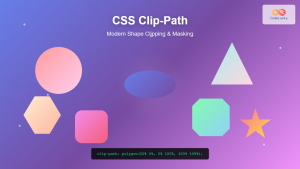
CSS Clip-Path Property: Create Stunning Visual Effects with Modern Shape Clipping
The CSS clip-path property is a powerful tool that allows you to create visually stunning effects by clipping elements into...
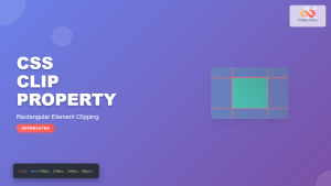
CSS Clip Property: Complete Guide to Rectangular Element Clipping (Deprecated)
The CSS clip property was once a powerful tool for creating rectangular clipping regions on absolutely positioned elements. While now...
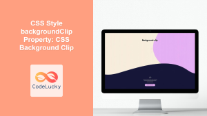
CSS Style backgroundClip Property: CSS Background Clip
CSS background-clip Property: A Comprehensive Guide The CSS background-clip property determines how far the background extends within an element. It...
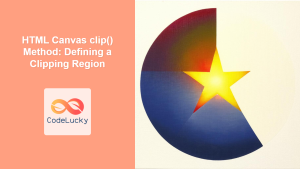
HTML Canvas clip() Method: Defining a Clipping Region
HTML Canvas clip() Method: Defining a Clipping Region The HTML Canvas clip() method is a powerful tool that allows you...
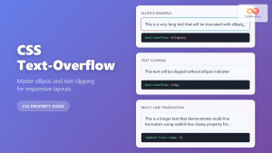
CSS Text-Overflow: Complete Guide to Ellipsis and Text Clipping Techniques
Long text content can break your carefully crafted layouts and create poor user experiences. The CSS text-overflow property provides elegant...
CSS Outline: Comprehensive Guide to the CSS outline Property
CSS Outline: A Comprehensive Guide The CSS outline property is used to draw a line around elements, outside the border....
CSS Style borderImage Property: CSS Border Image
CSS border-image Property: A Comprehensive Guide The CSS border-image property allows you to use an image as the border of...
CSS Visibility Property: Complete Guide to Showing and Hiding Elements
The CSS visibility property is a fundamental tool for controlling element visibility on web pages. Unlike other hiding methods, it...
HTML Area pathname Property: Area Pathname
HTML Area pathname Property: Understanding the Path Segment of a URL The pathname property of the HTML <a> (area) element...
CSS Style filter Property: CSS Filter
CSS filter Property: Enhance Your Web Graphics The CSS filter property provides powerful visual effects to elements like images, backgrounds,...
CSS Outline: Complete Guide to Non-Layout Border Alternative Property
The CSS outline property is a powerful styling tool that creates a visual border around elements without affecting their layout...
CSS Style opacity Property: CSS Opacity
CSS Opacity Property: A Comprehensive Guide The CSS opacity property is a fundamental tool for controlling the transparency of elements...


