
Understanding the CSS boxSizing Property
The boxSizing property in CSS is a fundamental tool for controlling how the total width and height of an element are calculated. It alters the default CSS box model, providing more intuitive control over element sizing, especially when dealing with padding and borders. This guide offers a deep dive into the boxSizing property, its values, and practical applications.
What is the CSS Box Model?
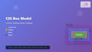
Before diving into boxSizing, it’s essential to understand the CSS box model. The box model describes how elements are rendered as rectangular boxes, consisting of:
- Content: The actual content of the element (e.g., text, images).
- Padding: Space around the content, inside the border.
- Border: A line that surrounds the padding and content.
- Margin: Space outside the border, separating the element from others.
The boxSizing property changes how the width and height of an element are calculated in relation to these components.
Purpose of the boxSizing Property
The boxSizing property lets you alter the default behavior of how the browser calculates an element’s total size. This is crucial for creating consistent and predictable layouts, especially when dealing with responsive designs. It prevents issues where adding padding or borders unexpectedly increases an element’s overall size, breaking the layout.
Syntax of the boxSizing Property
The boxSizing property accepts three primary values: content-box, border-box, and inherit.
element {
  box-sizing: content-box | border-box | inherit;
}
Values of the boxSizing Property
| Value | Description |
|---|---|
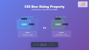
| `content-box` | This is the default behavior. The `width` and `height` properties specify the size of the content box. Padding and border are added to the specified `width` and `height`. |
| `border-box` | The `width` and `height` properties include the content, padding, and border. The content box shrinks to absorb the border and padding. This is often the preferred model for responsive designs. |
| `inherit` | The `boxSizing` value is inherited from the parent element. |
Examples of boxSizing in Action
Let’s explore the different boxSizing values with practical examples.
content-box: The Default Behavior
In this example, we’ll see how the content-box value causes the total width of the element to exceed the specified width when padding and borders are added.
<div style="width: 200px; padding: 20px; border: 5px solid red; box-sizing: content-box;">
  This is a content-box example.
</div>
In this case, if width is set to 200px, the total width of the element will be 200px (content) + 40px (padding) + 10px (border) = 250px.
border-box: A More Intuitive Approach
Using border-box, the specified width includes the content, padding, and border. This makes it easier to reason about the size of elements.
<div style="width: 200px; padding: 20px; border: 5px solid red; box-sizing: border-box;">
  This is a border-box example.
</div>
Here, the element’s total width will be 200px, including the content, padding, and border. The content area shrinks to accommodate the padding and border.
inherit: Maintaining Consistency
The inherit value is used to ensure that an element uses the same boxSizing value as its parent.
<div style="box-sizing: border-box;">
  <div style="width: 200px; padding: 20px; border: 5px solid red; box-sizing: inherit;">
    This inherits border-box from its parent.
  </div>
</div>
In this case, the inner div inherits box-sizing: border-box from the outer div, ensuring consistent sizing behavior.
Real-World Applications
Creating Responsive Layouts
border-box is particularly useful for responsive designs where elements need to fit within specific containers. By using border-box, you can ensure that adding padding or borders doesn’t break the layout.
<div style="width: 100%; box-sizing: border-box; padding: 10px; border: 1px solid #ccc;">
  This element will always take up 100% of its parent's width, regardless of padding or border.
</div>
Simplifying Element Sizing
border-box simplifies element sizing by making the specified width and height the total rendered size. This eliminates the need to manually calculate the impact of padding and borders, making your CSS more maintainable.
A Universal Reset with border-box
Many developers include the following CSS rule to set boxSizing to border-box for all elements:
html {
  box-sizing: border-box;
}

*,
*::before,
*::after {
  box-sizing: inherit;
}
This ensures that all elements, including pseudo-elements, use the border-box model by default, providing a consistent and predictable sizing behavior across your entire project. 💡
Browser Support
The boxSizing property is widely supported across all modern browsers.
Conclusion
The boxSizing property is an essential tool for CSS developers, providing control over how the box model is calculated. Using border-box can significantly simplify element sizing and prevent common layout issues, especially in responsive designs. Understanding and utilizing this property will make your CSS more predictable, maintainable, and robust. 📦
Related Posts
CSS Style height Property: CSS Height
Understanding the CSS height Property: A Comprehensive Guide The height property in CSS specifies the height of an element's content...
CSS Box-Sizing Property: Master Content-Box vs Border-Box for Perfect Layouts
The CSS box-sizing property is one of the most crucial yet often misunderstood concepts in web development. It determines how...
CSS Style padding Property: CSS Padding
CSS Padding Property: A Comprehensive Guide The CSS padding property is a fundamental tool in web development, allowing you to...
CSS Box Model: Master Content, Padding, Border and Margin for Perfect Layouts
The CSS Box Model is the fundamental concept that governs how elements are sized and spaced in web layouts. Understanding...
CSS Style paddingRight Property: CSS Padding Right
Understanding the CSS padding-right Property The padding-right property in CSS is used to set the amount of space between the...

CSS Style maxWidth Property: CSS Max Width
Understanding the CSS maxWidth Property The CSS maxWidth property is a fundamental tool in web development for controlling the maximum...

CSS Width Property: Mastering Element Width in CSS
CSS Width Property: Mastering Element Width The width property in CSS defines the width of an element's content area. It's...

CSS Style maxHeight Property: CSS Max Height
Understanding the CSS max-height Property The CSS max-height property is a fundamental tool for controlling the maximum height of an...
CSS Style borderWidth Property: CSS Border Width
CSS borderWidth Property: A Comprehensive Guide The borderWidth property in CSS is used to set the width of an element's...

CSS display Property: CSS Display
Understanding the CSS display Property: A Comprehensive Guide The display property in CSS is a cornerstone for controlling the layout...
CSS Style paddingTop Property: CSS Padding Top
Understanding the CSS padding-top Property The padding-top property in CSS defines the amount of space between the top edge of...

CSS Width and Height: Complete Guide to Element Dimensions
Understanding how to control element dimensions is fundamental to creating well-structured web layouts. CSS width and height properties give you...


