
CSS background-size Property: Mastering Background Image Scaling
The CSS background-size property specifies the size of background images. Controlling the size of your background images is crucial for creating visually appealing and responsive web designs. This comprehensive guide covers the syntax, possible values, and practical examples of the background-size property.
What is the background-size Property?
The background-size property allows you to control how background images are scaled within their container. It enables you to stretch, shrink, cover, or contain background images, ensuring they fit perfectly within the design. This property is essential for creating responsive and visually consistent layouts.
Purpose of the background-size Property
The primary purposes of the background-size property are to:
- Scale background images to fit the container.
- Ensure background images cover the entire container without distortion.
- Contain background images within the container without cropping.
- Control the size of background images for aesthetic and functional purposes.
Syntax
The background-size property can be defined using various values, each offering a different scaling behavior.
background-size: auto | cover | contain | <length> | <percentage>;
Possible Values
| Value | Description |
|---|---|
| `auto` | The background image is displayed at its original size. If the original size exceeds the container, it will be clipped. |
| `cover` | Scales the background image to cover the entire container. It may clip the image to do so, but the aspect ratio is maintained. |
| `contain` | Scales the background image to fit entirely within the container. The aspect ratio is maintained, and empty spaces may appear. |
| ` |
Specifies the width of the background image. The height is set to `auto` unless specified otherwise. Values can be in pixels (`px`), ems (`em`), or other CSS units. |
| ` |
Specifies the width of the background image as a percentage of the container’s width. The height is set to `auto` unless specified otherwise. |
| `initial` | Sets this property to its default value. |
| `inherit` | Inherits this property from its parent element. |
Examples
Let’s explore the different values of the background-size property with practical examples. Each example includes the HTML and CSS code to demonstrate the effect of each value.
1. background-size: auto;
The auto value displays the background image at its original size.
<div class="container-auto">
  <p>background-size: auto;</p>
</div>
.container-auto {
  width: 300px;
  height: 200px;
  border: 1px solid black;
  background-image: url("https://dummyimage.com/400x300/000/fff");
  background-repeat: no-repeat;
  background-size: auto;
}
The image is displayed at its original size (400×300), and since it’s larger than the container, it gets clipped.
2. background-size: cover;
The cover value scales the background image to cover the entire container.
<div class="container-cover">
  <p>background-size: cover;</p>
</div>
.container-cover {
  width: 300px;
  height: 200px;
  border: 1px solid black;
  background-image: url("https://dummyimage.com/400x300/000/fff");
  background-repeat: no-repeat;
  background-size: cover;
}
The image is scaled to cover the entire container (300×200), potentially clipping parts of the image, but maintaining its aspect ratio.
3. background-size: contain;
The contain value scales the background image to fit entirely within the container.
<div class="container-contain">
  <p>background-size: contain;</p>
</div>
.container-contain {
  width: 300px;
  height: 200px;
  border: 1px solid black;
  background-image: url("https://dummyimage.com/400x300/000/fff");
  background-repeat: no-repeat;
  background-size: contain;
}
The image is scaled to fit within the container (300×200), maintaining its aspect ratio. Empty spaces may appear to prevent clipping.
4. background-size: <length>;
The <length> value specifies the width of the background image in a specific unit like pixels.
<div class="container-length">
  <p>background-size: 200px;</p>
</div>
.container-length {
  width: 300px;
  height: 200px;
  border: 1px solid black;
  background-image: url("https://dummyimage.com/400x300/000/fff");
  background-repeat: no-repeat;
  background-size: 200px;
}
The image width is set to 200px, and the height is automatically adjusted to maintain the aspect ratio.
5. background-size: <percentage>;
The <percentage> value specifies the width of the background image as a percentage of the container’s width.
<div class="container-percentage">
  <p>background-size: 50%;</p>
</div>
.container-percentage {
  width: 300px;
  height: 200px;
  border: 1px solid black;
  background-image: url("https://dummyimage.com/400x300/000/fff");
  background-repeat: no-repeat;
  background-size: 50%;
}
The image width is set to 50% of the container’s width (150px), and the height is automatically adjusted to maintain the aspect ratio.
Combining Values
You can specify both width and height values for background-size.
background-size: 200px 100px; /* Width: 200px, Height: 100px */
background-size: 50% 50%; /* Width: 50% of container, Height: 50% of container */
<div class="container-combined-percentage">
  <p>background-size: 50% 50%;</p>
</div>
.container-combined-percentage {
  width: 300px;
  height: 200px;
  border: 1px solid black;
  background-image: url("https://dummyimage.com/400x300/000/fff");
  background-repeat: no-repeat;
  background-size: 50% 50%;
}
The image width is set to 50% of the container’s width (150px), and the height is also set to 50% of the container’s height (100px).
Real-World Applications of the background-size Property
The background-size property is widely used in web design for various purposes:
- Responsive Backgrounds: Ensuring background images adapt to different screen sizes.
- Hero Sections: Creating visually appealing hero sections with full-screen background images.
- Image Galleries: Scaling images within gallery containers for consistent display.
- Logos and Icons: Controlling the size of logos and icons in headers and footers.
Use Case Example: Creating a Responsive Hero Section
Let’s create a practical example that demonstrates how to use the background-size property to build a responsive hero section. This example combines the background-size property with other CSS properties to create an engaging visual experience.
<div class="hero-section">
  <h1>Welcome to Our Website</h1>
  <p>Discover amazing content and explore new possibilities.</p>
</div>
.hero-section {
  width: 100%;
  height: 500px;
  background-image: url("https://dummyimage.com/1200x600/000/fff");
  background-size: cover;
  background-position: center;
  background-repeat: no-repeat;
  color: white;
  text-align: center;
  padding: 50px;
  box-sizing: border-box;
}

.hero-section h1 {
  font-size: 3em;
  margin-bottom: 20px;
}

.hero-section p {
  font-size: 1.5em;
}
Welcome to Our Website
Discover amazing content and explore new possibilities.
.hero-section {
  width: 100%;
  height: 500px;
  background-image: url("https://dummyimage.com/1200x600/000/fff");
  background-size: cover;
  background-position: center;
  background-repeat: no-repeat;
  color: white;
  text-align: center;
  padding: 50px;
  box-sizing: border-box;
}

.hero-section h1 {
  font-size: 3em;
  margin-bottom: 20px;
}

.hero-section p {
  font-size: 1.5em;
}
This example demonstrates several important concepts:
- Full-Width Responsiveness: The hero section adapts to the full width of the screen.
- Background Scaling: The
background-size: cover;property ensures the background image covers the entire section, maintaining its aspect ratio. - Content Alignment: Text and other content are centered for a visually appealing layout.
- Consistent Design: The background image and content work together to create a cohesive and engaging user experience.
The result is a reusable hero section component that can be easily customized and integrated into larger applications. This practical example shows how the background-size property can be used to create visually appealing and responsive designs.
Browser Support
The background-size property enjoys excellent support across all modern web browsers, ensuring that your designs will render consistently across various platforms.
Note: It’s always advisable to test your web designs across different browsers and devices to ensure a consistent user experience. 🧐
Conclusion
The CSS background-size property is an essential tool for web developers, providing the means to control the scaling and display of background images. This comprehensive guide should equip you with the foundational knowledge and skills necessary to harness the power of the background-size property for your projects. From creating responsive backgrounds to implementing visually appealing hero sections, the possibilities are limited only by your imagination. Happy coding!
Related Posts
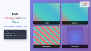
CSS Background-Size: Master Cover, Contain and Custom Sizing Techniques
The CSS background-size property is a powerful tool that controls how background images are sized within their containers. Whether you're...
CSS Style backgroundImage Property: CSS Background Image
CSS backgroundImage Property: A Comprehensive Guide The backgroundImage property in CSS is used to set one or more background images...
CSS Background-Image: Complete Guide to Adding Images to Element Backgrounds
The CSS background-image property is one of the most powerful tools for creating visually appealing web designs. It allows you...
CSS Style backgroundAttachment Property: CSS Background Attachment
Understanding the background-attachment Property in CSS The background-attachment property in CSS determines whether a background image scrolls with the containing...

CSS Style background Property: CSS Background
CSS background Property: A Comprehensive Guide to Styling Web Page Backgrounds The CSS background property is a versatile shorthand property...
CSS Style backgroundRepeat Property: CSS Background Repeat
CSS background-repeat: Mastering Background Image Repetition The CSS background-repeat property is a powerful tool for controlling how background images are...
CSS Style backgroundPosition Property: CSS Background Position
CSS background-position Property: Mastering Background Image Placement The CSS background-position property allows you to precisely control the initial position of...
CSS Style backgroundOrigin Property: CSS Background Origin
Understanding the background-origin Property in CSS The background-origin property in CSS specifies where the background image should be positioned within...
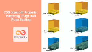
CSS object-fit Property: Mastering Image and Video Scaling
Understanding the CSS object-fit Property: A Comprehensive Guide The CSS object-fit property specifies how the content of a replaced element,...
CSS Background-Position: Complete Guide to Precise Background Image Positioning
The CSS background-position property is a fundamental tool for controlling exactly where background images appear within their containers. Whether you're...

HTML Img height Property: Image Height
HTML <img> height Property: Controlling Image Height The height attribute of the HTML <img> tag specifies the height of the...
CSS Style backgroundColor Property: CSS Background Color
CSS backgroundColor Property: Mastering Background Colors The backgroundColor property in CSS allows you to define the background color of an...


