
CSS background-repeat: Mastering Background Image Repetition
The CSS background-repeat property is a powerful tool for controlling how background images are repeated (tiled) within an element. This property allows you to specify whether a background image should repeat horizontally, vertically, both, or not at all, giving you precise control over the visual appearance of your web pages. This guide provides a comprehensive overview of the background-repeat property, including its syntax, possible values, and practical examples.
What is the background-repeat property?
The background-repeat property determines how a background image is repeated, or tiled, to fill the space within an element. By default, background images are repeated both vertically and horizontally. The background-repeat property allows you to modify this behavior to suit your design needs.
Purpose of the background-repeat property
The primary purpose of the background-repeat property is to:
- Control the tiling behavior of background images.
- Prevent repetition of background images.
- Repeat background images horizontally or vertically only.
- Create patterned backgrounds and textures.
Syntax
The syntax for the background-repeat property is as follows:
element {
  background-repeat: repeat | repeat-x | repeat-y | no-repeat | space | round | initial | inherit;
}
Possible Values
Understanding the different values of the background-repeat property is crucial for effective use:
| Value | Description |
|---|---|
| `repeat` | The background image is repeated both vertically and horizontally. This is the default value. |
| `repeat-x` | The background image is repeated only horizontally. |
| `repeat-y` | The background image is repeated only vertically. |
| `no-repeat` | The background image is not repeated. Only one instance of the image is displayed. |
| `space` | The background image is repeated as much as possible without clipping. The first and last images are pinned to either side of the element, and whitespace is distributed evenly between the images. |
| `round` | The background image is repeated, and if it doesn’t fit an exact number of times, it is scaled to fit the element perfectly. |
| `initial` | Sets this property to its default value (`repeat`). |
| `inherit` | Inherits this property from its parent element. |
Basic Examples
Let’s explore some basic drawing operations with the background-repeat property. Each example below includes the necessary HTML and CSS code to demonstrate the background-repeat property.
background-repeat: repeat;
The repeat value is the default. It repeats the background image both horizontally and vertically to cover the entire element.
<div
  id="repeatExample"
  style="
    width: 200px;
    height: 200px;
    background-image: url('https://dummyimage.com/50x50/007acc/ffffff');
    background-repeat: repeat;
    border: 1px solid black;
  "
></div>
In this example, the background image repeats to fill the entire 200×200 pixel area.
background-repeat: repeat-x;
The repeat-x value repeats the background image only horizontally.
<div
  id="repeatXExample"
  style="
    width: 200px;
    height: 200px;
    background-image: url('https://dummyimage.com/50x50/007acc/ffffff');
    background-repeat: repeat-x;
    border: 1px solid black;
  "
></div>
The background image repeats horizontally across the top of the element.
background-repeat: repeat-y;
The repeat-y value repeats the background image only vertically.
<div
  id="repeatYExample"
  style="
    width: 200px;
    height: 200px;
    background-image: url('https://dummyimage.com/50x50/007acc/ffffff');
    background-repeat: repeat-y;
    border: 1px solid black;
  "
></div>
The background image repeats vertically along the left side of the element.
background-repeat: no-repeat;
The no-repeat value prevents the background image from repeating at all.
<div
  id="noRepeatExample"
  style="
    width: 200px;
    height: 200px;
    background-image: url('https://dummyimage.com/50x50/007acc/ffffff');
    background-repeat: no-repeat;
    border: 1px solid black;
  "
></div>
Only one instance of the background image is displayed in the top-left corner of the element.
background-repeat: space;
The space value repeats the background image as much as possible without clipping. The first and last images are pinned to either side of the element, and whitespace is distributed evenly between the images.
<div
  id="spaceExample"
  style="
    width: 200px;
    height: 200px;
    background-image: url('https://dummyimage.com/50x50/007acc/ffffff');
    background-repeat: space;
    border: 1px solid black;
  "
></div>
The background images are spaced evenly across the element, with the first and last images aligned to the edges.
background-repeat: round;
The round value repeats the background image, and if it doesn’t fit an exact number of times, it is scaled to fit the element perfectly.
<div
  id="roundExample"
  style="
    width: 200px;
    height: 200px;
    background-image: url('https://dummyimage.com/60x60/007acc/ffffff');
    background-repeat: round;
    border: 1px solid black;
  "
></div>
The background images are scaled to fit the element perfectly, without any partial images.
Advanced Techniques
Combining background-repeat with background-position
You can combine background-repeat with background-position to create more complex background effects. For example, you can position a non-repeating background image in the center of an element.
<div
  id="noRepeatCenter"
  style="
    width: 200px;
    height: 200px;
    background-image: url('https://dummyimage.com/50x50/007acc/ffffff');
    background-repeat: no-repeat;
    background-position: center;
    border: 1px solid black;
  "
></div>
The background image is centered and not repeated.
Creating Patterns with repeat
Using a small, seamless image with the repeat value is a common technique for creating patterns.
<div
  id="patternExample"
  style="
    width: 200px;
    height: 200px;
    background-image: url('https://www.transparenttextures.com/patterns/carbon-fibre.png');
    background-repeat: repeat;
    border: 1px solid black;
  "
></div>
A subtle carbon fiber pattern is created by repeating the seamless image.
Using Multiple Backgrounds
You can use multiple backgrounds with different background-repeat values to create layered effects.
<div
  id="multipleBackgrounds"
  style="
    width: 200px;
    height: 200px;
    background-image: url('https://dummyimage.com/50x50/007acc/ffffff'),
      url('https://dummyimage.com/20x20/ff0000/ffffff');
    background-repeat: no-repeat, repeat;
    background-position: bottom right, top left;
    border: 1px solid black;
  "
></div>
A small red square is repeated from the top-left corner, while a larger blue square is positioned at the bottom-right corner and not repeated.
Real-World Applications
The background-repeat property is used in various scenarios, including:
- Creating Textures: Using seamless images to create background textures.
- Branding: Displaying logos or watermarks without repetition.
- Layout Design: Creating visually appealing layouts with repeated patterns.
- Decorative Elements: Adding repeated decorative elements to headers or footers.
Use Case Example: Creating a Striped Background
Let’s create a practical example that demonstrates how to use the background-repeat property to build a simple but effective striped background. This example shows how to combine various CSS features to create a real-world visual effect.
<div
  id="stripedBackground"
  style="
    width: 300px;
    height: 200px;
    background-image: linear-gradient(to right, #f0f0f0 50%, #ffffff 50%);
    background-size: 20px 100%;
    border: 1px solid #ddd;
  "
></div>
This code creates a striped background effect by using a linear gradient and repeating it horizontally. The result is a reusable striped background that can be easily customized and integrated into larger applications. This practical example shows how the background-repeat property can be used to create meaningful visual effects that would be difficult to achieve with standard HTML elements.
Browser Support
The background-repeat property enjoys excellent support across all modern web browsers, ensuring that your creations will render consistently across various platforms.
Note: It’s always advisable to test your CSS creations across different browsers and devices to ensure a consistent user experience. 🧐
Conclusion
The background-repeat property is an exceptionally versatile and powerful tool for web developers, providing the means to control how background images are repeated within elements. This comprehensive guide should equip you with the foundational knowledge and skills necessary to harness the power of the background-repeat property for your projects. From creating seamless patterns to controlling image placement, the possibilities are limited only by your imagination. Happy coding!
Related Posts
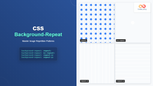
CSS Background-Repeat: Master Image Repetition Patterns and Control
The CSS background-repeat property is a fundamental tool for controlling how background images behave within their containers. Whether you want...
CSS Style backgroundImage Property: CSS Background Image
CSS backgroundImage Property: A Comprehensive Guide The backgroundImage property in CSS is used to set one or more background images...
CSS Style background Property: CSS Background
CSS background Property: A Comprehensive Guide to Styling Web Page Backgrounds The CSS background property is a versatile shorthand property...
CSS Background-Image: Complete Guide to Adding Images to Element Backgrounds
The CSS background-image property is one of the most powerful tools for creating visually appealing web designs. It allows you...
CSS Style backgroundAttachment Property: CSS Background Attachment
Understanding the background-attachment Property in CSS The background-attachment property in CSS determines whether a background image scrolls with the containing...
CSS Style backgroundSize Property: CSS Background Size
CSS background-size Property: Mastering Background Image Scaling The CSS background-size property specifies the size of background images. Controlling the size...
CSS Style backgroundPosition Property: CSS Background Position
CSS background-position Property: Mastering Background Image Placement The CSS background-position property allows you to precisely control the initial position of...
CSS Multiple Backgrounds: Complete Guide to Layering Images and Colors Like a Pro
CSS multiple backgrounds revolutionized web design by allowing developers to layer multiple background images, colors, and gradients on a single...
CSS Style backgroundColor Property: CSS Background Color
CSS backgroundColor Property: Mastering Background Colors The backgroundColor property in CSS allows you to define the background color of an...
CSS Style backgroundOrigin Property: CSS Background Origin
Understanding the background-origin Property in CSS The background-origin property in CSS specifies where the background image should be positioned within...
CSS Style backgroundClip Property: CSS Background Clip
CSS background-clip Property: A Comprehensive Guide The CSS background-clip property determines how far the background extends within an element. It...
CSS Background-Size: Master Cover, Contain and Custom Sizing Techniques
The CSS background-size property is a powerful tool that controls how background images are sized within their containers. Whether you're...


