
Understanding the background-origin Property in CSS
The background-origin property in CSS specifies where the background image should be positioned within an element. By default, the background image starts from the top-left corner of the element’s padding edge. However, background-origin allows you to change this behavior, making the background image start from the border edge, the content edge, or the padding edge. This provides more control over the placement and appearance of background images in your designs.
Purpose of background-origin
The primary purpose of the background-origin property is to:
- Control the starting point of a background image within an element.
- Align background images relative to the border, padding, or content edge.
- Create more visually appealing and precise background effects.
- Customize background image behavior for various design requirements.
Syntax
The background-origin property can be defined using the following syntax:
element {
  background-origin: padding-box | border-box | content-box;
}
Values
The background-origin property accepts the following values:
| Value | Description |
|---|---|
| `padding-box` | The background image starts from the top-left corner of the padding edge. This is the default value. |
| `border-box` | The background image starts from the top-left corner of the border edge. |
| `content-box` | The background image starts from the top-left corner of the content edge. |
Practical Examples of background-origin
Let’s explore how the background-origin property works with practical examples. Each example includes the necessary HTML and CSS code to demonstrate the effect of different background-origin values.
Using padding-box
The padding-box value sets the origin of the background image to the padding edge, which is the default behavior.
<div class="origin-container" id="paddingBoxContainer">
  <div class="origin-box padding-box" id="paddingBox">
    Padding Box Origin
  </div>
</div>
.origin-container {
  width: 300px;
  height: 150px;
  border: 2px solid #000;
  margin-bottom: 20px;
}

.origin-box {
  width: 100%;
  height: 100%;
  padding: 20px;
  border: 10px dashed rgba(0, 0, 0, 0.5);
  background-image: url("https://dummyimage.com/50x50/007bff/fff");
  background-repeat: no-repeat;
  color: white;
  font-weight: bold;
  text-align: center;
  line-height: 110px;
}

.padding-box {
  background-origin: padding-box;
}
In this example, the background image starts from the top-left corner of the padding area.
Using border-box
The border-box value sets the origin of the background image to the border edge.
<div class="origin-container" id="borderBoxContainer">
  <div class="origin-box border-box" id="borderBox">
    Border Box Origin
  </div>
</div>
.border-box {
  background-origin: border-box;
}
Here, the background image starts from the top-left corner of the border.
Using content-box
The content-box value sets the origin of the background image to the content edge.
<div class="origin-container" id="contentBoxContainer">
  <div class="origin-box content-box" id="contentBox">
    Content Box Origin
  </div>
</div>
.content-box {
  background-origin: content-box;
}
In this case, the background image starts from the top-left corner of the content area, inside the padding and border.
Combining background-origin with Other Background Properties
The background-origin property is often used in conjunction with other background properties like background-clip and background-position to create complex and visually appealing effects.
Using background-origin and background-clip Together
This example demonstrates how background-origin and background-clip can be combined to create a custom background effect.
<div class="combined-container" id="combinedContainer">
  <div class="combined-box" id="combinedBox">
    Combined Origin and Clip
  </div>
</div>
.combined-container {
  width: 300px;
  height: 150px;
  border: 2px solid #000;
  margin-bottom: 20px;
}

.combined-box {
  width: 100%;
  height: 100%;
  padding: 20px;
  border: 10px dashed rgba(0, 0, 0, 0.5);
  background-image: url("https://dummyimage.com/50x50/007bff/fff");
  background-repeat: no-repeat;
  color: white;
  font-weight: bold;
  text-align: center;
  line-height: 110px;
  background-origin: border-box;
  background-clip: content-box;
}
In this example, the background image starts from the border edge (background-origin: border-box), but it is clipped to the content edge (background-clip: content-box).
Using background-origin and background-position Together
This example illustrates how to use background-origin and background-position to precisely control the placement of the background image.
<div class="position-container" id="positionContainer">
  <div class="position-box" id="positionBox">
    Combined Origin and Position
  </div>
</div>
.position-container {
  width: 300px;
  height: 150px;
  border: 2px solid #000;
  margin-bottom: 20px;
}

.position-box {
  width: 100%;
  height: 100%;
  padding: 20px;
  border: 10px dashed rgba(0, 0, 0, 0.5);
  background-image: url("https://dummyimage.com/50x50/007bff/fff");
  background-repeat: no-repeat;
  color: white;
  font-weight: bold;
  text-align: center;
  line-height: 110px;
  background-origin: border-box;
  background-position: right bottom;
}
Here, the background image starts from the border edge and is positioned at the bottom-right corner of the border area.
Real-World Applications of background-origin
The background-origin property is useful in scenarios such as:
- Custom Buttons: Aligning background images within buttons to create unique hover effects.
- Content Boxes: Positioning background images within content boxes to enhance visual appeal.
- Decorative Borders: Using background images to create decorative borders with precise alignment.
- Image Galleries: Aligning background images in image galleries for a consistent look.
Use Case Example: Creating a Custom Button with background-origin
Let’s create a custom button using the background-origin property to precisely control the placement of a background image.
<button class="custom-button" id="customButton">
  Click Me
</button>
.custom-button {
  padding: 10px 20px;
  border: 2px solid #007bff;
  background-color: transparent;
  color: #007bff;
  font-size: 16px;
  cursor: pointer;
  background-image: url("https://dummyimage.com/20x20/007bff/fff");
  background-repeat: no-repeat;
  background-position: 5px center;
  background-origin: border-box;
  padding-left: 30px; /* Adjust padding to accommodate the image */
}

.custom-button:hover {
  background-color: #007bff;
  color: white;
}
In this example, the background-origin is set to border-box, ensuring the icon is positioned relative to the border. The padding-left is adjusted to prevent the text from overlapping the icon.
Browser Support
The background-origin property is supported by all modern browsers:
- Chrome
- Firefox
- Safari
- Edge
- Opera
It’s always good to test your designs across different browsers to ensure consistent rendering. 🧪
Tips and Best Practices
- Use with
background-position: Combinebackground-originwithbackground-positionfor precise control over background image placement. - Consider
background-clip: Usebackground-clipto control how the background image is clipped within the element. - Test Across Browsers: Ensure your designs render correctly across different browsers and devices.
- Maintain Readability: Use clear and descriptive class names to improve code readability.
Conclusion
The background-origin property in CSS provides a powerful way to control the positioning of background images within an element. By understanding and utilizing its values, you can create more visually appealing and precisely aligned designs. This guide has provided you with the knowledge and examples needed to effectively use the background-origin property in your web development projects. Happy styling! 🎨
Related Posts
CSS Style backgroundPosition Property: CSS Background Position
CSS background-position Property: Mastering Background Image Placement The CSS background-position property allows you to precisely control the initial position of...
CSS Background-Position: Complete Guide to Precise Background Image Positioning
The CSS background-position property is a fundamental tool for controlling exactly where background images appear within their containers. Whether you're...
CSS Style backgroundImage Property: CSS Background Image
CSS backgroundImage Property: A Comprehensive Guide The backgroundImage property in CSS is used to set one or more background images...
CSS Background-Image: Complete Guide to Adding Images to Element Backgrounds
The CSS background-image property is one of the most powerful tools for creating visually appealing web designs. It allows you...
CSS Style backgroundSize Property: CSS Background Size
CSS background-size Property: Mastering Background Image Scaling The CSS background-size property specifies the size of background images. Controlling the size...
CSS Background-Color: Complete Guide to Setting Element Background Colors
The CSS background-color property is one of the most fundamental styling tools in web development, allowing you to set the...
CSS Style backgroundAttachment Property: CSS Background Attachment
Understanding the background-attachment Property in CSS The background-attachment property in CSS determines whether a background image scrolls with the containing...
CSS Style backgroundClip Property: CSS Background Clip
CSS background-clip Property: A Comprehensive Guide The CSS background-clip property determines how far the background extends within an element. It...
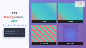
CSS Background-Size: Master Cover, Contain and Custom Sizing Techniques
The CSS background-size property is a powerful tool that controls how background images are sized within their containers. Whether you're...
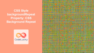
CSS Style backgroundRepeat Property: CSS Background Repeat
CSS background-repeat: Mastering Background Image Repetition The CSS background-repeat property is a powerful tool for controlling how background images are...
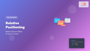
CSS Relative Positioning: Master Element Offset and Layout Control
Understanding CSS Relative Positioning CSS relative positioning is a fundamental layout technique that allows you to move elements from their...
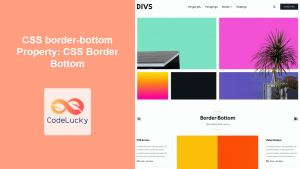
CSS border-bottom Property: CSS Border Bottom
Understanding the CSS border-bottom Property The border-bottom property in CSS is used to set the style, color, and width of...


