
CSS backgroundImage Property: A Comprehensive Guide
The backgroundImage property in CSS is used to set one or more background images for an element. The background image is a visual element that appears behind the content of an element, enhancing the aesthetic appeal and user experience of a webpage. This guide will cover everything you need to know about using the backgroundImage property effectively.
Purpose of the backgroundImage Property
The primary purpose of the backgroundImage property is to:
- Add visual interest to an element by placing an image behind its content.
- Create visually appealing layouts and designs.
- Enhance the user experience by providing context and visual cues.
- Brand elements with logos, patterns, or thematic imagery.
Syntax
The basic syntax for the backgroundImage property is as follows:
selector {
  background-image: value;
}
Possible Values
| Value | Description |
|---|---|
| `url(“url”)` | Specifies an image to use as the background. The URL can be absolute or relative. |
| `none` | Specifies that no background image should be used. This is the default value. |
| `linear-gradient(direction, color-stop1, color-stop2, …)` | Creates a linear gradient as the background image. |
| `radial-gradient(shape size at position, color-stop1, color-stop2, …)` | Creates a radial gradient as the background image. |
| `conic-gradient(from angle at position, color-stop1, color-stop2, …)` | Creates a conic gradient as the background image. |
| `image-set()` | Allows specifying different images for different display densities or screen resolutions. |
| `initial` | Sets this property to its default value. |
| `inherit` | Inherits this property from its parent element. |
Basic Examples
Let’s start with some basic examples to illustrate how to use the backgroundImage property.
Example 1: Setting a Background Image with a URL
This example demonstrates how to set a background image using a URL.
<!DOCTYPE html>
<html>
  <head>
    <title>Background Image Example</title>
    <style>
      #element1 {
        width: 300px;
        height: 200px;
        background-image: url("https://dummyimage.com/300x200/000/fff");
        color: white;
        text-align: center;
        line-height: 200px;
      }
    </style>
  </head>
  <body>
    <div id="element1">Background Image</div>
  </body>
</html>
The backgroundImage property is set to the URL of an image. The div element with the ID element1 will display this image as its background.
Example 2: Using none to Remove a Background Image
This example shows how to use the none value to remove a background image that might have been inherited from a parent element.
<!DOCTYPE html>
<html>
  <head>
    <title>Remove Background Image Example</title>
    <style>
      #parent2 {
        width: 300px;
        height: 200px;
        background-image: url("https://dummyimage.com/300x200/000/fff");
        color: white;
        text-align: center;
        line-height: 200px;
      }

      #child2 {
        background-image: none;
        width: 150px;
        height: 100px;
        color: black;
        line-height: 100px;
        margin: auto;
      }
    </style>
  </head>
  <body>
    <div id="parent2">
      Parent with Background
      <div id="child2">No Background</div>
    </div>
  </body>
</html>
In this example, the parent element (parent2) has a background image. The child element (child2) sets background-image to none, which overrides the inherited background image, resulting in no background image being displayed for the child element.
Gradients as Background Images
The backgroundImage property can also be used to set gradients as background images. CSS supports linear, radial, and conic gradients.
Example 3: Linear Gradient
This example demonstrates how to use a linear gradient as a background image.
<!DOCTYPE html>
<html>
  <head>
    <title>Linear Gradient Example</title>
    <style>
      #element3 {
        width: 300px;
        height: 200px;
        background-image: linear-gradient(to right, red, yellow);
        color: white;
        text-align: center;
        line-height: 200px;
      }
    </style>
  </head>
  <body>
    <div id="element3">Linear Gradient</div>
  </body>
</html>
A linear gradient is created with the linear-gradient() function, transitioning from red to yellow. This gradient is then set as the background image for the element3 div.
Example 4: Radial Gradient
This example demonstrates how to use a radial gradient as a background image.
<!DOCTYPE html>
<html>
  <head>
    <title>Radial Gradient Example</title>
    <style>
      #element4 {
        width: 300px;
        height: 200px;
        background-image: radial-gradient(circle, red, yellow);
        color: white;
        text-align: center;
        line-height: 200px;
      }
    </style>
  </head>
  <body>
    <div id="element4">Radial Gradient</div>
  </body>
</html>
A radial gradient is created with the radial-gradient() function, transitioning from red at the center to yellow at the edges.
Example 5: Conic Gradient
This example demonstrates how to use a conic gradient as a background image.
<!DOCTYPE html>
<html>
  <head>
    <title>Conic Gradient Example</title>
    <style>
      #element5 {
        width: 300px;
        height: 200px;
        background-image: conic-gradient(red, yellow, green);
        color: white;
        text-align: center;
        line-height: 200px;
      }
    </style>
  </head>
  <body>
    <div id="element5">Conic Gradient</div>
  </body>
</html>
A conic gradient is created with the conic-gradient() function, transitioning from red to yellow to green in a circular fashion.
Using Multiple Background Images
You can specify multiple background images for an element by separating the URLs with commas. The images are stacked on top of each other, with the first image specified being the closest to the user.
Example 6: Multiple Background Images
This example shows how to use multiple background images.
<!DOCTYPE html>
<html>
  <head>
    <title>Multiple Background Images Example</title>
    <style>
      #element6 {
        width: 300px;
        height: 200px;
        background-image: url("https://dummyimage.com/50x50/000/fff"),
          url("https://dummyimage.com/75x75/000/eee");
        background-repeat: no-repeat;
        background-position: top left, bottom right;
        color: white;
        text-align: center;
        line-height: 200px;
      }
    </style>
  </head>
  <body>
    <div id="element6">Multiple Background Images</div>
  </body>
</html>
In this example, two background images are specified. The first image (50×50) is positioned at the top left, and the second image (75×75) is positioned at the bottom right. The background-repeat property is set to no-repeat to prevent the images from tiling.
The image-set() Function
The image-set() function allows you to specify different images for different display densities or screen resolutions, ensuring that the most appropriate image is used for the user’s device.
Example 7: Using image-set()
<!DOCTYPE html>
<html>
  <head>
    <title>Image-set Example</title>
    <style>
      #element7 {
        width: 300px;
        height: 200px;
        background-image: image-set(
          "image1x.png" 1x,
          "image2x.png" 2x
        ); /* Assuming image1x.png and image2x.png exist */
        color: white;
        text-align: center;
        line-height: 200px;
      }
    </style>
  </head>
  <body>
    <div id="element7">Image-set</div>
  </body>
</html>
In this example, the image-set() function is used to specify different images for different display densities. If the device has a pixel density of 1x, image1x.png will be used. If the device has a pixel density of 2x, image2x.png will be used.
Note: The image-set() function is particularly useful for providing high-resolution images for devices with high-density displays. 📱
Tips and Best Practices
- Use appropriate image formats: Choose image formats like JPEG, PNG, or WebP based on the image content and desired level of compression.
- Optimize images: Optimize images to reduce file size and improve page load times.
- Consider
background-size: Use thebackground-sizeproperty to control the size of the background image. - Use
background-repeatjudiciously: Control how the background image repeats using thebackground-repeatproperty. - Provide fallback colors: Set a
background-colorthat complements the background image to ensure readability if the image fails to load. - Ensure contrast: Ensure sufficient contrast between the background image and the text or content placed on top of it for accessibility.
Real-World Applications of the backgroundImage Property
The backgroundImage property is used in various real-world applications, including:
- Website Headers: Adding visually appealing images or gradients to website headers.
- Call-to-Action Buttons: Enhancing the visual appeal of call-to-action buttons with background images.
- Content Sections: Creating visually distinct content sections with background images or patterns.
- Logos and Branding: Displaying logos or branding elements as background images.
- Decorative Elements: Adding decorative images or patterns to enhance the overall design.
Browser Support
The backgroundImage property is widely supported by all modern web browsers. However, some of the advanced features like image-set() may have limited support in older browsers.
It’s always advisable to check browser compatibility for advanced features and provide fallbacks where necessary. 🧐
Conclusion
The backgroundImage property is a powerful and versatile tool for adding visual interest and enhancing the user experience of webpages. By understanding the syntax, values, and best practices outlined in this guide, you can effectively use the backgroundImage property to create visually appealing and engaging designs. Happy styling!
Related Posts
CSS Background-Image: Complete Guide to Adding Images to Element Backgrounds
The CSS background-image property is one of the most powerful tools for creating visually appealing web designs. It allows you...
CSS Style background Property: CSS Background
CSS background Property: A Comprehensive Guide to Styling Web Page Backgrounds The CSS background property is a versatile shorthand property...
CSS Style backgroundAttachment Property: CSS Background Attachment
Understanding the background-attachment Property in CSS The background-attachment property in CSS determines whether a background image scrolls with the containing...
CSS Style backgroundPosition Property: CSS Background Position
CSS background-position Property: Mastering Background Image Placement The CSS background-position property allows you to precisely control the initial position of...
CSS Style backgroundRepeat Property: CSS Background Repeat
CSS background-repeat: Mastering Background Image Repetition The CSS background-repeat property is a powerful tool for controlling how background images are...
CSS Style backgroundSize Property: CSS Background Size
CSS background-size Property: Mastering Background Image Scaling The CSS background-size property specifies the size of background images. Controlling the size...
CSS Style backgroundColor Property: CSS Background Color
CSS backgroundColor Property: Mastering Background Colors The backgroundColor property in CSS allows you to define the background color of an...
CSS Style backgroundOrigin Property: CSS Background Origin
Understanding the background-origin Property in CSS The background-origin property in CSS specifies where the background image should be positioned within...
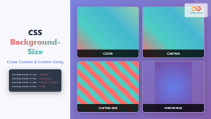
CSS Background-Size: Master Cover, Contain and Custom Sizing Techniques
The CSS background-size property is a powerful tool that controls how background images are sized within their containers. Whether you're...
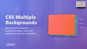
CSS Multiple Backgrounds: Complete Guide to Layering Images and Colors Like a Pro
CSS multiple backgrounds revolutionized web design by allowing developers to layer multiple background images, colors, and gradients on a single...
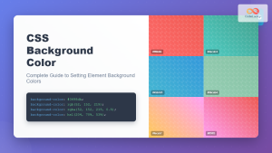
CSS Background-Color: Complete Guide to Setting Element Background Colors
The CSS background-color property is one of the most fundamental styling tools in web development, allowing you to set the...
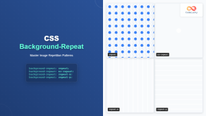
CSS Background-Repeat: Master Image Repetition Patterns and Control
The CSS background-repeat property is a fundamental tool for controlling how background images behave within their containers. Whether you want...


