
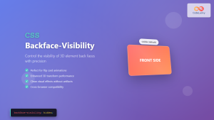
CSS backface-visibility Property: Controlling the Back Face in 3D Transforms
The backface-visibility property in CSS determines whether the back face of an element is visible when rotated in 3D space. This property is particularly useful when working with 3D transforms, allowing you to control the user’s perception of elements as they rotate. This article provides a comprehensive guide to the backface-visibility property, including its syntax, values, and practical examples.
What is backface-visibility?
When an element is transformed in 3D space using CSS transforms, it has a front face and a back face. The backface-visibility property allows you to specify whether the back face should be visible to the user. By default, the back face is visible, but in many cases, you might want to hide it to create a more realistic or visually appealing effect.
Purpose of backface-visibility
The primary purposes of the backface-visibility property are:
- Enhance 3D Effects: Control the visibility of an element’s back face to create more realistic 3D effects.
- Improve User Experience: Prevent visual distractions or confusion by hiding the back face when it’s not needed.
- Optimize Performance: In some cases, hiding the back face can improve rendering performance by preventing the browser from drawing it.
Syntax
The backface-visibility property accepts one of two values:
backface-visibility: visible|hidden|initial|inherit;
Values
| Value | Description |
|---|---|
| `visible` | The back face is visible. This is the default value. |
| `hidden` | The back face is hidden. |
| `initial` | Sets this property to its default value. |
| `inherit` | Inherits this property from its parent element. |
Examples
Let’s explore some practical examples of how to use the backface-visibility property.
Basic Example: Hiding the Back Face
This example demonstrates how to hide the back face of a rotating element.
<!DOCTYPE html>
<html>
<head>
<style>
.container_basic {
  width: 200px;
  height: 200px;
  perspective: 800px;
  margin: 50px;
}

.cube_basic {
  width: 200px;
  height: 200px;
  position: relative;
  transform-style: preserve-3d;
  transition: transform 2s;
}

.cube_basic:hover {
  transform: rotateY(180deg);
}

.face_basic {
  position: absolute;
  width: 200px;
  height: 200px;
  display: flex;
  justify-content: center;
  align-items: center;
  font-size: 24px;
  color: white;
}

.front_basic {
  background: rgba(0, 0, 255, 0.7);
  transform: translateZ(100px);
}

.back_basic {
  background: rgba(255, 0, 0, 0.7);
  transform: rotateY(180deg) translateZ(100px);
  backface-visibility: hidden; /* Hide the back face */
}
</style>
</head>
<body>

<div class="container_basic">
  <div class="cube_basic">
    <div class="face_basic front_basic">Front</div>
    <div class="face_basic back_basic">Back</div>
  </div>
</div>

</body>
</html>
In this example, the back face of the cube is hidden when it rotates 180 degrees.
Advanced Example: Creating a Flipping Card
This example demonstrates how to create a flipping card effect using backface-visibility.
<!DOCTYPE html>
<html>
<head>
<style>
.card_container {
  width: 300px;
  height: 200px;
  perspective: 800px;
  margin: 50px;
}

.card_adv {
  width: 100%;
  height: 100%;
  position: relative;
  transition: transform 0.8s;
  transform-style: preserve-3d;
}

.card_container:hover .card_adv {
  transform: rotateY(180deg);
}

.front_adv, .back_adv {
  position: absolute;
  width: 100%;
  height: 100%;
  backface-visibility: hidden;
  display: flex;
  justify-content: center;
  align-items: center;
  font-size: 24px;
  color: white;
}

.front_adv {
  background: rgba(0, 128, 0, 0.7);
}

.back_adv {
  background: rgba(128, 0, 128, 0.7);
  transform: rotateY(180deg);
}
</style>
</head>
<body>

<div class="card_container">
  <div class="card_adv">
    <div class="front_adv">Front of Card</div>
    <div class="back_adv">Back of Card</div>
  </div>
</div>

</body>
</html>
In this example, the card flips when you hover over it, showing the front and back faces alternately. The backface-visibility: hidden; ensures that the back face is not visible when it’s facing away from the viewer.
Real-World Applications of backface-visibility
The backface-visibility property is used in various scenarios, including:
- Flipping Animations: Creating flipping effects for cards, panels, or other UI elements.
- 3D Galleries: Implementing 3D image galleries where images rotate to reveal content on the back.
- Interactive Tutorials: Developing interactive tutorials with elements that flip to show instructions or additional information.
- Game Development: Enhancing 2D game development with 3D transformations to provide depth and realism.
Browser Support
The backface-visibility property is supported by all major modern browsers. Here’s a quick overview:
- Chrome: Supported
- Edge: Supported
- Firefox: Supported
- Safari: Supported
- Opera: Supported
- iOS Safari: Supported
- Android Browser: Supported
Tips and Notes
- Use with Perspective: The
backface-visibilityproperty works best when combined with theperspectiveproperty, which defines the distance between the z=0 plane and the user. - Transform Style: Ensure that the
transform-styleproperty is set topreserve-3don the parent element to enable 3D transforms on child elements. - Performance: Hiding the back face can sometimes improve rendering performance, especially on mobile devices.
- Accessibility: Ensure that content remains accessible even when using 3D transforms. Provide alternative ways to access information if the 3D effect hinders accessibility.
Conclusion
The backface-visibility property is a powerful tool for controlling the visibility of an element’s back face in 3D transforms. By using this property effectively, you can create more realistic and visually appealing 3D effects, enhancing the user experience and optimizing performance. Understanding its syntax, values, and real-world applications will enable you to leverage its full potential in your web development projects.
Related Posts
CSS Backface-Visibility: Complete Guide to Controlling 3D Element Back Faces
The CSS backface-visibility property is a powerful tool for controlling the visibility of the back face of an element when...
CSS perspective Property: CSS Perspective
Understanding the CSS perspective Property The CSS perspective property allows you to give a 3D-positioned element some perspective. It defines...
CSS Style visibility Property: CSS Visibility
Understanding the CSS visibility Property The visibility property in CSS controls the visibility of an element without affecting the layout...
CSS Style transform Property: CSS Transform
CSS transform Property: A Comprehensive Guide The CSS transform property is a powerful tool that allows you to modify the...
CSS Style transformOrigin Property: CSS Transform Origin
CSS transformOrigin Property: Mastering Element Transformation Origins The transformOrigin property in CSS is a fundamental tool for controlling how transformations...
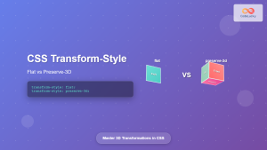
CSS Transform-Style: Complete Guide to Flat vs Preserve-3d for 3D Transformations
The CSS transform-style property is a powerful tool that controls how child elements are rendered in 3D space when their...
CSS Style perspectiveOrigin Property: CSS Perspective Origin
CSS perspective-origin Property: A Comprehensive Guide The perspective-origin property in CSS is used to set the vanishing point for 3D...
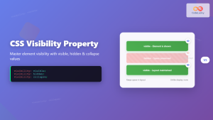
CSS Visibility Property: Complete Guide to Showing and Hiding Elements
The CSS visibility property is a fundamental tool for controlling element visibility on web pages. Unlike other hiding methods, it...
CSS Rotate: Complete Guide to Rotating Elements with Transform
CSS rotation is one of the most powerful and visually striking transformation effects available to web developers. The transform: rotate()...

CSS Style background Property: CSS Background
CSS background Property: A Comprehensive Guide to Styling Web Page Backgrounds The CSS background property is a versatile shorthand property...
CSS Perspective Property: Master 3D Depth and Transform Effects
What is CSS Perspective Property? The CSS perspective property is a powerful tool that defines the distance between the user...
CSS Style backgroundColor Property: CSS Background Color
CSS backgroundColor Property: Mastering Background Colors The backgroundColor property in CSS allows you to define the background color of an...


