CSS Style animationTimingFunction Property: A Comprehensive Guide
The animation-timing-function property in CSS is a crucial component for controlling the pace of an animation’s progression. It defines how intermediate values of the CSS properties being animated are calculated, allowing you to create animations with varying speeds and rhythms. Understanding this property is essential for crafting smooth and engaging user experiences on the web.
What is animationTimingFunction?
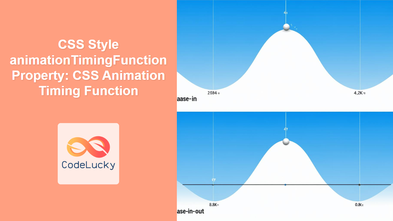
The animation-timing-function property specifies the acceleration curve for an animation. In simpler terms, it dictates how the animation’s speed changes over its duration. This allows you to create animations that start slowly, speed up in the middle, slow down at the end, or follow other custom patterns.
Purpose of animationTimingFunction
The primary purpose of animation-timing-function is to:
- Control the speed of an animation at different points in its duration.
- Create more natural and visually appealing animations.
- Add emphasis to certain parts of an animation, such as the start or end.
- Synchronize animations with other elements or events on the page.
Syntax
The animation-timing-function property accepts several values, each defining a different type of timing function:
animation-timing-function: linear | ease | ease-in | ease-out | ease-in-out |
  step-start | step-end | steps(int, start | end) | cubic-bezier(n, n, n, n) |
  initial | inherit | revert | unset;
Values
Here’s a breakdown of the possible values for animation-timing-function:
| Value | Description |
|---|---|
| `linear` | The animation progresses at a constant speed from start to end. |
| `ease` | (Default) The animation starts slowly, accelerates in the middle, and slows down at the end. Equivalent to `cubic-bezier(0.25, 0.1, 0.25, 1.0)`. |
| `ease-in` | The animation starts slowly and gradually accelerates. Equivalent to `cubic-bezier(0.42, 0, 1.0, 1.0)`. |
| `ease-out` | The animation starts quickly and gradually decelerates. Equivalent to `cubic-bezier(0, 0, 0.58, 1.0)`. |
| `ease-in-out` | The animation starts slowly, accelerates in the middle, and decelerates at the end. Equivalent to `cubic-bezier(0.42, 0, 0.58, 1.0)`. |
| `step-start` | The animation jumps immediately to the end state at the beginning of the animation. Equivalent to `steps(1, start)`. |
| `step-end` | The animation holds at the start state until the end, then jumps to the end state. Equivalent to `steps(1, end)`. |
| `steps(int, start | end)` | Specifies a step function, dividing the animation into equal intervals. The first parameter specifies the number of steps. The second parameter (`start` or `end`) determines when the jump occurs within each interval. |
| `cubic-bezier(n, n, n, n)` | Defines a custom timing function using a cubic Bezier curve. The four numeric values specify the coordinates of two control points, P1(x1, y1) and P2(x2, y2). All values must be in the range [0, 1]. |
| `initial` | Sets the property to its default value (`ease`). |
| `inherit` | Inherits this property from its parent element. |
| `revert` | Reverts the property to the value established by the user-agent stylesheet. |
| `unset` | Resets the property to its inherited value if it inherits from its parent or to its initial value if not. |
Examples
Let’s explore some practical examples of how to use the animation-timing-function property to control animation behavior.
Example 1: Linear Animation
A linear animation progresses at a constant speed.
<!DOCTYPE html>
<html>
  <head>
    <style>
      .box_linear {
        width: 100px;
        height: 100px;
        background-color: red;
        position: relative;
        animation-name: move_linear;
        animation-duration: 4s;
        animation-timing-function: linear;
        animation-iteration-count: infinite;
      }

      @keyframes move_linear {
        from {
          left: 0;
        }
        to {
          left: 300px;
        }
      }
    </style>
  </head>
  <body>
    <div class="box_linear"></div>
  </body>
</html>
The box will move from left to right at a constant speed, repeating indefinitely.
Example 2: Ease-In Animation
An ease-in animation starts slowly and gradually accelerates.
<!DOCTYPE html>
<html>
  <head>
    <style>
      .box_easein {
        width: 100px;
        height: 100px;
        background-color: blue;
        position: relative;
        animation-name: move_easein;
        animation-duration: 4s;
        animation-timing-function: ease-in;
        animation-iteration-count: infinite;
      }

      @keyframes move_easein {
        from {
          left: 0;
        }
        to {
          left: 300px;
        }
      }
    </style>
  </head>
  <body>
    <div class="box_easein"></div>
  </body>
</html>
The box will start moving slowly and gradually speed up as it moves from left to right, repeating indefinitely.
Example 3: Ease-Out Animation
An ease-out animation starts quickly and gradually decelerates.
<!DOCTYPE html>
<html>
  <head>
    <style>
      .box_easeout {
        width: 100px;
        height: 100px;
        background-color: green;
        position: relative;
        animation-name: move_easeout;
        animation-duration: 4s;
        animation-timing-function: ease-out;
        animation-iteration-count: infinite;
      }

      @keyframes move_easeout {
        from {
          left: 0;
        }
        to {
          left: 300px;
        }
      }
    </style>
  </head>
  <body>
    <div class="box_easeout"></div>
  </body>
</html>
The box will start moving quickly and gradually slow down as it moves from left to right, repeating indefinitely.
Example 4: Steps Animation
A steps animation divides the animation into discrete intervals, creating a stepped effect.
<!DOCTYPE html>
<html>
  <head>
    <style>
      .box_steps {
        width: 100px;
        height: 100px;
        background-color: orange;
        position: relative;
        animation-name: move_steps;
        animation-duration: 4s;
        animation-timing-function: steps(5, end);
        animation-iteration-count: infinite;
      }

      @keyframes move_steps {
        from {
          left: 0;
        }
        to {
          left: 300px;
        }
      }
    </style>
  </head>
  <body>
    <div class="box_steps"></div>
  </body>
</html>
The box will jump in 5 discrete steps from left to right, creating a choppy, segmented animation, repeating indefinitely.
Example 5: Cubic Bezier Animation
A cubic bezier animation allows you to define a custom timing function using a Bezier curve.
<!DOCTYPE html>
<html>
  <head>
    <style>
      .box_bezier {
        width: 100px;
        height: 100px;
        background-color: purple;
        position: relative;
        animation-name: move_bezier;
        animation-duration: 4s;
        animation-timing-function: cubic-bezier(0.68, -0.55, 0.27, 1.55);
        animation-iteration-count: infinite;
      }

      @keyframes move_bezier {
        from {
          left: 0;
        }
        to {
          left: 300px;
        }
      }
    </style>
  </head>
  <body>
    <div class="box_bezier"></div>
  </body>
</html>
The box will move from left to right following a custom acceleration curve defined by the cubic Bezier function, repeating indefinitely. The specified cubic Bezier values will create a bouncing effect.
Real-World Applications
The animation-timing-function property is used in various real-world scenarios, including:
- UI Transitions: Creating smooth and natural transitions between different states of a UI element.
- Loading Animations: Adding subtle acceleration or deceleration to loading indicators to make them more engaging.
- Scrolling Effects: Synchronizing animations with the user’s scroll position to create parallax or reveal effects.
- Game Development: Controlling the movement and behavior of game characters and objects.
Tips and Best Practices
- Use
easefor General-Purpose Animations: Theeasetiming function provides a balanced and natural-looking animation for most use cases. 🤝 - Experiment with Cubic Bezier Curves: Use online tools like cubic-bezier.com to visualize and create custom timing functions. 🧪
- Consider the User Experience: Choose timing functions that feel natural and responsive to the user’s actions. 🧠
- Avoid Overly Complex Animations: Complex timing functions can be distracting or disorienting for users. ⚠️
- Test on Different Devices: Ensure your animations perform smoothly on a variety of devices and screen sizes. 📱
Browser Support
The animation-timing-function property is widely supported across modern web browsers.
Conclusion
The animation-timing-function property is a powerful tool for adding nuance and polish to your CSS animations. By understanding the different timing functions and how they affect animation behavior, you can create engaging and visually appealing user experiences on the web. Experiment with different values and techniques to find the perfect timing for your animations! 🎉


