CSS animation Property: A Comprehensive Guide to CSS Animations
The animation property in CSS is a shorthand property used to control animation behavior. It allows you to configure various aspects of CSS animations, such as duration, timing function, delay, iteration count, direction, fill mode, and the animation name, all in a single declaration. This guide provides a detailed overview of the animation property, including its syntax, values, and practical examples to help you create dynamic and engaging web animations.
What is the CSS animation Property?
The animation property is a shorthand that combines multiple animation-related properties into one. Using this property, you can define the entire animation sequence and its characteristics in a concise manner. It’s an essential tool for creating complex animations with minimal code.
Purpose of the animation Property
The primary purpose of the animation property is to:
- Define the animation sequence using
@keyframes. - Control the timing and duration of the animation.
- Specify how many times the animation should play.
- Define the direction of the animation.
- Control the animation’s behavior before and after it plays.
Syntax of the animation Property
The animation property’s syntax is as follows:
animation: animation-name animation-duration animation-timing-function animation-delay animation-iteration-count animation-direction animation-fill-mode animation-play-state;
Each component is optional, but it’s good practice to specify at least animation-name and animation-duration for the animation to work correctly.
Possible Values
Here is a table detailing each of the sub-properties that can be used with the animation shorthand:
| Property | Description | Default Value |
|---|---|---|
| `animation-name` | Specifies the name of the `@keyframes` animation to bind to the element. | `none` |
| `animation-duration` | Specifies the time an animation should take to complete one cycle. | `0s` |
| `animation-timing-function` | Specifies the speed curve of the animation. | `ease` |
| `animation-delay` | Specifies a delay before the animation starts. | `0s` |
| `animation-iteration-count` | Specifies the number of times an animation should play. | `1` |
| `animation-direction` | Specifies whether the animation should play in reverse on alternate cycles. | `normal` |
| `animation-fill-mode` | Specifies how the animation should apply styles to the target before and after the animation. | `none` |
| `animation-play-state` | Specifies whether the animation is running or paused. | `running` |
Basic Examples of the animation Property
Let’s look at some basic examples of how to use the animation property to create simple animations.
Simple Fade-In Animation
This example demonstrates a simple fade-in animation using the animation property.
<!DOCTYPE html>
<html>
  <head>
    <title>Simple Fade-In Animation</title>
    <style>
      .fade-in {
        width: 100px;
        height: 100px;
        background-color: red;
        animation: fadeIn 2s ease-in-out;
      }

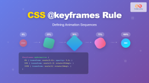
      @keyframes fadeIn {
        0% {
          opacity: 0;
        }
        100% {
          opacity: 1;
        }
      }
    </style>
  </head>
  <body>
    <div class="fade-in"></div>
  </body>
</html>
In this example, the fadeIn animation is defined using @keyframes, and the animation property is used to apply this animation to a div element.
Slide-In Animation
This example demonstrates a slide-in animation using the animation property.
<!DOCTYPE html>
<html>
  <head>
    <title>Slide-In Animation</title>
    <style>
      .slide-in {
        width: 100px;
        height: 100px;
        background-color: blue;
        position: relative;
        animation: slideIn 2s ease-in-out;
      }

      @keyframes slideIn {
        0% {
          left: -100px;
        }
        100% {
          left: 0;
        }
      }
    </style>
  </head>
  <body>
    <div class="slide-in"></div>
  </body>
</html>
Here, the slideIn animation moves the element from left to right, creating a slide-in effect.
Rotation Animation
This example demonstrates a rotation animation using the animation property.
<!DOCTYPE html>
<html>
  <head>
    <title>Rotation Animation</title>
    <style>
      .rotate {
        width: 100px;
        height: 100px;
        background-color: green;
        animation: rotate 2s linear infinite;
      }

      @keyframes rotate {
        0% {
          transform: rotate(0deg);
        }
        100% {
          transform: rotate(360deg);
        }
      }
    </style>
  </head>
  <body>
    <div class="rotate"></div>
  </body>
</html>
In this example, the rotate animation rotates the element continuously using the infinite iteration count.
Advanced Techniques with the animation Property
Let’s explore some advanced techniques using the animation property to create more complex animations.
Multiple Animations
You can apply multiple animations to a single element by separating them with commas.
<!DOCTYPE html>
<html>
  <head>
    <title>Multiple Animations</title>
    <style>
      .multiple-animations {
        width: 100px;
        height: 100px;
        background-color: purple;
        position: relative;
        animation: fadeIn 2s ease-in-out, slideIn 2s ease-in-out;
      }

      @keyframes fadeIn {
        0% {
          opacity: 0;
        }
        100% {
          opacity: 1;
        }
      }

      @keyframes slideIn {
        0% {
          left: -100px;
        }
        100% {
          left: 0;
        }
      }
    </style>
  </head>
  <body>
    <div class="multiple-animations"></div>
  </body>
</html>
In this example, both fadeIn and slideIn animations are applied to the element.
Combining Sub-Properties
You can use individual animation properties along with the animation shorthand for more control.
<!DOCTYPE html>
<html>
  <head>
    <title>Combining Sub-Properties</title>
    <style>
      .combined-animation {
        width: 100px;
        height: 100px;
        background-color: orange;
        animation-name: rotate;
        animation-duration: 3s;
        animation-timing-function: linear;
        animation-iteration-count: infinite;
      }

      @keyframes rotate {
        0% {
          transform: rotate(0deg);
        }
        100% {
          transform: rotate(360deg);
        }
      }
    </style>
  </head>
  <body>
    <div class="combined-animation"></div>
  </body>
</html>
Here, the animation-name, animation-duration, animation-timing-function, and animation-iteration-count properties are used in conjunction with the @keyframes rule.
Real-World Applications of the animation Property
The animation property is used in various applications, including:
- Loading Indicators: Creating animated loading spinners and progress bars.
- UI Enhancements: Adding subtle animations to buttons, menus, and other UI elements.
- Page Transitions: Animating the appearance and disappearance of page elements.
- Interactive Effects: Creating dynamic effects based on user interactions.
Use Case Example: Animated Button
Let’s create a practical example that demonstrates how to use the animation property to add an animated hover effect to a button.
<!DOCTYPE html>
<html>
  <head>
    <title>Animated Button</title>
    <style>
      .animated-button {
        padding: 10px 20px;
        background-color: #4caf50;
        color: white;
        border: none;
        cursor: pointer;
        animation: pulse 2s infinite;
      }

      @keyframes pulse {
        0% {
          transform: scale(1);
        }
        50% {
          transform: scale(1.1);
        }
        100% {
          transform: scale(1);
        }
      }
    </style>
  </head>
  <body>
    <button class="animated-button">Click Me</button>
  </body>
</html>
In this example, the button pulses slightly, providing a visual cue to the user.
Browser Support
The animation property is well-supported across modern browsers. Here is a general overview:
- Chrome: Supported
- Edge: Supported
- Firefox: Supported
- Safari: Supported
- Opera: Supported
- Internet Explorer: Supported from version 10
Tips and Best Practices
- Keep Animations Subtle: Use animations sparingly to avoid overwhelming the user.
- Optimize Performance: Use hardware-accelerated properties like
transformandopacityfor better performance. - Provide Fallbacks: Ensure your site is still usable if animations are disabled or not supported.
- Test Across Browsers: Always test your animations across different browsers to ensure consistency.
Conclusion
The animation property in CSS is a powerful tool for creating dynamic and engaging web animations. By understanding its syntax, values, and practical applications, you can create visually appealing and interactive user experiences. Whether you’re adding subtle UI enhancements or creating complex animated sequences, the animation property provides the flexibility and control you need to bring your web designs to life.

