
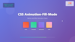
CSS animation-fill-mode: Controlling Styles Before and After Animation
The animation-fill-mode property in CSS specifies how a CSS animation should apply styles to the target element before and after the animation’s execution. This property is essential for maintaining the desired visual state of an element when the animation is not actively running. It determines whether the animation’s styles should be retained, removed, or applied in a forward or backward manner.
Purpose of animation-fill-mode
The primary purpose of animation-fill-mode is to manage the visual state of an animated element outside the animation’s active period. This is particularly useful when you want the element to either retain the final animation state, revert to its original style, or apply the initial animation state.
Syntax
The animation-fill-mode property accepts one of the following values:
animation-fill-mode: none | forwards | backwards | both | initial | inherit;
animation-fill-mode Values
| Value | Description |
|---|---|
| `none` | Default value. The animation does not apply any styles to the element before or after the animation is playing. The element reverts to its original style. |
| `forwards` | The element retains the style values that are set by the last keyframe encountered during the animation’s execution. |
| `backwards` | The element gets the style values that are defined in the first keyframe as soon as the animation is applied, and retains these during the `animation-delay` period. |
| `both` | The animation will follow the rules for both `forwards` and `backwards`. That is: extending the animation properties in both directions. |
| `initial` | Sets this property to its default value (i.e., `none`). |
| `inherit` | Inherits this property from its parent element. |
Basic Examples
Let’s explore each value of animation-fill-mode with examples.
none
The default value. The element reverts to its original styles after the animation.
<style>
  .box_none {
    width: 100px;
    height: 100px;
    background-color: lightblue;
    position: relative;
    animation-name: slide_none;
    animation-duration: 3s;
    animation-fill-mode: none;
  }

  @keyframes slide_none {
    from {
      left: 0;
    }
    to {
      left: 200px;
    }
  }
</style>

<div class="box_none">none</div>
After the animation, the div returns to its original position.
forwards
The element retains the styles from the last keyframe of the animation.
<style>
  .box_forwards {
    width: 100px;
    height: 100px;
    background-color: lightblue;
    position: relative;
    animation-name: slide_forwards;
    animation-duration: 3s;
    animation-fill-mode: forwards;
  }

  @keyframes slide_forwards {
    from {
      left: 0;
    }
    to {
      left: 200px;
    }
  }
</style>

<div class="box_forwards">forwards</div>
After the animation, the div stays at left: 200px;.
backwards
The element applies the styles from the first keyframe immediately when the animation is applied, during the animation-delay period.
<style>
  .box_backwards {
    width: 100px;
    height: 100px;
    background-color: lightblue;
    position: relative;
    animation-name: slide_backwards;
    animation-duration: 3s;
    animation-delay: 1s;
    animation-fill-mode: backwards;
  }

  @keyframes slide_backwards {
    from {
      left: 200px;
    }
    to {
      left: 0;
    }
  }
</style>

<div class="box_backwards">backwards</div>
The div starts at left: 200px; during the 1-second delay, then animates back to left: 0;.
both
Combines the effects of forwards and backwards.
<style>
  .box_both {
    width: 100px;
    height: 100px;
    background-color: lightblue;
    position: relative;
    animation-name: slide_both;
    animation-duration: 3s;
    animation-delay: 1s;
    animation-fill-mode: both;
  }

  @keyframes slide_both {
    from {
      left: 0;
    }
    to {
      left: 200px;
    }
  }
</style>

<div class="box_both">both</div>
The div starts at left: 0; during the 1-second delay, animates to left: 200px;, and stays there after the animation.
Practical Examples
Retaining the Final State of a Fade-In Animation
<style>
  .fade_in {
    width: 100px;
    height: 100px;
    background-color: red;
    animation: fade_in_animation 2s forwards;
  }

  @keyframes fade_in_animation {
    from {
      opacity: 0;
    }
    to {
      opacity: 1;
    }
  }
</style>

<div class="fade_in">Fade In</div>
In this example, the animation-fill-mode: forwards; ensures that after the fade-in animation completes, the element remains fully opaque. Without forwards, the element would revert to opacity: 0;.
Starting an Animation in Its End State
<style>
  .start_end {
    width: 100px;
    height: 100px;
    background-color: green;
    position: relative;
    animation: move_start_end 2s backwards;
  }

  @keyframes move_start_end {
    from {
      left: 200px;
    }
    to {
      left: 0;
    }
  }
</style>

<div class="start_end">Start End</div>
Here, animation-fill-mode: backwards; makes the element start in the animation’s end state (left: 200px;) before animating to its start state (left: 0;).
Combining Forward and Backward Fills
<style>
  .fill_both {
    width: 100px;
    height: 100px;
    background-color: blue;
    position: relative;
    animation: move_fill_both 2s 1s both;
  }

  @keyframes move_fill_both {
    from {
      left: 0;
      opacity: 0;
    }
    to {
      left: 200px;
      opacity: 1;
    }
  }
</style>

<div class="fill_both">Fill Both</div>
The animation-fill-mode: both; ensures the element starts with left: 0; and opacity: 0; during the animation-delay, then animates to left: 200px; and opacity: 1;, and stays there after the animation.
Real-World Applications of animation-fill-mode
- Maintaining Animation State: Ensuring UI elements (e.g., notifications, loaders) retain their final animated state.
- Transitions: Starting animations from a defined end state for smooth transitions.
- Interactive Animations: Preserving animation outcomes based on user interactions.
- Progress Indicators: Keeping progress bars or spinners in their final state upon completion.
Best Practices
- Consistent Styling: Use
animation-fill-modeto maintain consistent styling before, during, and after animations. - Performance: Be mindful of complex animations affecting performance, especially on mobile devices.
- Testing: Test animations across different browsers and devices to ensure compatibility.
Browser Support
The animation-fill-mode property is widely supported across modern browsers.
* Chrome\
* Edge\
* Firefox\
* Safari\
* Opera
Conclusion
The animation-fill-mode property is a powerful tool for managing the visual state of animated elements. By mastering its values, you can create more refined and professional-looking animations, ensuring that your web applications provide a polished user experience. Understanding how to use this property effectively allows you to maintain consistent styling and create seamless transitions in your web designs.
Related Posts
CSS Animation-Fill-Mode: Complete Guide to Before and After Animation States
The animation-fill-mode property is one of the most powerful yet underutilized features in CSS animations. It determines how an element...
CSS Style animation Property: CSS Animation
CSS animation Property: A Comprehensive Guide to CSS Animations The animation property in CSS is a shorthand property used to...
CSS Style animationDuration Property: CSS Animation Duration
Understanding the animationDuration Property in CSS The animationDuration property in CSS specifies the length of time that an animation should...
CSS Style animationTimingFunction Property: CSS Animation Timing Function
CSS Style animationTimingFunction Property: A Comprehensive Guide The animation-timing-function property in CSS is a crucial component for controlling the pace...
CSS Style animationName Property: CSS Animation Name
CSS animationName Property: A Comprehensive Guide The CSS animationName property specifies the name of the @keyframes at-rule that defines the...
CSS Animation-Name: Complete Guide to Connecting Animations to Elements
The animation-name property is the bridge that connects your carefully crafted keyframe animations to HTML elements. Without this crucial CSS...
CSS Animation-Delay: Master Timing Control for Perfect Web Animations
What is CSS Animation-Delay? The animation-delay property in CSS controls when an animation starts after it's been applied to an...
CSS Style animationIterationCount Property: CSS Animation Iteration Count
CSS animation-iteration-count Property: Controlling Animation Loops The animation-iteration-count property in CSS specifies the number of times an animation should play....
CSS Style animationDirection Property: CSS Animation Direction
CSS Style animation-direction Property: Controlling CSS Animation Direction The animation-direction property in CSS specifies the direction in which an animation...
CSS Style transition Property: CSS Transition
CSS transition Property: A Comprehensive Guide The CSS transition property is a powerful tool for creating smooth animations when CSS...
CSS Style animationDelay Property: CSS Animation Delay
Understanding the CSS animationDelay Property The CSS animationDelay property specifies the amount of time to wait from when the element...
JavaScript animationend Event: Triggered on Animation End
JavaScript animationend Event: Triggered on Animation Completion The animationend event in JavaScript is a crucial tool for web developers working...


