
CSS Style animation-direction Property: Controlling CSS Animation Direction
The animation-direction property in CSS specifies the direction in which an animation should play. It allows you to control whether the animation plays forward, backward, or alternates between forward and backward on each iteration. This property is essential for creating dynamic and engaging user interfaces by adding nuanced control over animation playback.
Purpose of animation-direction
The primary purpose of the animation-direction property is to define the direction of an animation’s playback. It enables you to:
- Play animations in reverse.
- Alternate the animation direction on each iteration.
- Create looping animations with smooth transitions.
- Enhance user experience with visually appealing effects.
Syntax
The animation-direction property accepts several values, each defining a different animation playback direction.
animation-direction: normal | reverse | alternate | alternate-reverse | initial | inherit;
Values
| Value | Description |
|---|---|
| `normal` | The animation plays forward each time it cycles. This is the default value. |
| `reverse` | The animation plays backward each time it cycles. |
| `alternate` | The animation plays forward first, then backward, and so on. |
| `alternate-reverse` | The animation plays backward first, then forward, and so on. |
| `initial` | Sets this property to its default value (`normal`). |
| `inherit` | Inherits this property from its parent element. |
Examples
Let’s explore how to use the animation-direction property with practical examples.
1. Basic Animation
First, let’s define a simple animation that moves an element from left to right.
<style>
  .box_animation_direction_basic {
    width: 100px;
    height: 100px;
    background-color: red;
    position: relative;
    animation-name: slide;
    animation-duration: 3s;
  }

  @keyframes slide {
    from {
      left: 0;
    }
    to {
      left: 200px;
    }
  }
</style>

<div class="box_animation_direction_basic"></div>
This code defines a red box that slides from left to right over 3 seconds.
2. animation-direction: reverse
Now, let’s make the animation play in reverse.
<style>
  .box_animation_direction_reverse {
    width: 100px;
    height: 100px;
    background-color: blue;
    position: relative;
    animation-name: slide_reverse;
    animation-duration: 3s;
    animation-direction: reverse;
  }

  @keyframes slide_reverse {
    from {
      left: 200px;
    }
    to {
      left: 0;
    }
  }
</style>

<div class="box_animation_direction_reverse"></div>
The box now slides from right to left.
3. animation-direction: alternate
To make the animation alternate direction, use the alternate value.
<style>
  .box_animation_direction_alternate {
    width: 100px;
    height: 100px;
    background-color: green;
    position: relative;
    animation-name: slide_alternate;
    animation-duration: 3s;
    animation-direction: alternate;
    animation-iteration-count: infinite;
  }

  @keyframes slide_alternate {
    from {
      left: 0;
    }
    to {
      left: 200px;
    }
  }
</style>

<div class="box_animation_direction_alternate"></div>
The box now slides back and forth continuously.
4. animation-direction: alternate-reverse
The alternate-reverse value starts the animation in reverse, then alternates.
<style>
  .box_animation_direction_alternate_reverse {
    width: 100px;
    height: 100px;
    background-color: orange;
    position: relative;
    animation-name: slide_alternate_reverse;
    animation-duration: 3s;
    animation-direction: alternate-reverse;
    animation-iteration-count: infinite;
  }

  @keyframes slide_alternate_reverse {
    from {
      left: 0;
    }
    to {
      left: 200px;
    }
  }
</style>

<div class="box_animation_direction_alternate_reverse"></div>
The box starts sliding from right to left, then alternates.
5. Combining with Other Animation Properties
Let’s combine animation-direction with other animation properties for a more complex effect.
<style>
  .box_animation_direction_combined {
    width: 100px;
    height: 100px;
    background-color: purple;
    position: relative;
    animation-name: combined_animation;
    animation-duration: 2s;
    animation-direction: alternate;
    animation-iteration-count: infinite;
    animation-timing-function: ease-in-out;
  }

  @keyframes combined_animation {
    0% {
      left: 0;
      top: 0;
      background-color: purple;
    }
    50% {
      left: 150px;
      top: 50px;
      background-color: yellow;
    }
    100% {
      left: 0;
      top: 0;
      background-color: purple;
    }
  }
</style>

<div class="box_animation_direction_combined"></div>
This code creates an animation that moves the box diagonally and changes its color while alternating directions.
Real-World Applications of animation-direction
The animation-direction property is used in various scenarios to enhance user experience:
- Loading Indicators: Creating smooth and continuous loading animations.
- Interactive Buttons: Providing visual feedback with subtle directional animations.
- Carousel Effects: Implementing carousel animations that move items smoothly in both directions.
- Game Development: Animating characters and objects with realistic movements.
Use Case Example: Creating a Bouncing Ball Animation
Let’s create a practical example that demonstrates how to use the animation-direction property to simulate a bouncing ball.
<style>
  .ball_animation_direction_usecase {
    width: 50px;
    height: 50px;
    background-color: #3498db;
    border-radius: 50%;
    position: relative;
    animation: bounce 1.5s ease-in-out infinite alternate;
  }

  @keyframes bounce {
    0% {
      transform: translateY(0);
    }
    100% {
      transform: translateY(200px);
    }
  }
</style>

<div class="ball_animation_direction_usecase"></div>
This code creates a bouncing ball effect by using the alternate value of the animation-direction property.
This example showcases:
- Smooth Transitions: Using
ease-in-outfor a natural bouncing effect. - Infinite Looping: The animation repeats indefinitely with
infinite. - Alternate Direction: The ball moves up and down seamlessly.
Browser Support
The animation-direction property is supported by all modern web browsers, ensuring consistent animation behavior across different platforms.
Note: It’s always a good practice to test your animations across multiple browsers to ensure compatibility and optimal performance. 🧐
Tips and Best Practices
- Combine with Other Properties: Use
animation-directionwith other animation properties likeanimation-duration,animation-timing-function, andanimation-iteration-countfor more complex animations. - Use Keyframes Effectively: Define keyframes that create smooth and visually appealing transitions.
- Test Across Browsers: Ensure your animations work consistently across different browsers and devices.
- Keep Animations Subtle: Overusing animations can distract users, so use them sparingly and purposefully.
Conclusion
The animation-direction property is a powerful tool for controlling the playback direction of CSS animations. By understanding its values and how to combine it with other animation properties, you can create dynamic and engaging user interfaces that enhance the overall user experience. Happy animating!
Related Posts
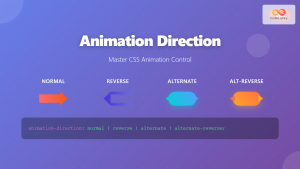
CSS Animation-Direction: Master Normal, Reverse, Alternate Animation Control
The animation-direction property in CSS gives you complete control over how your animations play, whether they run forward, backward, or...
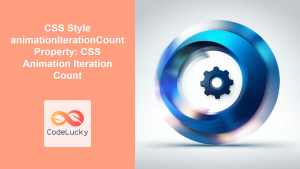
CSS Style animationIterationCount Property: CSS Animation Iteration Count
CSS animation-iteration-count Property: Controlling Animation Loops The animation-iteration-count property in CSS specifies the number of times an animation should play....
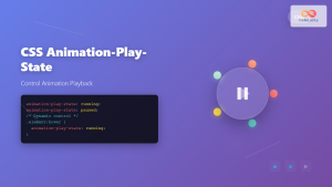
CSS Animation-Play-State: Complete Guide to Pausing and Resuming Animations
What is CSS Animation-Play-State? The animation-play-state property is a powerful CSS feature that allows developers to control whether an animation...
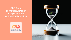
CSS Style animationDuration Property: CSS Animation Duration
Understanding the animationDuration Property in CSS The animationDuration property in CSS specifies the length of time that an animation should...
CSS Style animation Property: CSS Animation
CSS animation Property: A Comprehensive Guide to CSS Animations The animation property in CSS is a shorthand property used to...
CSS Style animationFillMode Property: CSS Animation Fill Mode
CSS animation-fill-mode: Controlling Styles Before and After Animation The animation-fill-mode property in CSS specifies how a CSS animation should apply...
CSS Style animationTimingFunction Property: CSS Animation Timing Function
CSS Style animationTimingFunction Property: A Comprehensive Guide The animation-timing-function property in CSS is a crucial component for controlling the pace...
CSS Style animationName Property: CSS Animation Name
CSS animationName Property: A Comprehensive Guide The CSS animationName property specifies the name of the @keyframes at-rule that defines the...
CSS Animation Property: Complete Guide to Keyframe-Based Animations
CSS animations bring life to web pages by allowing elements to transition smoothly between different states over time. The animation...
CSS Animation-Name: Complete Guide to Connecting Animations to Elements
The animation-name property is the bridge that connects your carefully crafted keyframe animations to HTML elements. Without this crucial CSS...
CSS Animation-Delay: Master Timing Control for Perfect Web Animations
What is CSS Animation-Delay? The animation-delay property in CSS controls when an animation starts after it's been applied to an...
CSS @keyframes Rule: Complete Guide to Creating Smooth Animation Sequences
CSS animations bring life to web interfaces, and the @keyframes rule is the foundation that makes complex animation sequences possible....


