
Understanding the CSS animationDelay Property
The CSS animationDelay property specifies the amount of time to wait from when the element loads until the animation sequence begins. This property allows you to control when an animation starts, creating staggered effects or synchronizing animations with other events on your webpage.
Purpose of animationDelay
The main purpose of the animationDelay property is to:
- Delay the start of an animation.
- Create staggered animation effects.
- Synchronize animations with other page events or user interactions.
- Control the timing of complex animation sequences.
Syntax
The animationDelay property accepts a time value, specified in seconds (s) or milliseconds (ms).
animation-delay: time;
Possible Values
| Value | Description |
|---|---|
| `time` | Specifies the delay before the animation starts. Can be a positive value (delay) or a negative value (animation starts partway through). |
| `0s` | The animation starts immediately (default value). |
| `2s` | The animation starts after a 2-second delay. |
| `-1s` | The animation starts 1 second into the animation sequence. |
| `inherit` | The animation-delay property inherits from its parent element. |
Examples
Basic Delay
This example demonstrates a simple delay before the animation starts.
<!DOCTYPE html>
<html>
  <head>
    <title>Basic Animation Delay</title>
    <style>
      .box_delay_basic {
        width: 100px;
        height: 100px;
        background-color: red;
        animation-name: slide;
        animation-duration: 2s;
        animation-delay: 1s;
        animation-iteration-count: infinite;
      }

      @keyframes slide {
        from {
          margin-left: 0%;
        }
        to {
          margin-left: 100%;
        }
      }
    </style>
  </head>
  <body>
    <div class="box_delay_basic"></div>
  </body>
</html>
In this example, the box_delay_basic element will wait for 1 second before starting the slide animation.
Staggered Animations
Create a staggered animation effect using different animationDelay values for multiple elements.
<!DOCTYPE html>
<html>
  <head>
    <title>Staggered Animations</title>
    <style>
      .box_delay_staggered {
        width: 50px;
        height: 50px;
        background-color: blue;
        margin-bottom: 5px;
        animation-name: fade;
        animation-duration: 1s;
        animation-iteration-count: infinite;
      }

      .box_delay_staggered:nth-child(1) {
        animation-delay: 0s;
      }

      .box_delay_staggered:nth-child(2) {
        animation-delay: 0.5s;
      }

      .box_delay_staggered:nth-child(3) {
        animation-delay: 1s;
      }

      @keyframes fade {
        from {
          opacity: 0;
        }
        to {
          opacity: 1;
        }
      }
    </style>
  </head>
  <body>
    <div class="box_delay_staggered"></div>
    <div class="box_delay_staggered"></div>
    <div class="box_delay_staggered"></div>
  </body>
</html>
Here, each box_delay_staggered element starts its fade animation with an increasing delay, creating a staggered effect.
Negative Delay
Using a negative value for animationDelay causes the animation to start partway through its cycle.
<!DOCTYPE html>
<html>
  <head>
    <title>Negative Animation Delay</title>
    <style>
      .box_delay_negative {
        width: 100px;
        height: 100px;
        background-color: green;
        animation-name: rotate;
        animation-duration: 4s;
        animation-delay: -2s;
        animation-iteration-count: infinite;
        animation-timing-function: linear;
      }

      @keyframes rotate {
        from {
          transform: rotate(0deg);
        }
        to {
          transform: rotate(360deg);
        }
      }
    </style>
  </head>
  <body>
    <div class="box_delay_negative"></div>
  </body>
</html>
In this case, the rotate animation will start 2 seconds into its cycle, effectively skipping the first half of the animation.
Combining with Other Animation Properties
The animationDelay property works seamlessly with other animation properties like animationDuration, animationIterationCount, and animationTimingFunction.
<!DOCTYPE html>
<html>
  <head>
    <title>Combined Animation Properties</title>
    <style>
      .box_delay_combined {
        width: 100px;
        height: 100px;
        background-color: orange;
        animation-name: pulse;
        animation-duration: 1.5s;
        animation-delay: 0.2s;
        animation-iteration-count: infinite;
        animation-timing-function: ease-in-out;
      }

      @keyframes pulse {
        0% {
          transform: scale(1);
        }
        50% {
          transform: scale(1.2);
        }
        100% {
          transform: scale(1);
        }
      }
    </style>
  </head>
  <body>
    <div class="box_delay_combined"></div>
  </body>
</html>
Here, the pulse animation starts with a slight delay, has a duration of 1.5 seconds, repeats infinitely, and uses an ease-in-out timing function.
Real-World Use Cases
- Loading Animations: Delay the appearance of elements to create a sense of loading content progressively.
- Interactive Effects: Synchronize animations with user interactions like hover or click events.
- Storytelling: Animate elements in a specific order to guide the user’s attention through a narrative.
- UI Transitions: Create smooth transitions between different states of a UI component.
Tips and Best Practices
- Keep it Subtle: Use delays judiciously to enhance the user experience without causing unnecessary waiting.
- Synchronize with Events: Use JavaScript to dynamically set
animationDelayvalues based on user actions or data loading. - Test Performance: Ensure that animations with delays do not negatively impact page performance, especially on mobile devices.
- Accessibility: Be mindful of users with vestibular disorders. Excessive or unexpected animations can be disorienting.
Browser Support
The animationDelay property is widely supported across modern browsers.
- Chrome
- Edge
- Firefox
- Safari
- Opera
Conclusion
The animationDelay property is a powerful tool for controlling the timing of CSS animations, enabling you to create sophisticated and engaging web experiences. By understanding its syntax, values, and use cases, you can effectively use delays to enhance your animations and improve the overall user experience.
Related Posts
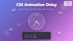
CSS Animation-Delay: Master Timing Control for Perfect Web Animations
What is CSS Animation-Delay? The animation-delay property in CSS controls when an animation starts after it's been applied to an...

CSS Style animationDuration Property: CSS Animation Duration
Understanding the animationDuration Property in CSS The animationDuration property in CSS specifies the length of time that an animation should...
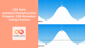
CSS Style animationTimingFunction Property: CSS Animation Timing Function
CSS Style animationTimingFunction Property: A Comprehensive Guide The animation-timing-function property in CSS is a crucial component for controlling the pace...
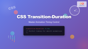
CSS Transition-Duration: Complete Guide to Animation Timing Control
What is CSS Transition-Duration? The transition-duration property in CSS defines how long a transition animation should take to complete. It's...
JavaScript TransitionEvent elapsedTime Property: Transition Duration
JavaScript TransitionEvent elapsedTime Property: Understanding Transition Durations The elapsedTime property of the JavaScript TransitionEvent interface is a crucial element for...

CSS Style animation Property: CSS Animation
CSS animation Property: A Comprehensive Guide to CSS Animations The animation property in CSS is a shorthand property used to...

CSS Style animationIterationCount Property: CSS Animation Iteration Count
CSS animation-iteration-count Property: Controlling Animation Loops The animation-iteration-count property in CSS specifies the number of times an animation should play....
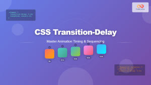
CSS Transition-Delay: Master Animation Timing and Sequencing
The transition-delay property in CSS is a powerful tool that allows you to control when a transition animation begins. Unlike...
CSS Style transition Property: CSS Transition
CSS transition Property: A Comprehensive Guide The CSS transition property is a powerful tool for creating smooth animations when CSS...

CSS Animation Property: Complete Guide to Keyframe-Based Animations
CSS animations bring life to web pages by allowing elements to transition smoothly between different states over time. The animation...

CSS Style animationName Property: CSS Animation Name
CSS animationName Property: A Comprehensive Guide The CSS animationName property specifies the name of the @keyframes at-rule that defines the...
CSS Transition-Timing-Function: Master Easing and Animation Curves for Smooth Web Animations
The transition-timing-function property in CSS is a powerful tool that controls how intermediate values are calculated during a transition. It...


