
CSS align-self Property: Mastering Individual Item Alignment in Flexbox and Grid
The CSS align-self property is a powerful tool for web developers, allowing precise control over the vertical alignment of individual items within a flexbox or grid container. It overrides the align-items property set on the container, providing granular control over specific items that need unique alignment within the layout. This comprehensive guide will walk you through the essentials of the align-self property, its syntax, values, and practical examples.
What is the align-self Property?
The align-self property specifies the alignment of a single item inside a flexbox or grid container along the cross axis (the axis perpendicular to the main axis). In flexbox layouts, this typically controls vertical alignment (if flex-direction is row) or horizontal alignment (if flex-direction is column). In grid layouts, align-self aligns items within their grid area along the block (column) axis.
Purpose of the align-self Property
The primary purpose of the align-self property is to:
- Override the default alignment set by
align-itemson the flexbox or grid container. - Fine-tune the alignment of specific items that require unique positioning.
- Create visually appealing and responsive layouts with precise item placement.
- Handle exceptions and edge cases within a general alignment strategy.
Syntax and Values
The align-self property accepts several values that dictate how an item is aligned within its container.
Syntax:
align-self: auto | stretch | center | flex-start | flex-end | baseline | initial | inherit;
align-self Values
| Value | Description |
|---|---|
| `auto` | The item inherits the `align-items` property value from its parent. For grid items, it behaves as `stretch` unless the item has a fixed size. |
| `stretch` | The item stretches to fill the container’s cross-axis space. Respects `min-width`/`min-height`/`max-width`/`max-height`. |
| `center` | The item is centered within the container along the cross axis. |
| `flex-start` | The item is aligned to the start of the container’s cross axis. |
| `flex-end` | The item is aligned to the end of the container’s cross axis. |
| `baseline` | The item is aligned based on its baseline. |
| `initial` | Sets the property to its default value (`auto`). |
| `inherit` | Inherits this property from its parent element. |
Practical Examples
Let’s explore some practical examples demonstrating how the align-self property works within flexbox and grid layouts.
Flexbox Example
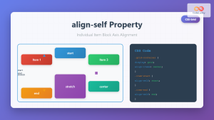
In this example, we’ll create a flexbox container with three items. The container’s align-items property is set to center, but we’ll use align-self to override this for the second item.
<div class="flex-container-align-self">
  <div class="flex-item-align-self">Item 1</div>
  <div class="flex-item-align-self align-self-start">Item 2</div>
  <div class="flex-item-align-self">Item 3</div>
</div>
.flex-container-align-self {
  display: flex;
  height: 200px;
  background-color: #f0f0f0;
  align-items: center; /* Default alignment for all items */
  border: 1px solid black;
}

.flex-item-align-self {
  width: 100px;
  padding: 10px;
  text-align: center;
  background-color: #ddd;
  border: 1px solid #ccc;
}

.align-self-start {
  align-self: flex-start; /* Overriding alignment for Item 2 */
}
.flex-container-align-self-output {
  display: flex;
  height: 200px;
  background-color: #f0f0f0;
  align-items: center; /* Default alignment for all items */
  border: 1px solid black;
}

.flex-item-align-self-output {
  width: 100px;
  padding: 10px;
  text-align: center;
  background-color: #ddd;
  border: 1px solid #ccc;
}

.align-self-start-output {
  align-self: flex-start; /* Overriding alignment for Item 2 */
}
In this flexbox example, the second item is aligned to the top of the container, overriding the default center alignment applied to all items by the align-items property of the container. ✅
Grid Example
Now, let’s see how align-self works in a grid layout. We’ll create a 3×3 grid and use align-self to position one of the items at the bottom of its grid cell.
<div class="grid-container-align-self">
  <div>Item 1</div>
  <div>Item 2</div>
  <div>Item 3</div>
  <div>Item 4</div>
  <div class="align-self-end-grid">Item 5</div>
  <div>Item 6</div>
  <div>Item 7</div>
  <div>Item 8</div>
  <div>Item 9</div>
</div>
.grid-container-align-self {
  display: grid;
  grid-template-columns: repeat(3, 1fr);
  grid-gap: 10px;
  height: 300px;
  background-color: #f0f0f0;
  border: 1px solid black;
}

.grid-container-align-self > div {
  padding: 20px;
  text-align: center;
  background-color: #ddd;
  border: 1px solid #ccc;
}

.align-self-end-grid {
  align-self: end; /* Aligning Item 5 to the bottom of its grid cell */
}
.grid-container-align-self-output {
  display: grid;
  grid-template-columns: repeat(3, 1fr);
  grid-gap: 10px;
  height: 300px;
  background-color: #f0f0f0;
  border: 1px solid black;
}

.grid-container-align-self-output > div {
  padding: 20px;
  text-align: center;
  background-color: #ddd;
  border: 1px solid #ccc;
}

.align-self-end-grid-output {
  align-self: end; /* Aligning Item 5 to the bottom of its grid cell */
}
In this grid layout, the fifth item is aligned to the bottom of its grid cell due to the align-self: end property, demonstrating how it overrides the default alignment. 🎉
Combining align-self with Other Alignment Properties
align-self can be combined with other alignment properties like justify-self to control both the vertical and horizontal alignment of an item within its container.
<div class="grid-container-combined">
  <div>Item 1</div>
  <div class="combined-alignment">Item 2</div>
  <div>Item 3</div>
</div>
.grid-container-combined {
  display: grid;
  grid-template-columns: repeat(3, 1fr);
  grid-gap: 10px;
  height: 200px;
  background-color: #f0f0f0;
  border: 1px solid black;
}

.grid-container-combined > div {
  padding: 20px;
  text-align: center;
  background-color: #ddd;
  border: 1px solid #ccc;
}

.combined-alignment {
  align-self: center; /* Vertical alignment */
  justify-self: center; /* Horizontal alignment */
}
.grid-container-combined-output {
  display: grid;
  grid-template-columns: repeat(3, 1fr);
  grid-gap: 10px;
  height: 200px;
  background-color: #f0f0f0;
  border: 1px solid black;
}

.grid-container-combined-output > div {
  padding: 20px;
  text-align: center;
  background-color: #ddd;
  border: 1px solid #ccc;
}

.combined-alignment-output {
  align-self: center; /* Vertical alignment */
  justify-self: center; /* Horizontal alignment */
}
In this scenario, the second item is perfectly centered both vertically and horizontally within its grid cell, showcasing the combined effect of align-self and justify-self. 🧠
Common Use Cases
- Vertical Centering: Aligning a specific element vertically within a flexbox container.
- Override Default Alignment: Correcting alignment issues caused by inherited styles or container settings.
- Creating Dynamic Layouts: Adjusting the position of elements based on screen size or user interaction.
- Special Cases in Grids: Aligning specific elements in a grid layout differently from the other elements.
Tips and Best Practices
- Specificity: Be mindful of CSS specificity. Inline styles or more specific selectors can override
align-self. - Testing: Always test your layouts on different screen sizes and browsers to ensure consistent alignment.
- Understand the Context: Ensure you understand the container’s
align-itemsandjustify-contentproperties to effectively usealign-self. - Use Cases: Identify specific elements that require unique alignment and apply
align-selfselectively.
Browser Support
The align-self property is well-supported across modern browsers. Here’s a general overview:
- Chrome: Supported
- Edge: Supported
- Firefox: Supported
- Safari: Supported
- Opera: Supported
- iOS Safari: Supported
- Android Browser: Supported
Note: As with any CSS property, it’s always a good idea to check the latest browser compatibility data on resources like Can I use to ensure support for your target audience. 🌐
Conclusion
The align-self property offers a powerful way to control the alignment of individual items within flexbox and grid layouts. By understanding its values and how it interacts with other alignment properties, you can create more flexible, responsive, and visually appealing web designs. This guide should serve as a solid foundation for mastering individual item alignment in CSS. Happy styling! 🎨
Related Posts
CSS Style alignItems Property: CSS Align Items
Understanding the CSS align-items Property The align-items property in CSS is a powerful tool that defines how items are aligned...
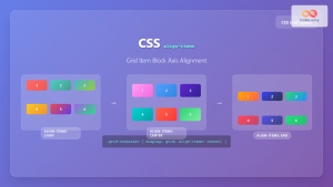
CSS Align-Self: Master Individual Grid Item Block Axis Alignment
The CSS align-self property provides granular control over individual grid items' alignment along the block axis (vertical direction in horizontal...

CSS align-content Property: CSS Align Content
CSS align-content Property: Mastering Content Alignment in Flexbox and Grid Layouts The CSS align-content property is a powerful tool for...
CSS Place-Self: Master Grid and Flexbox Item Positioning with One Property
The CSS place-self property is a powerful shorthand that combines justify-self and align-self into a single declaration, making it easier...

CSS Align-Items: Master Cross-Axis Alignment in Flexbox and Grid
The CSS align-items property is a fundamental tool for controlling cross-axis alignment in both flexbox and CSS Grid layouts. Understanding...
CSS Place-Items: Master Combined Justify and Align Items in One Property
The CSS place-items property is a powerful shorthand that combines justify-items and align-items into a single declaration. This property revolutionizes...
CSS Align-Items: Complete Guide to Grid Item Block Axis Alignment
Understanding CSS Align-Items in Grid Context The CSS align-items property is a powerful tool for controlling how grid items align...
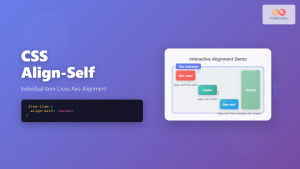
CSS Align-Self: Master Individual Flexbox Item Alignment
The CSS align-self property is a powerful flexbox feature that allows you to override the default cross-axis alignment for individual...
CSS vertical-align Property: CSS Vertical Align
CSS vertical-align Property: Mastering Vertical Alignment The CSS vertical-align property specifies the vertical alignment of an inline or table-cell box....
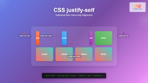
CSS Justify-Self: Master Individual Item Inline Axis Alignment
The justify-self property in CSS is a powerful alignment tool that allows you to control how individual items align themselves...
CSS Align-Content: Complete Guide to Cross-Axis Multi-Line Alignment
The align-content property is a powerful CSS tool that controls how multiple lines of content are distributed along the cross-axis...

CSS Align-Content: Master Grid Container Block Axis Alignment
The CSS align-content property is a powerful tool for controlling how grid items are distributed along the block axis (typically...


