
The CSS align-self property provides granular control over individual grid items’ alignment along the block axis (vertical direction in horizontal writing modes). While align-items sets alignment for all items in a grid container, align-self allows you to override this behavior for specific items, giving you precise control over your grid layout.
Understanding CSS Align-Self in Grid Context
The align-self property works exclusively within CSS Grid and Flexbox contexts. In grid layouts, it controls how an individual grid item aligns within its grid area along the block axis. This property is particularly useful when you need certain items to behave differently from the container’s default alignment.
Basic Syntax
.grid-item {
  align-self: value;
}
Align-Self Values and Their Effects
The align-self property accepts several values, each producing distinct alignment behaviors:
1. Auto (Default)
The auto value inherits the alignment from the parent grid container’s align-items property. This is the default behavior when no explicit align-self value is set.
Example: Auto Alignment
.grid-container {
  display: grid;
  grid-template-columns: repeat(3, 1fr);
  align-items: center;
  height: 200px;
}

.item-2 {
  align-self: auto; /* Inherits center from parent */
}
2. Start
The start value aligns the item to the beginning of its grid area along the block axis, regardless of the container’s alignment setting.
Example: Start Alignment
.grid-container {
  display: grid;
  grid-template-columns: repeat(3, 1fr);
  align-items: center;
  height: 200px;
}

.item-2 {
  align-self: start; /* Aligns to top */
}
3. End
The end value positions the item at the end of its grid area along the block axis.
Example: End Alignment
.grid-container {
  display: grid;
  grid-template-columns: repeat(3, 1fr);
  align-items: center;
  height: 200px;
}

.item-2 {
  align-self: end; /* Aligns to bottom */
}
4. Center
The center value centers the item within its grid area along the block axis.
Example: Center Alignment
.grid-container {
  display: grid;
  grid-template-columns: repeat(3, 1fr);
  align-items: start;
  height: 200px;
}

.item-2 {
  align-self: center; /* Centers vertically */
}
5. Stretch
The stretch value makes the item expand to fill the entire height of its grid area, provided it doesn’t have a fixed height.
Example: Stretch Alignment
.grid-container {
display: grid;
grid-template-columns: repeat(3, 1fr);
align-items: start;
height: 200px;
}
.item-2 {
align-self: stretch; /* Fills full height */
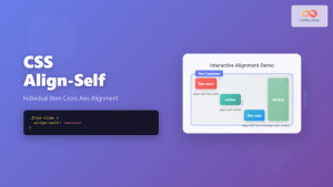
}Interactive Demonstration
Below is an interactive example where you can experiment with different align-self values to see their effects in real-time:
Interactive Align-Self Demo
.grid-container {
  display: grid;
  grid-template-columns: repeat(3, 1fr);
  align-items: center;
  height: 200px;
}

.item-2 {
  align-self: auto;
}
Practical Use Cases
Card Layout with Mixed Heights
In card-based layouts, align-self is invaluable for creating visually appealing arrangements where cards have different content lengths:
Example: Card Layout
Basic Plan
Essential features for small teams
Pro Plan
Advanced features for growing businesses
Includes priority support and analytics
Enterprise
Custom solutions
.card-grid {
  display: grid;
  grid-template-columns: repeat(auto-fit, minmax(200px, 1fr));
  gap: 20px;
}

.card-basic {
  align-self: start; /* Aligns to top */
}

.card-pro {
  align-self: stretch; /* Fills full height */
}

.card-enterprise {
  align-self: end; /* Aligns to bottom */
}
Navigation with Logo Alignment
For navigation bars where you need precise control over item positioning:
Example: Navigation Bar
.navbar {
  display: grid;
  grid-template-columns: auto 1fr auto;
  align-items: center;
  height: 80px;
}

.logo {
  align-self: center; /* Centers vertically */
}

.nav-menu {
  align-self: center; /* Centers navigation */
}

.user-info {
  align-self: end; /* Aligns to bottom */
}
Browser Support and Compatibility
The align-self property enjoys excellent browser support across all modern browsers. It works consistently in:
- Chrome: 57+ (full support)
- Firefox: 52+ (full support)
- Safari: 10.1+ (full support)
- Edge: 16+ (full support)
- Internet Explorer: Limited support (IE 11 with -ms- prefix)
Common Pitfalls and Solutions
1. Stretch Not Working
If align-self: stretch isn’t working, ensure the item doesn’t have a fixed height:
/* This won't stretch */
.item {
  height: 100px;
  align-self: stretch;
}

/* This will stretch */
.item {
  /* No fixed height */
  align-self: stretch;
}
2. Confusion with Align-Items
Remember that align-self overrides align-items. If you’re not seeing expected results, check if there’s a conflicting align-self declaration:
.grid-container {
  align-items: center; /* Default for all items */
}

.special-item {
  align-self: start; /* Overrides the center alignment */
}
Advanced Techniques
Responsive Alignment
Combine align-self with media queries for responsive designs:
.responsive-item {
  align-self: start;
}

@media (max-width: 768px) {
  .responsive-item {
    align-self: stretch; /* Full height on mobile */
  }
}
Animation and Transitions
While align-self itself cannot be animated, you can create smooth transitions by animating related properties:
.animated-item {
  align-self: center;
  transition: transform 0.3s ease;
}

.animated-item:hover {
  transform: translateY(-5px);
}
Best Practices
Follow these guidelines to make the most of align-self:
Use Semantic Alignment: Choose alignment values that make sense for your content. Center important elements, align decorative elements to edges, and stretch elements that should fill space.
Consider Content Flow: Think about how your alignment choices affect the natural reading flow and user experience.
Test Across Devices: Different screen sizes may require different alignment strategies. Test your layouts on various devices to ensure optimal presentation.
Combine with Other Properties: Use align-self alongside justify-self for complete control over item positioning within grid areas.
Conclusion
The CSS align-self property is a powerful tool for achieving precise vertical alignment of individual grid items. By understanding its various values and how they interact with grid containers, you can create sophisticated layouts that respond beautifully to different content types and screen sizes. Whether you’re building card layouts, navigation bars, or complex dashboard interfaces, mastering align-self will significantly enhance your CSS grid capabilities.
Remember to combine align-self with other grid properties like justify-self and grid-area for complete layout control. Practice with different scenarios to build intuition about when and how to use each alignment value effectively.
Related Posts
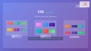
CSS Align-Items: Complete Guide to Grid Item Block Axis Alignment
Understanding CSS Align-Items in Grid Context The CSS align-items property is a powerful tool for controlling how grid items align...

CSS Align-Items: Master Cross-Axis Alignment in Flexbox and Grid
The CSS align-items property is a fundamental tool for controlling cross-axis alignment in both flexbox and CSS Grid layouts. Understanding...
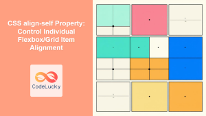
CSS align-self Property: Control Individual Flexbox/Grid Item Alignment
CSS align-self Property: Mastering Individual Item Alignment in Flexbox and Grid The CSS align-self property is a powerful tool for...

CSS Align-Content: Master Grid Container Block Axis Alignment
The CSS align-content property is a powerful tool for controlling how grid items are distributed along the block axis (typically...
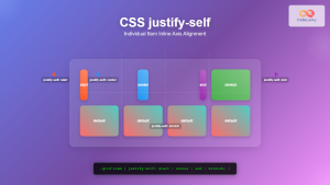
CSS Justify-Self: Master Individual Item Inline Axis Alignment
The justify-self property in CSS is a powerful alignment tool that allows you to control how individual items align themselves...
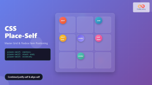
CSS Place-Self: Master Grid and Flexbox Item Positioning with One Property
The CSS place-self property is a powerful shorthand that combines justify-self and align-self into a single declaration, making it easier...
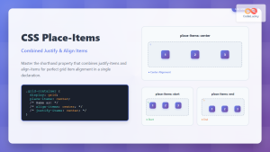
CSS Place-Items: Master Combined Justify and Align Items in One Property
The CSS place-items property is a powerful shorthand that combines justify-items and align-items into a single declaration. This property revolutionizes...
CSS Align-Self: Master Individual Flexbox Item Alignment
The CSS align-self property is a powerful flexbox feature that allows you to override the default cross-axis alignment for individual...
CSS Style alignItems Property: CSS Align Items
Understanding the CSS align-items Property The align-items property in CSS is a powerful tool that defines how items are aligned...
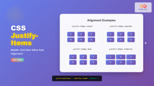
CSS Justify-Items: Complete Guide to Grid Item Inline Axis Alignment
The justify-items property is a powerful CSS Grid feature that controls how grid items are aligned along the inline axis...
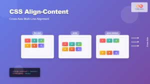
CSS Align-Content: Complete Guide to Cross-Axis Multi-Line Alignment
The align-content property is a powerful CSS tool that controls how multiple lines of content are distributed along the cross-axis...
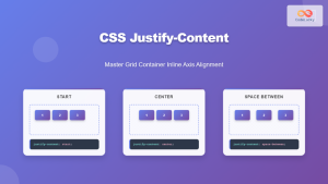
CSS Justify-Content: Master Grid Container Inline Axis Alignment with Examples
The justify-content property is a powerful CSS tool for controlling how grid items are aligned along the inline axis (horizontal...


