
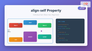
The CSS align-self property is a powerful flexbox feature that allows you to override the default cross-axis alignment for individual flex items. While align-items controls the alignment of all flex items in a container, align-self gives you granular control over specific items.
Understanding CSS Align-Self
The align-self property works exclusively within flexbox layouts and controls how a single flex item aligns along the cross-axis. The cross-axis is perpendicular to the main axis defined by flex-direction.
Basic Syntax
.flex-item {
  align-self: auto | flex-start | flex-end | center | baseline | stretch;
}
Align-Self Values Explained
1. auto (Default)
Inherits the parent container’s align-items value. This is the default behavior.
2. flex-start
Aligns the item to the start of the cross-axis.
3. flex-end
Aligns the item to the end of the cross-axis.
4. center
Centers the item along the cross-axis.
5. baseline
Aligns the item’s baseline with other items’ baselines.
6. stretch
Stretches the item to fill the container’s cross-axis dimension.
Interactive Demo: Align-Self in Action
Try Different Align-Self Values:
Container has align-items: flex-start but each item uses different align-self values.
Practical Examples
Example 1: Card Layout with Special Alignment
Result:
Regular Card
Standard alignment
Bottom Card
Aligned to bottom
Centered Card
Vertically centered
.card-container {
  display: flex;
  gap: 15px;
  align-items: flex-start; /* Default alignment */
}

.card {
  background: white;
  padding: 15px;
  border-radius: 8px;
  flex: 1;
}

.card--bottom {
  align-self: flex-end; /* Override default */
}

.card--center {
  align-self: center; /* Override default */
}
Example 2: Navigation with Logo Alignment
Result:
.navbar {
  display: flex;
  align-items: center;
  background: #2c3e50;
  padding: 10px 20px;
}

.logo {
  align-self: flex-start; /* Align logo to top */
}

.nav-links {
  margin-left: auto;
  display: flex;
  gap: 20px;
}

.cta-button {
  align-self: stretch; /* Stretch to full height */
  margin-left: 20px;
}
Align-Self with Different Flex Directions
Row Direction (Default)
When flex-direction: row, the cross-axis is vertical:
Column Direction
When flex-direction: column, the cross-axis is horizontal:
Common Use Cases
1. Form Layout Enhancement
Use align-self to position form elements uniquely:
2. Media Object Pattern
Align content differently in media objects:

John Doe
This is a longer message that demonstrates how the avatar stays aligned to the top while the content flows naturally. The align-self property keeps the avatar positioned at the start of the cross-axis.
Browser Support and Considerations
The align-self property has excellent browser support across modern browsers:
- Chrome: 21+
- Firefox: 20+
- Safari: 9+
- Edge: 12+
- Internet Explorer: 11+
Important Notes
align-selfonly works on flex items, not the flex container- It overrides the container’s
align-itemsvalue for that specific item - The property has no effect on absolutely positioned elements
- When using
align-self: baseline, ensure items have text content for proper alignment
Advanced Techniques
Combining with Auto Margins
You can combine align-self with auto margins for even more control:
.item-1 {
  align-self: center;
}

.item-2 {
  margin-left: auto; /* Push to right */
  align-self: flex-end; /* Align to bottom */
}
Responsive Alignment
Use media queries to change alignment based on screen size:
.responsive-item {
  align-self: center;
}

@media (max-width: 768px) {
  .responsive-item {
    align-self: stretch; /* Full width on mobile */
  }
}
Best Practices
- Use Sparingly: Don’t override alignment for every item; it defeats the purpose of
align-items - Semantic Naming: Use descriptive class names that indicate the alignment purpose
- Test Across Devices: Ensure your alignment works well on different screen sizes
- Consider Accessibility: Ensure visual alignment doesn’t break logical reading order
- Document Your Code: Comment why specific items need different alignment
Troubleshooting Common Issues
Align-Self Not Working?
Check these common issues:
- Ensure the parent container has
display: flex - Verify you’re applying
align-selfto flex items, not the container - Check if the item has a fixed height that prevents alignment
- Ensure there’s enough space in the cross-axis for the alignment to be visible
Unexpected Behavior with Stretch
If align-self: stretch isn’t working:
- Remove any explicit height/width on the cross-axis
- Ensure the flex container has a defined size on the cross-axis
- Check that no other CSS properties are overriding the stretch behavior
Conclusion
The CSS align-self property is an essential tool for creating sophisticated flexbox layouts. It provides the flexibility to align individual items differently from the container’s default alignment, enabling you to create more dynamic and visually appealing designs.
By understanding how align-self works with different flex directions and combining it with other flexbox properties, you can create complex layouts that adapt beautifully to different content and screen sizes. Remember to use this property judiciously and always consider the overall user experience and accessibility of your designs.
Master align-self along with other flexbox properties, and you’ll have powerful tools for creating modern, responsive web layouts that work consistently across all browsers and devices.
Related Posts

CSS Align-Items: Master Cross-Axis Alignment in Flexbox and Grid
The CSS align-items property is a fundamental tool for controlling cross-axis alignment in both flexbox and CSS Grid layouts. Understanding...
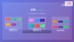
CSS Align-Self: Master Individual Grid Item Block Axis Alignment
The CSS align-self property provides granular control over individual grid items' alignment along the block axis (vertical direction in horizontal...
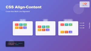
CSS Align-Content: Complete Guide to Cross-Axis Multi-Line Alignment
The align-content property is a powerful CSS tool that controls how multiple lines of content are distributed along the cross-axis...
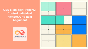
CSS align-self Property: Control Individual Flexbox/Grid Item Alignment
CSS align-self Property: Mastering Individual Item Alignment in Flexbox and Grid The CSS align-self property is a powerful tool for...
CSS Align-Items: Complete Guide to Grid Item Block Axis Alignment
Understanding CSS Align-Items in Grid Context The CSS align-items property is a powerful tool for controlling how grid items align...
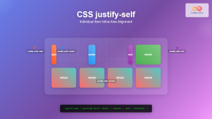
CSS Justify-Self: Master Individual Item Inline Axis Alignment
The justify-self property in CSS is a powerful alignment tool that allows you to control how individual items align themselves...
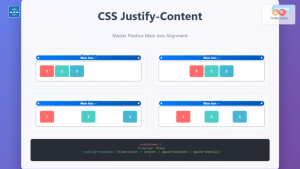
CSS Justify-Content: Complete Guide to Flexbox Main Axis Alignment
The justify-content property is one of the most powerful tools in CSS Flexbox for controlling how flex items are distributed...
CSS Style alignItems Property: CSS Align Items
Understanding the CSS align-items Property The align-items property in CSS is a powerful tool that defines how items are aligned...
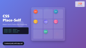
CSS Place-Self: Master Grid and Flexbox Item Positioning with One Property
The CSS place-self property is a powerful shorthand that combines justify-self and align-self into a single declaration, making it easier...
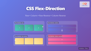
CSS Flex-Direction: Complete Guide to Row, Column, Row-Reverse & Column-Reverse
The flex-direction property is one of the most fundamental aspects of CSS Flexbox, determining how flex items are arranged within...
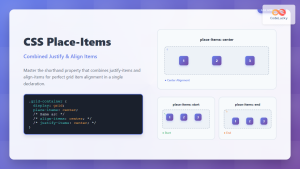
CSS Place-Items: Master Combined Justify and Align Items in One Property
The CSS place-items property is a powerful shorthand that combines justify-items and align-items into a single declaration. This property revolutionizes...

CSS Align-Content: Master Grid Container Block Axis Alignment
The CSS align-content property is a powerful tool for controlling how grid items are distributed along the block axis (typically...


