
Understanding CSS Align-Items in Grid Context
The CSS align-items property is a powerful tool for controlling how grid items align along the block axis (vertical axis in horizontal writing modes) within their grid areas. Unlike flexbox where align-items affects the cross axis, in CSS Grid, this property specifically targets the block axis alignment of grid items within their designated grid cells.
When working with CSS Grid, understanding the distinction between the inline axis (horizontal) and block axis (vertical) is crucial. The align-items property controls alignment along the block axis, while justify-items handles inline axis alignment.
CSS Align-Items Property Syntax
The align-items property accepts several keyword values that determine how grid items are positioned within their grid areas:
.grid-container {
  display: grid;
  align-items: stretch | start | end | center | baseline;
}
Align-Items Values Explained
1. Stretch (Default Value)
The stretch value is the default behavior for align-items. Grid items expand to fill the entire height of their grid area, unless they have a specified height or max-height property.
Stretch Example:
CSS Code:
.grid-container {
  display: grid;
  grid-template-columns: repeat(3, 1fr);
  gap: 10px;
  height: 200px;
  align-items: stretch; /* Default value */
}
2. Start
The start value aligns grid items to the beginning of their grid area along the block axis. Items maintain their natural height and are positioned at the top of their cells.
Start Example:
CSS Code:
.grid-container {
  display: grid;
  grid-template-columns: repeat(3, 1fr);
  gap: 10px;
  height: 200px;
  align-items: start;
}
3. End
The end value aligns grid items to the end of their grid area along the block axis. Items are positioned at the bottom of their cells while maintaining their natural dimensions.
End Example:
CSS Code:
.grid-container {
  display: grid;
  grid-template-columns: repeat(3, 1fr);
  gap: 10px;
  height: 200px;
  align-items: end;
}
4. Center
The center value centers grid items within their grid areas along the block axis. This is particularly useful for creating balanced layouts with varying content heights.
Center Example:
CSS Code:
.grid-container {
  display: grid;
  grid-template-columns: repeat(3, 1fr);
  gap: 10px;
  height: 200px;
  align-items: center;
}
5. Baseline
The baseline value aligns grid items based on their text baseline. This is especially useful when dealing with text content of different sizes or when you want to maintain consistent text alignment across grid items.
Baseline Example:
CSS Code:
.grid-container {
  display: grid;
  grid-template-columns: repeat(3, 1fr);
  gap: 10px;
  height: 200px;
  align-items: baseline;
}
Interactive Align-Items Demo
Try Different Align-Items Values:
Current value: stretch
Individual Item Alignment with Align-Self
While align-items sets the default alignment for all grid items, you can override this behavior for individual items using the align-self property. This provides granular control over specific grid items.
Align-Self Override Example:
CSS Code:
.grid-container {
  display: grid;
  grid-template-columns: repeat(4, 1fr);
  gap: 10px;
  height: 200px;
  align-items: center; /* Default for all items */
}

.item-start { align-self: start; }
.item-end { align-self: end; }
.item-stretch { align-self: stretch; }
Practical Use Cases and Examples
Card Layout with Consistent Alignment
One common use case for align-items in grid layouts is creating card-based designs where you want consistent alignment regardless of content length.
Card Layout Example:
Card Title 1
Short content description that doesn’t take much space.
Card Title 2
This card has significantly more content to demonstrate how align-items stretch ensures all cards maintain the same height regardless of their content length. This creates a visually appealing and consistent layout.
Card Title 3
Medium length content that falls between the other two examples.
Dashboard Widget Alignment
For dashboard layouts, you might want to center-align widgets within their grid areas for a clean, professional appearance.
Dashboard Widget Example:
Total Users
Revenue
Conversion Rate
Browser Support and Compatibility
The align-items property for CSS Grid enjoys excellent browser support across all modern browsers. It’s supported in:
- Chrome: 57+ (March 2017)
- Firefox: 52+ (March 2017)
- Safari: 10.1+ (March 2017)
- Edge: 16+ (October 2017)
- Opera: 44+ (March 2017)
For legacy browser support, consider using feature queries (@supports) to provide fallback layouts using flexbox or traditional positioning methods.
/* Modern browsers with grid support */
@supports (display: grid) {
  .grid-container {
    display: grid;
    align-items: center;
  }
}

/* Fallback for older browsers */
.grid-container {
  display: flex;
  flex-wrap: wrap;
  align-items: center;
}
Best Practices and Tips
1. Consider Content Types
Choose alignment values based on your content type. Use stretch for cards and containers, center for icons and widgets, baseline for text-heavy content, and start or end for specific positioning needs.
2. Combine with Justify-Items
For complete control over grid item positioning, combine align-items (block axis) with justify-items (inline axis). The shorthand property place-items can set both values simultaneously.
.grid-container {
  display: grid;
  /* Long form */
  align-items: center;
  justify-items: center;

  /* Shorthand equivalent */
  place-items: center center;

  /* Or even shorter when both values are the same */
  place-items: center;
}
3. Responsive Alignment
Consider using different alignment values for different screen sizes to optimize the user experience across devices.
.grid-container {
  display: grid;
  align-items: stretch; /* Mobile: full height utilization */
}

@media (min-width: 768px) {
  .grid-container {
    align-items: center; /* Desktop: centered alignment */
  }
}
4. Performance Considerations
The align-items property doesn’t significantly impact performance, but be mindful when using stretch with content that might cause layout shifts. Consider setting explicit heights when content dimensions are unpredictable.
Common Mistakes to Avoid
1. Confusing Grid vs Flexbox Behavior
Remember that in CSS Grid, align-items affects the block axis within grid areas, not the cross axis as in flexbox. This fundamental difference is crucial for proper implementation.
2. Forgetting About Writing Modes
The block axis direction changes with writing modes. In vertical writing modes, align-items affects horizontal alignment instead of vertical.
3. Overriding with Align-Self
Individual align-self properties on grid items will override the container’s align-items setting. This is often the source of unexpected behavior.
Advanced Techniques
Creating Flexible Card Grids
Combine align-items with CSS Grid’s auto-fit and minmax functions to create responsive card layouts that maintain consistent alignment across different screen sizes.
Advanced Card Grid:
Feature A
Basic functionality
Feature B
Advanced functionality with more detailed description
Additional details
Feature C
Premium feature
Notice how all cards align to the bottom despite different content heights.
Conclusion
The CSS align-items property is an essential tool for controlling block axis alignment in CSS Grid layouts. Understanding its various values—stretch, start, end, center, and baseline—enables you to create sophisticated, responsive layouts that maintain visual consistency across different content types and screen sizes.
By mastering align-items in grid contexts, you can build more flexible and maintainable layouts that respond gracefully to content changes and provide excellent user experiences across all devices. Whether you’re creating card grids, dashboard widgets, or complex multi-section layouts, proper use of align-items ensures your designs remain professional and accessible.
Remember to combine align-items with other grid alignment properties like justify-items and consider responsive design patterns to create truly adaptive layouts that work beautifully in any context.
Related Posts
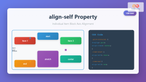
CSS Align-Self: Master Individual Grid Item Block Axis Alignment
The CSS align-self property provides granular control over individual grid items' alignment along the block axis (vertical direction in horizontal...

CSS Align-Items: Master Cross-Axis Alignment in Flexbox and Grid
The CSS align-items property is a fundamental tool for controlling cross-axis alignment in both flexbox and CSS Grid layouts. Understanding...

CSS Align-Content: Master Grid Container Block Axis Alignment
The CSS align-content property is a powerful tool for controlling how grid items are distributed along the block axis (typically...
CSS Style alignItems Property: CSS Align Items
Understanding the CSS align-items Property The align-items property in CSS is a powerful tool that defines how items are aligned...
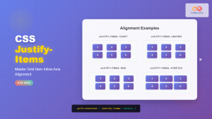
CSS Justify-Items: Complete Guide to Grid Item Inline Axis Alignment
The justify-items property is a powerful CSS Grid feature that controls how grid items are aligned along the inline axis...
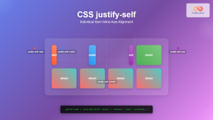
CSS Justify-Self: Master Individual Item Inline Axis Alignment
The justify-self property in CSS is a powerful alignment tool that allows you to control how individual items align themselves...
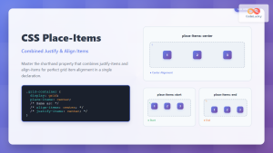
CSS Place-Items: Master Combined Justify and Align Items in One Property
The CSS place-items property is a powerful shorthand that combines justify-items and align-items into a single declaration. This property revolutionizes...
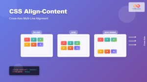
CSS Align-Content: Complete Guide to Cross-Axis Multi-Line Alignment
The align-content property is a powerful CSS tool that controls how multiple lines of content are distributed along the cross-axis...
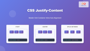
CSS Justify-Content: Master Grid Container Inline Axis Alignment with Examples
The justify-content property is a powerful CSS tool for controlling how grid items are aligned along the inline axis (horizontal...
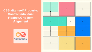
CSS align-self Property: Control Individual Flexbox/Grid Item Alignment
CSS align-self Property: Mastering Individual Item Alignment in Flexbox and Grid The CSS align-self property is a powerful tool for...
CSS Place-Self: Master Grid and Flexbox Item Positioning with One Property
The CSS place-self property is a powerful shorthand that combines justify-self and align-self into a single declaration, making it easier...
CSS align-content Property: CSS Align Content
CSS align-content Property: Mastering Content Alignment in Flexbox and Grid Layouts The CSS align-content property is a powerful tool for...
- Understanding CSS Align-Items in Grid Context
- CSS Align-Items Property Syntax
- Align-Items Values Explained
- Interactive Align-Items Demo
- Individual Item Alignment with Align-Self
- Practical Use Cases and Examples
- Browser Support and Compatibility
- Best Practices and Tips
- Common Mistakes to Avoid
- Advanced Techniques
- Conclusion


