
The CSS align-items property is a fundamental tool for controlling cross-axis alignment in both flexbox and CSS Grid layouts. Understanding how to properly use this property is essential for creating well-aligned, professional-looking web interfaces that work consistently across different screen sizes and devices.
What is CSS Align-Items?
The align-items property defines how flex items or grid items are aligned along the container’s cross axis. In a flex container with flex-direction: row, the cross axis runs vertically, while in flex-direction: column, it runs horizontally. For CSS Grid, it controls alignment within grid areas along the block axis.
Basic Syntax
.container {
  display: flex; /* or grid */
  align-items: stretch; /* default value */
}
Align-Items Values and Their Effects
The align-items property accepts several values, each producing different alignment behaviors:
1. stretch (Default Value)
The stretch value makes items stretch to fill the container’s cross-axis dimension. This is the default behavior for both flexbox and grid.
All items stretch to fill the container’s height
.container {
  display: flex;
  align-items: stretch; /* default */
  height: 120px;
}

.item {
  flex: 1;
  padding: 10px;
}
2. flex-start / start
Aligns items to the start of the cross axis. In a horizontal flexbox, this means aligning to the top.
Multi-line
Items align to the top of the container
.container {
  display: flex;
  align-items: flex-start;
  height: 120px;
}
3. flex-end / end
Aligns items to the end of the cross axis. In a horizontal flexbox, this aligns items to the bottom.
Multi-line
Items align to the bottom of the container
.container {
  display: flex;
  align-items: flex-end;
  height: 120px;
}
4. center
Centers items along the cross axis. This is one of the most commonly used values for creating vertically centered layouts.
Multi-line
Items are centered vertically within the container
.container {
  display: flex;
  align-items: center;
  height: 120px;
}
5. baseline
Aligns items along their text baseline. This is particularly useful when you have items with different font sizes or line heights.
Items align along their text baseline regardless of font size
.container {
  display: flex;
  align-items: baseline;
  height: 120px;
}

.small { font-size: 14px; }
.large { font-size: 24px; }
.medium { font-size: 18px; }
Interactive Demo: Experiment with Align-Items
Try different align-items values:
Multi-line
Align-Items in CSS Grid
While align-items is commonly associated with flexbox, it also works in CSS Grid to align items within their grid areas along the block axis.
Taller content
Grid items centered within their grid areas
.grid-container {
  display: grid;
  grid-template-columns: 1fr 1fr;
  align-items: center;
  height: 120px;
  gap: 10px;
}
Common Use Cases and Best Practices
Perfect Vertical Centering
One of the most popular uses of align-items: center is creating perfectly centered content:
.hero-section {
  display: flex;
  align-items: center;
  justify-content: center;
  min-height: 100vh;
}

.hero-content {
  text-align: center;
}
Navigation Bar Alignment
Align navigation items consistently regardless of their content size:
Navigation items stay aligned despite varying content heights
.navbar {
  display: flex;
  align-items: center;
  background: #333;
  padding: 10px;
}

.nav-item {
  padding: 8px 15px;
  margin-right: 10px;
}
Card Layout Alignment
Create consistent card layouts where content is properly aligned:
Card Title
This is some card content that might vary in length.
Another Card
This card has much longer content that spans multiple lines to demonstrate how flex-grow works with align-items.
Cards with consistent button alignment using flexbox and align-items
Browser Support and Considerations
The align-items property has excellent browser support across all modern browsers. However, there are a few considerations to keep in mind:
- IE11 Support: Partial support with some flexbox bugs. Use vendor prefixes for older browsers.
- Safari Legacy: Use
-webkit-align-itemsfor older Safari versions. - Grid Support: CSS Grid support for
align-itemsis available in all modern browsers.
Cross-browser compatibility:
.container {
  display: -webkit-flex; /* Safari */
  display: flex;
  -webkit-align-items: center; /* Safari */
  align-items: center;
}
Common Mistakes and Solutions
Mistake 1: Confusing align-items with justify-content
Remember that align-items controls cross-axis alignment, while justify-content controls main-axis alignment.
/* Wrong - using justify-content for vertical centering */
.container {
  display: flex;
  justify-content: center; /* This centers horizontally */
}

/* Correct - using align-items for vertical centering */
.container {
  display: flex;
  align-items: center; /* This centers vertically */
  justify-content: center; /* This centers horizontally */
}
Mistake 2: Not setting container height
For align-items to have a visible effect, the container needs a defined height or content that creates height.
/* Won't show vertical alignment effect */
.container {
  display: flex;
  align-items: center;
  /* No height specified */
}

/* Will show vertical alignment effect */
.container {
  display: flex;
  align-items: center;
  min-height: 200px; /* or height: 200px; */
}
Advanced Techniques
Overriding with align-self
Individual flex items can override the container’s align-items value using the align-self property:
Individual items can override the container’s alignment
.container {
  display: flex;
  align-items: flex-start;
}

.special-item {
  align-self: center; /* Overrides container alignment */
}
Responsive Alignment
Use media queries to change alignment behavior on different screen sizes:
.container {
  display: flex;
  align-items: stretch;
}

@media (max-width: 768px) {
  .container {
    flex-direction: column;
    align-items: center;
  }
}
Conclusion
The CSS align-items property is a powerful tool for controlling cross-axis alignment in modern web layouts. Whether you’re working with flexbox for one-dimensional layouts or CSS Grid for two-dimensional layouts, understanding how to properly use align-items will help you create more consistent and visually appealing designs.
Key takeaways:
align-itemscontrols cross-axis alignment for all items in a container- Use
centerfor perfect vertical centering - Use
stretch(default) to make items fill the container - Use
baselinefor text alignment across different font sizes - Individual items can override container alignment with
align-self - Remember to set container height for visible alignment effects
Master these concepts, and you’ll be able to create sophisticated layouts that work consistently across different browsers and devices, making your web development process more efficient and your final products more professional.
Related Posts
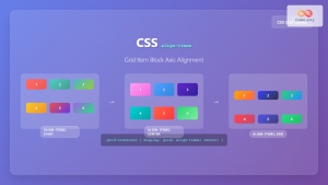
CSS Align-Items: Complete Guide to Grid Item Block Axis Alignment
Understanding CSS Align-Items in Grid Context The CSS align-items property is a powerful tool for controlling how grid items align...
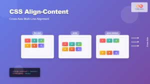
CSS Align-Content: Complete Guide to Cross-Axis Multi-Line Alignment
The align-content property is a powerful CSS tool that controls how multiple lines of content are distributed along the cross-axis...
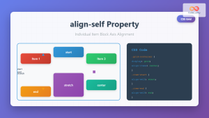
CSS Align-Self: Master Individual Grid Item Block Axis Alignment
The CSS align-self property provides granular control over individual grid items' alignment along the block axis (vertical direction in horizontal...
CSS Style alignItems Property: CSS Align Items
Understanding the CSS align-items Property The align-items property in CSS is a powerful tool that defines how items are aligned...

CSS Align-Content: Master Grid Container Block Axis Alignment
The CSS align-content property is a powerful tool for controlling how grid items are distributed along the block axis (typically...
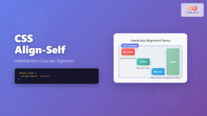
CSS Align-Self: Master Individual Flexbox Item Alignment
The CSS align-self property is a powerful flexbox feature that allows you to override the default cross-axis alignment for individual...
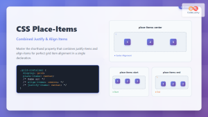
CSS Place-Items: Master Combined Justify and Align Items in One Property
The CSS place-items property is a powerful shorthand that combines justify-items and align-items into a single declaration. This property revolutionizes...
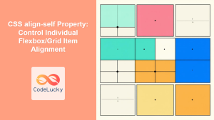
CSS align-self Property: Control Individual Flexbox/Grid Item Alignment
CSS align-self Property: Mastering Individual Item Alignment in Flexbox and Grid The CSS align-self property is a powerful tool for...
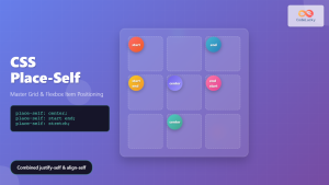
CSS Place-Self: Master Grid and Flexbox Item Positioning with One Property
The CSS place-self property is a powerful shorthand that combines justify-self and align-self into a single declaration, making it easier...

CSS align-content Property: CSS Align Content
CSS align-content Property: Mastering Content Alignment in Flexbox and Grid Layouts The CSS align-content property is a powerful tool for...
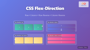
CSS Flex-Direction: Complete Guide to Row, Column, Row-Reverse & Column-Reverse
The flex-direction property is one of the most fundamental aspects of CSS Flexbox, determining how flex items are arranged within...
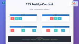
CSS Justify-Content: Complete Guide to Flexbox Main Axis Alignment
The justify-content property is one of the most powerful tools in CSS Flexbox for controlling how flex items are distributed...


