
CSS align-content Property: Mastering Content Alignment in Flexbox and Grid Layouts
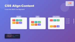
The CSS align-content property is a powerful tool for controlling the vertical alignment of content lines within flex containers and grid items within grid containers. Unlike align-items, which aligns individual items within a line, align-content manages the distribution of space between and around entire lines or tracks of content. This property is particularly useful when dealing with multi-line flex containers or grid layouts where you want to control how the lines of content are spaced out vertically.
Understanding the Purpose of align-content
The align-content property is designed to handle the distribution of space when there is extra space in the flex container or grid container in the cross-axis direction. It affects how multiple lines of flex items or grid tracks are aligned within their container. This property enhances control over the visual layout, allowing for more flexible and responsive designs.
Syntax of align-content
The align-content property can accept several values that dictate how the lines or tracks are aligned within the container.
align-content: stretch | center | flex-start | flex-end | space-between | space-around | space-evenly | start | end | normal;
Here is a table that summarizes the possible values:
| Value | Description |
|---|---|
| `stretch` | The default value. Lines stretch to fill the remaining space in the container. |
| `center` | Lines are packed toward the center of the container. The remaining space is divided equally before the first line and after the last line. |
| `flex-start` / `start` | Lines are packed to the start of the container. |
| `flex-end` / `end` | Lines are packed to the end of the container. |
| `space-between` | Lines are evenly distributed. The first line is at the start of the container, and the last line is at the end. |
| `space-around` | Lines are evenly distributed with equal space around each line. Note that visually, the space before the first and after the last line will be half the size of the space between each line. |
| `space-evenly` | Lines are evenly distributed such that the space between any two adjacent lines is the same, as is the space before the first line and after the last line. |
| `normal` | Behaves as `stretch`. If using `align-content` in a block formatting context, this value computes to `start`. |
Note: The align-content property has no effect when there is only one line of flex items or grid tracks, or when the flex container is set to flex-wrap: nowrap. 🤔
Examples of align-content in Action
Let’s explore how align-content can be used in both flexbox and grid layouts.
Example 1: align-content: center in Flexbox
In this example, we will create a flex container with multiple lines of items and use align-content: center to vertically center the lines within the container.
<div
  id="flexContainerCenter"
  style="
    display: flex;
    flex-wrap: wrap;
    height: 200px;
    width: 300px;
    border: 1px solid black;
    align-content: center;
  "
>
  <div style="width: 50px; height: 50px; background-color: #f00;">1</div>
  <div style="width: 50px; height: 50px; background-color: #0f0;">2</div>
  <div style="width: 50px; height: 50px; background-color: #00f;">3</div>
  <div style="width: 50px; height: 50px; background-color: #ff0;">4</div>
  <div style="width: 50px; height: 50px; background-color: #f0f;">5</div>
  <div style="width: 50px; height: 50px; background-color: #0ff;">6</div>
</div>
The flex items will wrap into multiple lines, and these lines will be centered vertically within the flex container.
Example 2: align-content: space-between in Flexbox
Here, we’ll use align-content: space-between to distribute the lines evenly, with the first line at the top and the last line at the bottom.
<div
  id="flexContainerSpaceBetween"
  style="
    display: flex;
    flex-wrap: wrap;
    height: 200px;
    width: 300px;
    border: 1px solid black;
    align-content: space-between;
  "
>
  <div style="width: 50px; height: 50px; background-color: #f00;">1</div>
  <div style="width: 50px; height: 50px; background-color: #0f0;">2</div>
  <div style="width: 50px; height: 50px; background-color: #00f;">3</div>
  <div style="width: 50px; height: 50px; background-color: #ff0;">4</div>
  <div style="width: 50px; height: 50px; background-color: #f0f;">5</div>
  <div style="width: 50px; height: 50px; background-color: #0ff;">6</div>
</div>
The lines will be distributed such that the first line is at the top, the last line is at the bottom, and the remaining space is evenly distributed between the lines.
Example 3: align-content: stretch in Grid Layout
In this example, we will create a grid container and use align-content: stretch to stretch the grid tracks to fill the available space.
<div
  id="gridContainerStretch"
  style="
    display: grid;
    grid-template-columns: repeat(3, 1fr);
    grid-template-rows: repeat(2, auto);
    height: 200px;
    width: 300px;
    border: 1px solid black;
    align-content: stretch;
  "
>
  <div style="background-color: #f00;">1</div>
  <div style="background-color: #0f0;">2</div>
  <div style="background-color: #00f;">3</div>
  <div style="background-color: #ff0;">4</div>
  <div style="background-color: #f0f;">5</div>
  <div style="background-color: #0ff;">6</div>
</div>
The grid tracks will stretch to fill the height of the grid container, distributing the available space equally among them.
Example 4: align-content: space-around in Grid Layout
Here, we’ll use align-content: space-around to distribute the grid tracks evenly with equal space around each track.
<div
  id="gridContainerSpaceAround"
  style="
    display: grid;
    grid-template-columns: repeat(3, 1fr);
    grid-template-rows: repeat(2, auto);
    height: 200px;
    width: 300px;
    border: 1px solid black;
    align-content: space-around;
  "
>
  <div style="background-color: #f00;">1</div>
  <div style="background-color: #0f0;">2</div>
  <div style="background-color: #00f;">3</div>
  <div style="background-color: #ff0;">4</div>
  <div style="background-color: #f0f;">5</div>
  <div style="background-color: #0ff;">6</div>
</div>
The grid tracks will be distributed such that there is equal space around each track, providing a balanced appearance.
Real-World Applications of align-content
The align-content property is valuable in several real-world scenarios:
- Responsive Layouts: Ensuring that content is distributed attractively across different screen sizes.
- Dashboard Design: Aligning and distributing dashboard widgets within a container.
- Gallery Layouts: Controlling the vertical spacing and alignment of image rows in a gallery.
- Multi-Line Text Blocks: Managing the spacing of multiple lines of text within a container.
Tips and Best Practices
- Use with
flex-wrap: wrap:align-contentonly works if the flex container has multiple lines, which requiresflex-wrap: wrap. - Consider Container Height: Ensure the container has a defined height to see the effects of
align-content. - Combine with
align-items: Usealign-itemsto control the alignment of items within each line, andalign-contentto control the alignment of the lines themselves. - Experiment with Values: Different values of
align-contentcan dramatically change the layout, so experiment to find the best fit for your design.
Browser Support
The align-content property is widely supported across modern browsers, including Chrome, Firefox, Safari, and Edge.
Conclusion
The CSS align-content property provides a robust way to control the vertical alignment and distribution of content lines in flexbox and grid layouts. By understanding its various values and how they affect the layout, you can create more flexible, responsive, and visually appealing designs. Whether you’re building a complex dashboard or a simple gallery, align-content is a valuable tool in your CSS arsenal. 🚀
Related Posts
CSS Style alignItems Property: CSS Align Items
Understanding the CSS align-items Property The align-items property in CSS is a powerful tool that defines how items are aligned...
CSS align-self Property: Control Individual Flexbox/Grid Item Alignment
CSS align-self Property: Mastering Individual Item Alignment in Flexbox and Grid The CSS align-self property is a powerful tool for...
CSS Align-Content: Complete Guide to Cross-Axis Multi-Line Alignment
The align-content property is a powerful CSS tool that controls how multiple lines of content are distributed along the cross-axis...
CSS Style justifyContent Property: CSS Justify Content
CSS justifyContent Property: Mastering Content Alignment The CSS justifyContent property defines how the browser distributes space between and around content...
CSS vertical-align Property: CSS Vertical Align
CSS vertical-align Property: Mastering Vertical Alignment The CSS vertical-align property specifies the vertical alignment of an inline or table-cell box....
CSS Place-Content: Complete Guide to Combined Justify and Align Content Properties
The place-content property in CSS is a powerful shorthand that combines both justify-content and align-content properties into a single declaration....

CSS Align-Content: Master Grid Container Block Axis Alignment
The CSS align-content property is a powerful tool for controlling how grid items are distributed along the block axis (typically...

CSS Align-Items: Master Cross-Axis Alignment in Flexbox and Grid
The CSS align-items property is a fundamental tool for controlling cross-axis alignment in both flexbox and CSS Grid layouts. Understanding...
CSS Place-Items: Master Combined Justify and Align Items in One Property
The CSS place-items property is a powerful shorthand that combines justify-items and align-items into a single declaration. This property revolutionizes...
CSS Align-Items: Complete Guide to Grid Item Block Axis Alignment
Understanding CSS Align-Items in Grid Context The CSS align-items property is a powerful tool for controlling how grid items align...
CSS Place-Self: Master Grid and Flexbox Item Positioning with One Property
The CSS place-self property is a powerful shorthand that combines justify-self and align-self into a single declaration, making it easier...
CSS Style textAlign Property: CSS Text Align
Understanding the CSS textAlign Property: Aligning Text in Web Layouts The textAlign property in CSS specifies the horizontal alignment of...


