
Web accessibility extends far beyond screen readers and keyboard navigation. One crucial but often overlooked aspect is motion sensitivity, which affects millions of users worldwide who experience vestibular disorders. Understanding how to implement prefers-reduced-motion and create motion-accessible interfaces is essential for modern web development.
Understanding Vestibular Disorders and Motion Sensitivity
Vestibular disorders affect the inner ear’s balance system, causing symptoms like dizziness, nausea, and disorientation when exposed to excessive motion. For web users with these conditions, animations and transitions can trigger severe physical reactions, making websites unusable and potentially causing lasting discomfort.
Common vestibular conditions include:
- Benign Paroxysmal Positional Vertigo (BPPV) – Triggered by head movements and visual motion
- Ménière’s Disease – Causes vertigo episodes and motion sensitivity
- Vestibular Migraine – Links migraine headaches with balance disorders
- Concussion-related vestibular dysfunction – Results from traumatic brain injuries
Additionally, users may experience motion sensitivity due to autism spectrum disorders, ADHD, or simply personal preferences for reduced visual stimulation.
The CSS prefers-reduced-motion Media Query
The prefers-reduced-motion CSS media query allows developers to detect when users have requested reduced motion through their system settings. This feature is supported across all modern browsers and provides two values:
no-preference– User hasn’t specified a preference (default)reduce– User has requested reduced motion
Basic Syntax and Implementation
/* Standard animations for users without motion preference */
.animated-element {
animation: slideIn 0.3s ease-out;
transition: transform 0.2s ease;
}
/* Reduced motion alternative */
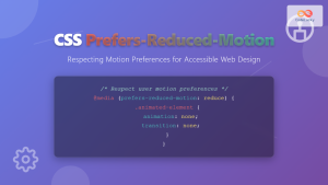
@media (prefers-reduced-motion: reduce) {
.animated-element {
animation: none;
transition: none;
}
}Practical Implementation Strategies
1. Progressive Enhancement Approach
Start with reduced motion as the default, then enhance with animations for users who can tolerate them:
/* Base styles - no motion by default */
.card {
  opacity: 1;
  transform: translateY(0);
}

/* Enhanced animations for users who prefer motion */
@media (prefers-reduced-motion: no-preference) {
  .card {
    opacity: 0;
    transform: translateY(20px);
    animation: fadeInUp 0.6s ease-out forwards;
  }
}

@keyframes fadeInUp {
  to {
    opacity: 1;
    transform: translateY(0);
  }
}
2. Conditional Transition Durations
Rather than removing all motion, consider reducing duration and easing:
.button {
  background-color: #007bff;
  transition: background-color 0.3s ease, transform 0.2s ease;
}

.button:hover {
  background-color: #0056b3;
  transform: translateY(-2px);
}

@media (prefers-reduced-motion: reduce) {
  .button {
    transition-duration: 0.01s;
  }

  .button:hover {
    transform: none;
  }
}
3. Smart Animation Replacement
Replace complex animations with simple state changes:
/* Loading spinner animation */
.spinner {
  width: 40px;
  height: 40px;
  border: 4px solid #f3f3f3;
  border-top: 4px solid #3498db;
  border-radius: 50%;
  animation: spin 1s linear infinite;
}

@keyframes spin {
  0% { transform: rotate(0deg); }
  100% { transform: rotate(360deg); }
}

/* Reduced motion alternative - static loading indicator */
@media (prefers-reduced-motion: reduce) {
  .spinner {
    animation: none;
    border: 4px solid #3498db;
    position: relative;
  }

  .spinner::after {
    content: "Loading...";
    position: absolute;
    top: 50%;
    left: 50%;
    transform: translate(-50%, -50%);
    font-size: 12px;
    color: #3498db;
  }
}
Interactive Examples
Responsive Card Animation
Here’s a practical example showing how to implement accessible card animations:
<div class="card-container">
  <div class="card">
    <h3>Standard Animation</h3>
    <p>This card respects motion preferences</p>
  </div>
</div>

<style>
.card-container {
  perspective: 1000px;
  margin: 20px;
}

.card {
  background: linear-gradient(135deg, #667eea 0%, #764ba2 100%);
  color: white;
  padding: 20px;
  border-radius: 10px;
  cursor: pointer;
  transition: transform 0.3s ease, box-shadow 0.3s ease;
}

.card:hover {
  transform: translateY(-10px) rotateX(5deg);
  box-shadow: 0 20px 40px rgba(0,0,0,0.3);
}

@media (prefers-reduced-motion: reduce) {
  .card {
    transition: box-shadow 0.1s ease;
  }

  .card:hover {
    transform: none;
    box-shadow: 0 4px 8px rgba(0,0,0,0.2);
  }
}
</style>
Accessible Navigation Menu
Creating dropdown menus that work for all users requires careful consideration of motion:
<nav class="main-nav">
  <ul class="nav-list">
    <li class="nav-item">
      <a href="#">Products</a>
      <ul class="dropdown">
        <li><a href="#">Web Design</a></li>
        <li><a href="#">Development</a></li>
        <li><a href="#">Consulting</a></li>
      </ul>
    </li>
  </ul>
</nav>

<style>
.nav-item {
  position: relative;
}

.dropdown {
  position: absolute;
  top: 100%;
  left: 0;
  background: white;
  border: 1px solid #ddd;
  border-radius: 4px;
  opacity: 0;
  visibility: hidden;
  transform: translateY(-10px);
  transition: opacity 0.2s ease, transform 0.2s ease, visibility 0.2s ease;
}

.nav-item:hover .dropdown,
.nav-item:focus-within .dropdown {
  opacity: 1;
  visibility: visible;
  transform: translateY(0);
}

@media (prefers-reduced-motion: reduce) {
  .dropdown {
    transform: none;
    transition: opacity 0.05s ease, visibility 0.05s ease;
  }

  .nav-item:hover .dropdown,
  .nav-item:focus-within .dropdown {
    transform: none;
  }
}
</style>
Advanced Techniques for Motion Accessibility
CSS Custom Properties for Dynamic Control
Use CSS custom properties to create a flexible motion system:
:root {
  --motion-duration: 0.3s;
  --motion-easing: ease-out;
  --motion-distance: 10px;
}

@media (prefers-reduced-motion: reduce) {
  :root {
    --motion-duration: 0.01s;
    --motion-easing: ease;
    --motion-distance: 0px;
  }
}

.animated-element {
  transition: transform var(--motion-duration) var(--motion-easing);
}

.animated-element:hover {
  transform: translateY(calc(-1 * var(--motion-distance)));
}
JavaScript Integration
Combine CSS media queries with JavaScript for enhanced control:
// Check user's motion preference
const prefersReducedMotion = window.matchMedia('(prefers-reduced-motion: reduce)');

function handleMotionPreference(mediaQuery) {
  if (mediaQuery.matches) {
    document.body.classList.add('reduce-motion');
  } else {
    document.body.classList.remove('reduce-motion');
  }
}

// Initial check
handleMotionPreference(prefersReducedMotion);

// Listen for changes
prefersReducedMotion.addEventListener('change', handleMotionPreference);
Safe Animation Guidelines
When animations are necessary, follow these principles to minimize vestibular impact:
- Limit displacement: Keep movements under 5x the triggering element’s size
- Avoid rotation: Spinning and rotating animations are particularly problematic
- Control direction: Horizontal movements are generally better tolerated than vertical
- Reduce frequency: Avoid rapid, repeated animations
- Provide controls: Allow users to pause or stop animations
Testing Motion Accessibility
Browser Developer Tools
Most modern browsers allow you to simulate reduced motion preferences:
- Chrome: DevTools → Rendering → Emulate CSS media feature prefers-reduced-motion
- Firefox: DevTools → Inspector → Rules → Toggle prefers-reduced-motion
- Safari: Develop → Experimental Features → prefers-reduced-motion
System Settings
Test with actual system settings enabled:
- Windows: Settings → Ease of Access → Display → Show animations
- macOS: System Preferences → Accessibility → Display → Reduce motion
- iOS: Settings → Accessibility → Motion → Reduce Motion
- Android: Settings → Accessibility → Remove animations
Performance Considerations
Implementing reduced motion can actually improve performance by reducing CPU and GPU usage:
/* Optimize for reduced motion users */
@media (prefers-reduced-motion: reduce) {
  *,
  *::before,
  *::after {
    animation-duration: 0.01s !important;
    animation-iteration-count: 1 !important;
    transition-duration: 0.01s !important;
    scroll-behavior: auto !important;
  }
}
Selective Motion Reduction
Be strategic about which animations to disable:
/* Keep essential feedback animations */
.button {
  background-color: #007bff;
  transition: background-color 0.15s ease;
}

.button:active {
  background-color: #0056b3;
}

/* Remove decorative animations only */
@media (prefers-reduced-motion: reduce) {
  .decorative-animation {
    animation: none;
  }

  .parallax-element {
    transform: none !important;
  }
}
Future-Proofing Your Motion Design
As web standards evolve, consider these emerging patterns:
1. prefers-color-scheme Integration
@media (prefers-reduced-motion: reduce) and (prefers-color-scheme: dark) {
  .card {
    animation: none;
    background: #2d2d2d;
    transition: background-color 0.1s ease;
  }
}
2. Container Queries for Context-Aware Motion
@container (max-width: 400px) and (prefers-reduced-motion: reduce) {
  .mobile-animation {
    animation: none;
    transform: none;
  }
}
Best Practices Checklist
- ✅ Always provide reduced motion alternatives
- ✅ Test with actual system settings enabled
- ✅ Consider progressive enhancement over feature detection
- ✅ Maintain visual feedback without motion
- ✅ Document motion preferences in your design system
- ✅ Use semantic HTML to ensure functionality without JavaScript
- ✅ Provide user controls for motion preferences
- ✅ Regular accessibility audits including motion testing
Conclusion
Implementing CSS accessibility for reduced motion isn’t just about compliance—it’s about creating inclusive web experiences that welcome all users. By understanding vestibular disorders and implementing thoughtful motion design, developers can build interfaces that are both engaging and accessible.
The prefers-reduced-motion media query provides a powerful tool for respecting user preferences, but it’s just the starting point. Combining proper CSS techniques with JavaScript enhancements and thorough testing ensures that your web applications work beautifully for everyone, regardless of their motion sensitivity.
As you implement these techniques, remember that accessibility is an ongoing process. Regular testing, user feedback, and staying current with web standards will help you create truly inclusive digital experiences that serve your entire audience effectively.
Related Posts
CSS Prefers-Reduced-Motion: Building Accessible Web Animations for All Users
Web animations can enhance user experience, but they can also cause serious problems for users with vestibular disorders, motion sensitivity,...
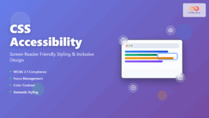
CSS Accessibility: Complete Guide to Screen Reader Friendly Styling and Inclusive Design
Understanding CSS Accessibility and Screen Reader Compatibility CSS accessibility forms the foundation of inclusive web design, ensuring that websites remain...

CSS Style perspectiveOrigin Property: CSS Perspective Origin
CSS perspective-origin Property: A Comprehensive Guide The perspective-origin property in CSS is used to set the vanishing point for 3D...
CSS scrollBehavior Property: CSS Scroll Behavior
Understanding CSS scroll-behavior: Smooth Scrolling Made Easy The scroll-behavior property in CSS allows you to define the scrolling behavior when...
CSS Fixed Positioning: Complete Guide to Viewport-Relative Elements
CSS fixed positioning is one of the most powerful tools in a web developer's arsenal for creating engaging, interactive user...

JavaScript KeyboardEvent ctrlKey Property: Ctrl Key Status
JavaScript KeyboardEvent ctrlKey Property: Detecting Ctrl Key Status The ctrlKey property of the JavaScript KeyboardEvent interface is a boolean value...

JavaScript onfocusin Event: Element Gained Focus
JavaScript onfocusin Event: Element Gained Focus The onfocusin event in JavaScript is triggered when an element, or any of its...

JavaScript WheelEvent deltaX Property: Wheel Scroll Delta X
JavaScript WheelEvent deltaX Property: Understanding Horizontal Scroll Delta The WheelEvent interface in JavaScript provides detailed information about mouse wheel events....

HTML Img alt Property: Image Alternate Text
HTML <img> alt Property: Image Alternate Text The alt attribute of the HTML <img> tag specifies an alternate text for...

HTML accesskey Property: Element Access Key
HTML accesskey Property: Enhancing Web Accessibility with Keyboard Shortcuts The HTML accesskey property specifies a shortcut key to activate or...
CSS Accessibility: Complete Guide to WCAG Color Contrast Requirements
Web accessibility is not just a legal requirement—it's a fundamental principle of inclusive design that ensures your website can be...
JavaScript onmouseover Event: Mouse Pointer Moved Over
JavaScript onmouseover Event: Mouse Pointer Moved Over The onmouseover event in JavaScript is triggered when a mouse pointer moves over...


